bg요소를 가변적으로 적용해야 하는 layout
한게임의 bout는 제가 입사해서 제일 처음 맡아 진행했던 프로젝트이자 표현과 구조를 분리해본 첫 사이트 였습니다. (그래서 인지 미숙한점이 많았습니다 ^^;)
게임페이지의 레이아웃은 일반사이트에 비해 비쥬얼이 강하다는 것이 특징이어서 layout을 잡을때 background와 구조적인 부분을 많이 고민하게 됩니다.
제가 bout를 작업하며 고민했던 background와 구조적인 부분이 같이 맞물려서 작업된 http://bout.hangame.com/ 사이트의 Layout에 대한 내용을 포스팅 해봅니다.
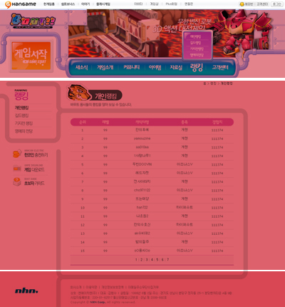
위의 Bout디지인경우는 구조를 3단구성으로 나누었습니다. (GNB영역은 제외합니다.) 3단구성은 아래 소스에서 top/content/footer로 나누었습니다. 보통3단으로 나누는 기준으로 컨텐츠 영역을 기준으로하곤 하지만 비쥬얼이 강한 bout디자인에서는 background의 가변성을 같이 고려 하였습니다.
<!-- gnb -->
<div>
</div>
<!-- top -->
<div>
</div>
<!-- content -->
<div>
<!-- left -->
<div>
<div>
</div>
<div>
<ul>
<li>
<a href="#">한코인 충전하기</a>
</li>
<li>
<a href="#">게임 다운로드</a>
</li>
<li>
<a href="#">초보자 가이드</a>
</li>
</ul>
</div>
</div>
<!-- middle -->
<div>
</div>
</div>
<!-- footer -->
<div>
</div>
body에서 정의해준 background는 위의 라인이 반복되도록 하였습니다.
body에서 background는 제일 많은 가변성을 요구하는 부분이 정의되어야 하기 때문에 컨텐츠 양에 따라 달라질 수 있는 부분이 정의되었습니다. 아래에서 정의해준 이미지는 width=894 height=1 이며 회색라인이 위의 이미지처럼 보이도록 세로로 반복됩니다.
body { background:url(http://coder.nhndesign.com/Book/img/common/con_bg.gif) repeat-y; } 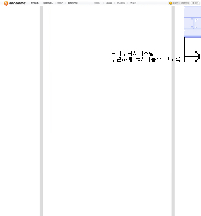
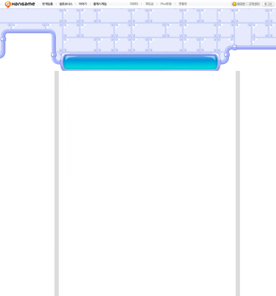
top영역에서 하늘색 부분이 반복될 수 있도록 컨텐츠 영역이 끝나는 부분부터 repeat되도록 잡았다가 하늘색 부분이 반복이 되면 디자인적인 부분에서 깨지는 곳이 발생되서 비쥬얼요소가 강한 게임사이트의 성격을 살리고자 1600브라우져까지 고려한 통이미지로 용량을 적당히 조절하여 처리하였습니다. (* 게임페이지의 특성상 사용성과 디자인적인 표현, 유지보수를 놓고 고민하게 될때가 발생합니다. 문제점이 없다면 게임사이트는 비쥬얼적인 디자인 표현을 우선시하게 되는거 같습니다.)
#top {width:100%; height:247px; background:url(http://coder.nhndesign.com/Book/img/common/bg_01.gif) 988px 0 repeat-x;}
↓
#top {width:100%; height:247px; background:url(http://coder.nhndesign.com/Book/img/common/bg_01.gif) no-repeat;} 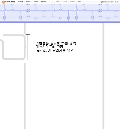
left Menu가 라운딩 박스를 가지면서 height값은 Menu개수에 따라 달라지는 레이아웃을 가졌습니다. 그러면서 right Content영역의 라인 이미지와 연결되는 부분이 있습니다.
라운딩 박스는 유동적이 되도록 class명을 menu로 잡았고 밑에 나오는 banner가 메뉴박스와 일정간격으로 디자인 되어 있으며, 모든페이지에서 같은 banner가 노출되기 때문에 banner가 라인이미지를 갖고 잘려지도록 하였습니다. banner가 항상 같지 않거나, 페이지마다 다른 컨텐츠가 뿌려지는 경우라면 라인이미지가 background로 들어갈 수 있도록 구조를 잡아야수월 한 경우가 많습니다.
#con {clear:both;width:894px;}
#con_l {float:left;width:219px;background:url(http://coder.nhndesign.com/Book/img/common/l_bg_01.gif) left top no-repeat;}
#con_l .menu {float:left;padding:0 0 40px 0;margin:30px 0 0 0;background:url(http://coder.nhndesign.com/Book/img/common/menu_b.gif) 18px bottom no-repeat;}
#con_l .menu ul {float:left;width:201px;background:url(http://coder.nhndesign.com/Book/img/common/menu_t.gif) left top no-repeat;margin:0 0 0 18px;padding:0 0 0 32px;display:inline;}
#con_l .menu ul li {float:left;border-top:1px solid #E6E9ED;}
#con_l .menu ul li a {display:block;}
#con_l .menu ul li span {display:none;}
#con_l .banner {}
#con_l .banner ul {margin:0 0 100px 18px;}
#con_l .banner ul li {float:left; list-style-type:none; margin:0; padding:0;}
#con_l .banner ul li a {display:block;width:201px;height:53px;}
#con_l .banner ul li span {display:none;}
#con_l .banner ul .li_01 {background:url(http://coder.nhndesign.com/Book/img/common/l_01.gif) left top no-repeat;}
#con_l .banner ul .li_02 {background:url(http://coder.nhndesign.com/Book/img/common/l_02.gif) left top no-repeat;}
#con_l .banner ul .li_03 {background:url(http://coder.nhndesign.com/Book/img/common/l_03.gif) left top no-repeat;} 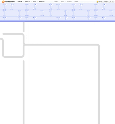
위 이미지에서 검정 사각 라인 영역을 오른 컨텐츠 top영역으로 잡았습니다. 이 영역에서는 history와 타이틀 이미지와 타이틀이 노출되야 하고 라인과 라운딩 오른 이미지로 레이아웃이 표현되도록 구조를 잡고 컨텐츠 양이 달라져도 top은 항상 고정이 되기 때문에 top영역에서 라운딩을 가져가는 것이 효율적 입니다.
표현
#con_m {float:left;width:675px;margin:0 0 25px 0;}
#con_m .tit_0101 {width:675px;height:145px;background:url(http://coder.nhndesign.com/Book/img/news/tit_0101.gif) left top no-repeat;}
#con_m .tit_0102 {width:675px;height:145px;background:url(http://coder.nhndesign.com/Book/img/news/tit_0102.gif) left top no-repeat;}
#con_m .tit_0103 {width:675px;height:145px;background:url(http://coder.nhndesign.com/Book/img/news/tit_0103.gif) left top no-repeat;}
#con_m h3 {display:none;} #con_m .history {float:right;padding:15px 54px 0 0;font-size:11px;}
#con_m .con {width:589px;margin:0 0 0 35px;}
구조
<div>
<div>
<h3> </h3>
<p>
<a href="#">홈</a>
</p>
<div>
</div>
</div>
</div> 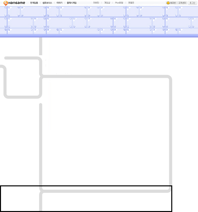
아래의 푸터 부분은 라운딩된 디자인 요소가 마무리되도록 디자인 되어 있습니다.
회색라운딩 되는 부분이 항상 아래부분으로 마무리 되기 때문에 검정 사각 라인으로 영역을 잡았습니다. 푸터를 위 이미지 처럼 잡으면 컨텐츠 양이 달라져도 항상 bottom으로 고정되어지기 때문에 컨텐츠양에 따라 height가 유동적으로 변하는 상황에서도 잘 적용 됩니다.
표현
#footer {clear:both;width:894px; height:127px;background:url(http://coder.nhndesign.com/Book/img/common/f_bg_01.gif) no-repeat;}
#footer_l {float:left;width:205px;}
#footer_l h3 {background:url(../http://coder.nhndesign.com/Book/img/common/logo_nhn.gif) no-repeat;margin:48px 0 0 48px;}
#footer_l h3 a {display:block;width:95px;height:35px;}
#footer_l h3 span {display:none;}
#footer_r {float:right;width:640px;margin:43px 0 0 0;}
구조
<div>
<div>
<h3>
<a href="#">NHN</a>
</h3>
</div>
<div>
<a href="#">회사소개</a>
ㅣ
<a href="#">이용약관</a>
ㅣ
<a href="#">개인정보</a>
ㅣ
<a href="#">사이트맵</a>
상호 : 엔에이치엔(주) l 대표 : 김범수 l 설립일 : 1999년 6월 2일 주소 : 경기도 성남시 분당구 정자동 25-1 분당벤처타운 A동 9층
사업자등록번호 : 220-81-62517 통신판매업신고번호 : 성남 제 2006-692호
Copyright ⓒ <strong>NHN Corp.</strong> All rights reserved.
</div>
</div>
이상이 바우트 사이트 설계시 고민하고 적용했던 layout 구조에 대한 내용이였습니다.
layout소스는 모든 페이지에 뼈대가 되는 중요한요소로 분량이 큰 프로젝트 일수록 layout설계에 많은 공을 들여야 합니다.
layout 및 코드 최적화 부분은 디자인과 개발 기획 모든영역에서 고민해야하는 부분이지만 실업무에서 디자인을 언어로 바꾸어 주는 우리들이 layout에 대한 구조적인 설계를 좀 더 고민하고 현 업무에 효율적으로 적용할 줄 안다면, 최적화된 사이트의 초석을 다지는게 아닐까 하는 생각을 해 봅니다.