널리 알리는 기술 소식 다양한 접근성과 사용성, UI 개발에 대한 소식을 널리 알리고 참여하세요!
Spread your knowledge!
포럼 우리 모두의 소중한 의견이 모이는 곳입니다.
-
tip[Android View Accessibility] 목록 총 항목 수 및 현재 항목 순서 정보 전달하기엔비전스 접근성 2024-05-21 11:27:43
Android는 목록 내 접근할 때 뿐만 아니라, 각 항목마다 목록 내 항목이 총 몇 개인지, 현재 몇번째 항목에 사용자가 초점을 보냈는지 알려줍니다. 데이터를 주로 담는 목록으로는 (구)ListView와 RecyclerView 등이 있으며, TabLayout또한 이에 해당합니다.
그런데, 단순히 LinearLayout같은 레이아웃 요소로 나열하게 된다면, TalkBack 사용자는 위와 같은 유용항 정보를 듣지 못하게 됩니다.
눈으로 보는 사람도 어처피 순서나 개수는 세야 하는데, 뭐가 문제냐고요? 역차별 아니냐고 생각하실 수 있겠는데요. 맞는 말씀이십니다.
…그런데, 그래도 줬다 뺐는건 기분이(?)가 나쁘잖아요 :) 그래서, LinearLayout을 Kotlin으로 가져와서 AccessibilityNodeInfo를 통해 CollectionInfo와 CollectionItemInfo를 수정하는 방법을 소개해볼까 해요.
목록 컨테이너 구현하기
먼저, XML부터 만듭시다.
<!--activity_main.xml-->

<?xml version="1.0" encoding="utf-8"?>
<LinearLayout xmlns:android="http://schemas.android.com/apk/res/android"
    xmlns:tools="http://schemas.android.com/tools"
    xmlns:app="http://schemas.android.com/apk/res-auto"
    android:id="@+id/main"
    android:orientation="vertical"
    android:layout_width="match_parent"
    android:layout_height="match_parent"
    tools:context=".MainActivity">
      <TextView
            android:layout_width="wrap_content"
            android:layout_height="wrap_content"
            android:text="Hello World"
            android:id="@+id/hw_text"
            android:layout_marginEnd="10sp"
            android:padding="4sp"
      />
     <TextView
            android:layout_width="wrap_content"
            android:layout_height="wrap_content"
            android:text="안녕 세계"
            android:id="@+id/hw_text_ko"
            android:layout_marginEnd="10sp"
            android:padding="4sp"
      />
     <TextView
        android:layout_width="wrap_content"
        android:layout_height="wrap_content"
        android:text="こんにちは、世界"
        android:id="@+id/hw_text_ja"
        android:layout_marginEnd="10sp"
        android:padding="4sp"
      />
      <TextView
        android:layout_width="wrap_content"
        android:layout_height="wrap_content"
        android:text="Hallo Welt"
        android:id="@+id/hw_text_de"
        android:padding="4sp"
     />
</LinearLayout>
이제, 이 LinearLayout에 들어있는 요소에 접근했을 때, 목록 정보를 전달받을 수 있도록 해보자고요.
// MainActivity.kt (1), import문 생략
class MainActivity : AppCompatActivity() {
    override fun onCreate(savedInstanceState: Bundle?) {
      super.onCreate(savedInstanceState)
      setContentView(R.layout.activity_main)
      val helloWorldLayout:LinearLayout = findViewById(R.id.main)
      helloWorldLayout.accessibilityDelegate = object : View.AccessibilityDelegate() {
        override fun onInitializeAccessibilityNodeInfo(
            host: View,
            info: AccessibilityNodeInfo
        ) {
          super.onInitializeAccessibilityNodeInfo(host, info) // (1)
          val infoCompat = AccessibilityNodeInfoCompat.wrap(info) // (3)

          val collectionInfo: CollectionInfoCompat = CollectionInfoCompat.obtain( // (3)
              helloWorldLayout.childCount, // (3-1)
              1, //(3-2)
              false // (3-3)
          )

          infoCompat.setCollectionInfo(collectionInfo) // (4)
      }
      helloWorldLayout.importantForAccessibility = View.IMPORTANT_FOR_ACCESSIBILITY_YES // (5)
      //...
    }
  }
}
자, 우선 목록 컨테이너가 될 LinearLayout부터 손봅시다.
-
LinearLayout을 불러와서 accessibilityDelegate를 초기화하고, onInitializeAccessibilityNodeInfo를 override합니다.
-
범용적으로 구형 디바이스또한 목록 정보를 주기 위해서는 일반적인 AccessibilityNodeInfo 대신 AccessibilityNodeInfoCompat을 사용해야 합니다. AccessibilityNodeInfoCompat.wrap(info)를 할당한 infoCompat 상수를 만들어줍시다.
-
CollectionInfoCompat을 할당한 collectionInfo 상수를 선언합니다. CollectionInfoCompat과 뒤에 나올 CollectionItemInfoCompat은 obtain으로 초기화합니다. CollectionInfoCompat.obtain에는 3개의 필수 매개변수가 필요합니다.
-
첫번째 매개변수는 총 행 개수 Int 입니다. 세로 레이아웃이면 이곳에 항목 개수를 넣습니다. 가로 레이아웃이면 1입니다.
-
두번째 매개변수는 총 열 개수 Int 입니다. 가로 레이아웃이면 이곳에 항목 개수를 넣습니다. 세로 레이아웃이면 1입니다.
-
세번째 매개변수는 계층구조가 나눠져있는지를 설정하는 Boolean입니다.
-
또한 Tab 요소와 같이 선택 가능한 요소인 경우 네번쨰 매개변수인 selectionMode를 설정할 수 있습니다.
-
-
CollectionInfoCompat이 담긴 collectionInfo 상수를 infoCompat.setCollectionInfo로 전달합니다.
-
helloWorldLayout.importantForAccessibility를 View.IMPORTANT_FOR_ACCESSIBILITY_YES로 설정합니다. 이 부분을 빼먹어서는 안 됩니다. LinearLayout은 화면의 배치를 담당하는 요소이기 때문에 importantForAccessibility의 기본 상태가 IMPORTANT_FOR_ACCESSIBILITY_NO로 동작합니다.
목록 항목 구현하기
다음은, 목록 항목을 구현할 차래입니다. MainActivity에서 이어서 작업합니다.
// MainActivity.kt (2), import문 생략
class MainActivity : AppCompatActivity() {
  override fun onCreate(savedInstanceState: Bundle?) {
    //...이전 내용 생략

    for( index in 0 until helloWorldLayout.childCount ) {
      val child = helloWorldLayout.getChildAt(index)
        child.accessibilityDelegate = object : View.AccessibilityDelegate() {
          override fun onInitializeAccessibilityNodeInfo(
              host: View,
              info: AccessibilityNodeInfo
          ) {
            super.onInitializeAccessibilityNodeInfo(host, info)
            val infoCompat = AccessibilityNodeInfoCompat.wrap(info)

          val collectionItemInfo: CollectionItemInfoCompat = CollectionItemInfoCompat
            .obtain(
              index,
              1,
              0,
              1,
              false,
              false
            )

          infoCompat.setCollectionItemInfo(collectionItemInfo)
        }
      }
    }
  }
}
목록을 구현할때와 비슷하게 진행됩니다. 다른점은, CollectionInfo가 아닌 CollectionItemInfo를 설정해야 합니다.
CollectionItemInfo의 설정 방법또한 CollectionInfo와 거의 유사합니다. 역시나 obtain으로 초기화합니다. 매개변수는 다음과 같습니다.
- 첫번째 매개변수는 rowIndex입니다. 필수 매개변수이며 Int를 요구합니다. 세로 레이아웃이라면 여기에 index를 전달합니다. 가로 레이아웃이라면 0을 전달합니다.
- 두번째 매개변수는 rowSpan입니다. 필수 매개변수이며 Int를 요구합니다. 그리드에서 합쳐진 셀을 나타낼때 쓰는 것 같습니다. 1차원 목록에서는 1을 전달합니다.
- 세번째 매개변수는 columnIndex입니다. 필수 매개변수이며 Int를 요구합니다. 가로 레이아웃이라면 여기에 index를 넣
- 네번째 매개변수는 columnSpan입니다. 필수 매개변수이며 Int를 요구합니다. 마찬가지로 그리드에서 합쳐진 셀을 나타내는 데 씁니다. 1차원 목록에서는 1을 전달합니다.
- 다섯번째 매개변수는 heading입니다. 필수 매개변수이며 요구값은 Boolean입니다. 이 항목을 제목요소로 설정합니다.
- 여섯번쨰 매개변수는 selected입니다. 필수 매개변수가 아니기 때문에 생략할 수 있으며 요구값은 Boolean입니다. 이 항목이 선택됨으로 설정합니다. 범용적으로 사용되지 않으며 View 또는 AccessibilityNodeInfo의isSelected 코틀린 프로퍼티 또는 setSelected 자바 메소드를 쓰는 것이 더 범용적입니다. API 버전 33 이상에서 동작하지 않을 수 있습니다.
자, 이제, TalkBack이 목록정보를 출력할 것입니다.
댓글을 작성하려면 로그인 해주세요. -
-
qnaResponsive Navigation Bar Alignment and Dropdown Issuekhanzain 2024-05-10 16:52:38
I'm trying to create a responsive navigation bar. However, the navigation links don't seem to align properly, and the dropdown menu isn't working as expected.
This is my code
<!DOCTYPE html>
<html lang="en">
<head>
<meta charset="UTF-8">
<meta name="viewport" content="width=device-width, initial-scale=1.0">
<title>Nav Nightmare</title>
<link rel="stylesheet" href="https://stackpath.bootstrapcdn.com/bootstrap/4.5.2/css/bootstrap.min.css">
</head>
<body>
<nav class="navbar navbar-expand-lg navbar-light bg-light">
<a class="navbar-brand" href="#">My Website</a>
<button class="navbar-toggler" type="button" data-toggle="collapse" data-target="#navbarNav" aria-controls="navbarNav" aria-expanded="false" aria-label="Toggle navigation">
<span class="navbar-toggler-icon"></span>
</button>
<div class="collapse navbar-collapse" id="navbarNav">
<ul class="navbar-nav ml-auto">
<li class="nav-item active">
<a class="nav-link" href="#">Home <span class="sr-only">(current)</span></a>
</li>
<li class="nav-item">
<a class="nav-link" href="#">About</a>
</li>
<li class="nav-item">
<a class="nav-link" href="#">Services</a>
</li>
<li class="nav-item dropdown">
<a class="nav-link dropdown-toggle" href="#" id="navbarDropdown" role="button" data-toggle="dropdown" aria-haspopup="true" aria-expanded="false">
More
</a>
<div class="dropdown-menu" aria-labelledby="navbarDropdown">
<a class="dropdown-item" href="#">Portfolio</a>
<a class="dropdown-item" href="#">Contact</a>
</div>
</li>
</ul>
</div>
</nav>
<script src="https://code.jquery.com/jquery-3.5.1.slim.min.js"></script>
<script src="https://cdn.jsdelivr.net/npm/@popperjs/core@2.5.2/dist/umd/popper.min.js"></script>
<script src="https://stackpath.bootstrapcdn.com/bootstrap/4.5.2/js/bootstrap.min.js"></script>
</body>
</html>
Any idea why the navigation links are misaligned, and the dropdown isn't working?댓글을 작성하려면 로그인 해주세요. -
tip[HTML-Javascript] 초점 반환, 두 줄씩만 넣어도 간편해집니다.엔비전스 접근성 2024-02-05 13:07:11
브라우저에서 제공하는 UI의 확장성에 불만이 많은 웹 개발자 및 디자이너는 메뉴나 콤보박스, 대화상자를 따로 만들기 시작했고, 오늘 날에는 형형색색 다양한 UI가 존재합니다. 이로 인해 생기는 문제점은 당연히 '웹 표준'이나 '접근성'이 취약하다는 점입니다.
특히, 대화상자는 초점을 관리해주지 않아서 서비스를 이용하는 데, 큰 어려움이 있어왔고, 여전히 ~ing입니다. 접근성을 조금이라도 신경쓰는 기업 또는 개발자는 적어도, 대화상자가 나타났을 때, 초점을 대화상자 안으로 보내주는 노력이 이어지고는 있지만, 여전히 대체로 구현되지 않습니다.
평상시에는 대화상자가 열렸을 때 초점 관리에 관해 다뤘다면, 오늘은 대화상자가 닫혔을 때 초점에 관해 팁을 드리고자 합니다. "보내주기만 하면 됐지, 뭘 또 하라는거냐"라고 생각하실 수 있고, 바쁜 거 압니다. 하지만, 코드로 봤을 때, 메소드에 한 두줄씩만 더 추가해서 더 좋은 결과를 낼 수 있습니다.
대화상자를 닫았을 때, 마우스 사용자는 대화상자 밖에 있는 어떤 요소든 다시 클릭하는 데, 오랜 시간이 걸리지 않습니다. 보이는 스크롤 위치부터 보고, 포인터를 움직여서 누르기만 하면 되니까요.
키보드 사용자는 어떨까요? 키보드 사용자는, 개발자의 설계 의도나 특별한 소프트웨어가 없다면 링크나 버튼 등을 모두 순서대로 하나씩 전부 탐색하게 됩니다. 만약에, 초점을 대화상자가 연 요소로 이동해주지 않고 대화상자만 닫힌다면 어떨까요? 문서에서 초점을 잃어버리기 때문에 처음부터 다시 탐색해야 합니다.
즉, 탐색과 조작의 연속성이 매우 떨어지게 됩니다. 이것을 "초점 반환"이라고 표현하겠습니다. 초점반환은 지난 아티클인 '조작의 연속성'과 아주 밀접한 연관이 있습니다.
지금부터 당신은 컴퓨터 사용이 서툰 사람이라고 가정해봅시다. 만약에, 회원가입 페이지가 있는데, 회원가입을 완료했더니, "가입하신걸 진심으로 환영합니다!"라는 페이지로 리디렉팅 된다고 생각해봅시다. 그런데, 리디렉팅된 페이지에 "로그인"이나 "홈으로 이동"과 같은 링크가 없다면 어떨까요?
매우 불편할 것입니다. 홈이나 로그인 url을 알고 있어서, 다시 접속해야겠지요. 컴퓨터 사용이 미숙한 분이라면 아마 매우 큰 수고가 필요할 겁니다. 이런 관점에서 이 초점 반환은 대화상자나, 메뉴, 콤보박스를 구현할 때, 반드시 필요한 과정입니다.
class CustomModalDialog extends HTMLElement {
    #returnFocus;
    set opened(v) { this.toggleAttribute('open',v); }
    get opened() { return this.hasAttribute("open"); }

    open (  ) {
        this.#returnFocus = document.activeElement;
        document.body.querySelectorAll(":scope>*:not(.modal-wrapper)").forEach(_=>{
            _.setAttribute('inert',"");
        });
        this.opened = true;
        this.focus();
    }
    close (  ) {
        this.opened = false;
        document.body.querySelectorAll(":scope>*:not(.modal-wrapper)").forEach(_=>{
            _.removeAttribute('inert',"");
        });
        this.returnFocus.focus();
    }

    set returnFocus (element) { this.#returnFocus = element; }
    get returnFocus () { return this.#returnFocus; }
    constructor() {
        super();
        this.attachShadow({mode:"open"});
        this.opened = false;
        this.role = "dialog";
        this.tabIndex = -1;
        this.ariaModal = true;
        const templateHTML = `<style>
            :host {
                top:0; left:0;
                width:100%; height:100%;
                display:flex;
                position:fixed;
                z-index:997;
                font-size:1.45rem;
            }
            :host(:not([open])) {
                display:none;
            }
            #backdrop {
                display:flex;
                width:100%;
                height:100%;
                background:rgba(0,0,0,0.5);
            }

            #body {
                display:flex;
                flex-direction:column;
                background-color:white;
                min-width:50%; max-width:80%; border-radius:0.5rem;
                aspect-ratio:16/9;
                overflow:hidden;
                margin: auto;
                padding:2rem;
            }
        </style>
        <div id="backdrop">
            <div id="body">
                <slot></slot>
            </div>
        </div>`;
        const templateElement = document.createElement("template");
        templateElement.innerHTML = templateHTML;
        this.shadowRoot.append(templateElement.content.cloneNode(true));

    }
    connectedCallback() {

        this.shadowRoot.querySelector("#backdrop").addEventListener("click",e=>{
            if(e.target == this.shadowRoot.querySelector("#backdrop")) this.close();
        });
        this.addEventListener("keydown",e=>{
            if(e.key == "Escape") this.close();
        });
        this.querySelectorAll(".btn-close").forEach(btn=>{
            btn.addEventListener("click",()=>{
                this.close();
            })
        });

        if(
            !this.parentElement.classList.contains('modal-wrapper')
            ||
            ![...document.body.childNodes].find(_=>_=== this.parentElement)
        ) {
            console.error("[Error] modal-dialog 태그는 body>.modal-wrapper 컨테이너 안에 배치해야 합니다.")
            this.parentElement.removeChild(this);
            delete this;
        }
    }
}

customElements.define("modal-dialog",CustomModalDialog);
위 코드를 한번 보세요. 이것은 customElements API로 만든 대화상자 컴포넌트입니다. 그리 긴 코드가 아닙니다. 이 컴포넌트의 open 메소드를 보시면 this.returnElement에 document.activeElement를 저장하는 것을 볼 수 있습니다. 이 녀석이 뭐길레 저장할까요?
현재 키보드 초점을 가리키는 속성: document.activeElement
알 사람도 알겠지만, 웹 표준 DOM의 document 객체에는 activeElement라는 녀석이 있습니다. 현재 키보드 초점이 있는 요소 위치를 감지할 수 있는 속성입니다. 대화상자가 열 때, 특정 변수나 속성에 이 activeElement를 담으면, 그 시점에 초점을 가지고 있는 요소가 담기게 됩니다.
이렇게 담겨진 요소는 나중에 close 메소드가 여러 이벤트에서 실행될 때, 초점을 다시 대화상자가 열리기 전 요소로 반환하는 용도로 사용할 수 있습니다. 특히, Windows 환경에서 이 document.activeElement는 유용합니다.
모바일은 어쩌고요?
모바일은 안타깝게도 TalkBack과 호환성이 맞지 않습니다. iOS만 놓고 보면, VoiceOver 커서는 마치 키보드의 Tab 키를 눌러서 이동하는 것처럼 링크나 버튼, 편집창에 커서가 있으면, 시스템 초점도 따라가게 됩니다. 그런데, TalkBack의 터치 커서는 시스템 커서에 관여하지 않기 때문에 한계가 있습니다.
그렇기 때문에, 일반적으로 모바일까지 고려한다면, aria-haspopup="dialog", aria-controls를 사용하여 둘을 연결하는 것을 권장합니다. 다만, 단순히 PC 페이지에서 사용될 대화상자라면, 이 document.activeElement만으로 초점을 쉽게 반환할 수 있습니다.
댓글을 작성하려면 로그인 해주세요. -
tip[HTML] 커스텀 키패드 접근성 적용 관련엔비전스 접근성 2024-01-30 11:55:38
요즘 비밀번호 입력과 같은 편집창에 input을 사용하지 않고 커스텀 키패드를 사용하는 경우가 점점 더 늘어나고 있는 것 같습니다.
스크린 리더 사용자 입장에서는 모든 접근성을 적용해 주는 input을 사용하는 것이 가장 좋지만 커스텀 키패드를 적용할 때 몇 가지 고려했으면 하는 사항들을 아래에 정리해 보았습니다.
1. 편집 가능한 커스텀 요소에 role textbox, aria-label, aria-live 속성 주기: 비밀번호, 금액 입력과 같은 값이 들어오는 요소에 아래 예시와 같이 적용할 수 있습니다.
<span id="dollarInput" role="textbox" aria-live="polite" class="input-field" aria-current="true" aria-label="달러 입력"></span>
여기서 aria-current true 속성은 편집창이 현재 활성화 되었다는 가정 하에 넣은 것입니다. 일반적으로 커스텀 키패드가 활성화 된 채로 화면이 표시되는 경우가 대부분이므로 해당 편집창에 aria-current true 속성을 주면 현재 편집창이 활성화된 상태라는 것을 바로 알 수 있습니다.
그리고 aria-live 속성을 주면 일부 스크린 리더에서 키패드를 입력할 때마다 입력된 글자를 읽어주므로 좀 더 실시간으로 내가 입력한 밸류 값을 들을 수 있게 됩니다.
2. 입력된 값 처리: 키패드에서 숫자 등을 입력할 때마다 해당 값이 role textbox가 있는 요소에 텍스트로 포함된다면 스크린 리더는 이를 밸류로 처리하므로 추가 접근성 적용이 필요 없습니다.
<span role="textbox">325</span>
그러나 값이 동그라미로 채워지거나 이미지로 표시된다면 aria-valuetext 속성을 넣어 입력된 값을 업데이트 해 주어야 합니다.
<span role="textbox" aria-valuetext="325"></span>
비밀번호 입력시에는 *, **, **** 와 같이 값을 넣어줍니다.
3. 키패드가 표시될 때에는 키패드 표시됨 이라는 어나운스를 해줍니다. 이때 announceForAccessibility 함수를 사용할 수 있습니다.
댓글을 작성하려면 로그인 해주세요. -
tipUnlocking the Power of SQL Triggerszain 2024-01-04 19:23:06
I'm delving into SQL triggers, and I'm curious about their use and functionality. Could you provide an example of when you might use a trigger in a database, and how it can be beneficial? I'd appreciate a real-world scenario to better understand their practical application.
Thanks!댓글을 작성하려면 로그인 해주세요. -
tipSmooth Scroll Animation Issue with HTML Page Linksiqratech 2024-01-04 16:02:50
I'm creating a simple webpage with multiple sections, and I want to add smooth scrolling when users click on navigation links that lead to different sections. However, it's not working as expected. The page just jumps to the next section without any smooth animation.
Here's my code:
<!DOCTYPE html>
<html lang=""en"">
<head>
    <meta charset=""UTF-8"">
    <meta name=""viewport"" content=""width=device-width, initial-scale=1.0"">
    <title>Smooth Scroll Struggles</title>
    <link rel=""stylesheet"" href=""styles.css"">
</head>
<body>

    <nav>
        <ul>
            <li><a href=""#section1"">Section 1</a></li>
            <li><a href=""#section2"">Section 2</a></li>
            <li><a href=""#section3"">Section 3</a></li>
        </ul>
    </nav>

    <section id=""section1"">
        <h2>Section 1</h2>
        <p>This is the first section of my webpage.</p>
    </section>

    <section id=""section2"">
        <h2>Section 2</h2>
        <p>This is the second section of my webpage.</p>
    </section>

    <section id=""section3"">
        <h2>Section 3</h2>
        <p>This is the third section of my webpage.</p>
    </section>

    <script src=""script.js""></script>
</body>
</html>
Any idea why the smooth scrolling isn't working?댓글을 작성하려면 로그인 해주세요. -
tip[android legacy view] 레이아웃 끼리의 초점 순서 재조정하기와 setAsContainer 메서드가 추가된 AccessibilityKotlin 업데이트엔비전스 접근성 2024-01-01 16:13:19
Jetpack Compose에서는 traversalIndex 속성으로 접근성 초점 순서를 조정할 수 있지만, 레거시 뷰는 accessibilityTraversalAfter나 before 속성을 사용합니다. 레거시 뷰의 문제는 초점을 재조정하려는 객체와 해당 속성에 지정된 객체가 모두 접근성 노드에서 시맨틱해야 합니다. 따라서 LinearLayout 같은 요소들은 접근성 노드에 영향을 미치지 않아 기본적으로 초점 순서를 재조정하기 어려웠습니다.
그러나 안드로이드 14부터는 레이아웃을 접근성 노드의 컨테이너로 처리하는 메서드가 추가되어 이 문제를 해결할 수 있게 되었습니다. 예를 들어, 화면에 '위로 이동' 버튼과 웹뷰가 있을 때, 버튼을 툴바의 supportActionBar?.setDisplayHomeAsUpEnabled(true)로 구현하면, 툴바에 포함된 위로 이동 버튼은 버튼 객체로 별도로 만들 수 있는 방법이 없기 때문에 상위 레이아웃인 툴바를 접근성 컨테이너로 설정한 후 웹뷰의 accessibilityTraversalAfter를 툴바로 지정하여 초점 순서를 조정할 수 있습니다. 다만 컨테이너로 설정하기 위해서는 AccessibilityNodeInfo 객체를 사용해야 하는 번거로움이 있기 때문에 이를 간단히 구현하기 위해 AccessibilityKotlin.kt에 setAsContainer 메서드를 추가했습니다. 이 메서드는 레이아웃 뷰와 컨테이너 타이틀을 아규먼트로 받습니다.
예: AccessibilityKotlin.setAsContainer(toolbar, "toolbar").
설정된 컨테이너는 컨테이너 하위에 포함된 접근성 요소들 전체에 영향을 미치므로 따라서 A 객체 전으로 B 레이아웃 컨테이너 초점 재조정을 설정하면 B 컨테이너 하위 3개 객체 다음에 지정한 A 객체가 탐색됩니다.
다만 현재까지는 컨테이너 타이틀을 지정해도 톡백에서 이를 인식하지 못하며 앞에서도 언급했듯이 안드로이드 14 버전부터 지원합니다.
댓글을 작성하려면 로그인 해주세요. -
tip[android 공통] 액티비티에 접근성 화면 전환 제목을 위한 setTitle 혹은 title 구현 시 참고 사항엔비전스 접근성 2023-12-22 11:38:25
여러번 말씀드렸지만 안드로이드에서는 새로운 액티비티가 실행되면 해당 액티비티의 레이블 또는 onCreate 메서드 내에서 선언된 타이틀 문자를 가지고 와서 톡백이 화면 제목으로 처리한다고 했습니다.
그리고 이러한 문자열이 없으면 앱 네임을 매 화면 제목마다 읽습니다.
그런데 이러한 타이틀 적용 시에 한 가지 고민되는 것은 화면 상단에 툴바 또는 액션바를 올려 놓고 타이틀은 커스텀으로 적용하고 싶을 때입니다.
왜냐하면 안드로이드에서 제공하는 기본 title 스타일을 디자인 측면에서 원하지 않거나 타이틀 텍스트 자체를 표시하지 않고 싶을 수 있기 때문입니다.
이 때는 기존 방식대로 타이틀은 커스텀으로 적용하되 톡백을 위한 title 또는 setTitle 을 우선 함게 작성합니다.
그리고 아래 코드를 사용해 주세요.
supportActionBar?.setDisplayShowHomeEnabled(true)
이렇게 하면 화면에서는 타이틀이 안 보이지만 톡백에서는 타이틀 문자열로 화면 제목을 읽어주게 됩니다.
댓글을 작성하려면 로그인 해주세요. -
tip[jetpack compose] isTraversalGroup, traversalIndex 속성을 활용한 접근성 초점 순서 재조정하기엔비전스 접근성 2023-11-21 19:33:04
젯팩 컴포즈 1.5 버전부터 제목에서 언급한 두 API가 추가되었습니다.
해당 두 API를 활용하면 화면 레이아웃 중첩이나 기타 이슈로 인해 접근성 초점이 의도된 대로 이동하지 않을 때 초점 순서를 재조정할 수 있습니다.
isTraversalGroup true 속성은 무조건 해당 레이아웃 안의 모든 요소를 다 탐색한 다음 다음 레이아웃으로 초점이 이동하도록 강제하는 것이고 traversalIndex 는 한 레이아웃 또는 레이아웃 끼리 탐색 시 초점 순서를 재조정하는 것입니다.
해당 API 사용 방법에 대해서는 조만간 널리 아티클로 게재할 예정이고 여기서는 해당 코드가 적용된 샘플 앱을 공유합니다.
아래 코드로 빌드를 하게 되면 두 개의 시계 레이아웃이 표시됩니다.
하나는 접근성 초점이 적용된 레이아웃이고 하나는 비적용된 레이아웃입니다.
비적용된 레이아웃의 경우 초점이 12시부터 이동하지 않고 10시부터 이동하며 초점 순서도 많이 틀어져 있습니다.
package com.example.accessibilitydemo import android.os.Bundle import androidx.activity.ComponentActivity import androidx.activity.compose.setContent import androidx.compose.foundation.layout.Box import androidx.compose.foundation.layout.Column import androidx.compose.foundation.layout.fillMaxSize import androidx.compose.foundation.layout.padding import androidx.compose.material3.Text import androidx.compose.runtime.Composable import androidx.compose.ui.Alignment import androidx.compose.ui.Modifier import androidx.compose.ui.layout.Layout import androidx.compose.ui.semantics.heading import androidx.compose.ui.semantics.semantics import androidx.compose.ui.semantics.isTraversalGroup import androidx.compose.ui.semantics.traversalIndex import androidx.compose.ui.unit.dp import kotlin.math.cos import kotlin.math.sin class MainActivity : ComponentActivity() { override fun onCreate(savedInstanceState: Bundle?) { super.onCreate(savedInstanceState) setContent { Box(modifier = Modifier.fillMaxSize()) { Column(modifier = Modifier.padding(16.dp)) { ScreenTitle() Column(modifier = Modifier.weight(1f)) { // Accessible Clock Layout SectionTitle("Accessible Clock Layout") ClockFaceDemo(accessible = true) } Column(modifier = Modifier.weight(1f)) { // Not Accessible Clock Layout SectionTitle("Not Accessible Clock Layout") ClockFaceDemo(accessible = false) } } } } } @Composable fun ScreenTitle() { Column(modifier = Modifier .padding(bottom = 16.dp) .semantics(mergeDescendants = true) { // Additional semantic properties can be added here } ) { Text("Accessibility focus order demo", modifier = Modifier.padding(bottom = 8.dp)) Text("Clock Layout") } } @Composable fun SectionTitle(title: String) { Text( title, modifier = Modifier.padding(vertical = 8.dp) .semantics { heading() } ) } @Composable fun ClockFaceDemo(accessible: Boolean) { Box( modifier = Modifier .fillMaxSize() .semantics { isTraversalGroup = accessible }, contentAlignment = Alignment.Center ) { CircularLayout { repeat(12) { hour -> if (accessible) { AccessibleClockText(hour) } else { NonAccessibleClockText(hour) } } } } } @Composable private fun AccessibleClockText(value: Int) { Box(modifier = Modifier.semantics { isTraversalGroup = true traversalIndex = value.toFloat() heading() }) { Text((if (value == 0) 12 else value).toString()) } } @Composable private fun NonAccessibleClockText(value: Int) { Box { Text((if (value == 0) 12 else value).toString()) } } @Composable fun CircularLayout( modifier: Modifier = Modifier, radius: Int = 100, // Radius of the circle content: @Composable () -> Unit ) { Layout( content = content, modifier = modifier ) { measurables, constraints -> // Calculate the size of the layout val size = 2 * radius val layoutWidth = size.coerceIn(constraints.minWidth.rangeTo(constraints.maxWidth)) val layoutHeight = size.coerceIn(constraints.minHeight.rangeTo(constraints.maxHeight)) // Measure and place children val childConstraints = constraints.copy(minWidth = 0, minHeight = 0) val placeables = measurables.map { measurable -> measurable.measure(childConstraints) } layout(layoutWidth, layoutHeight) { val center = radius.toFloat() val angleStep = 2 * Math.PI / placeables.size placeables.forEachIndexed { index, placeable -> // Subtract π/2 (90 degrees) to start from the top val angle = angleStep * index - Math.PI / 2 val x = (center + radius * cos(angle) - placeable.width / 2).toInt() val y = (center + radius * sin(angle) - placeable.height / 2).toInt() placeable.placeRelative(x, y) } } } } }댓글을 작성하려면 로그인 해주세요. -
tip[android jetpack compose] 12월 7일 널리 세미나에서 발표할 드래그 데모 앱 예제 코드 선 공유엔비전스 접근성 2023-11-17 16:42:49
2023년 12월 7일 널리 세미나 주제 중 안드로이드에서 커스텀 액션 접근성을 구현하는 코드를 설명할 예정입니다.
해당 세션에서 사용할 코드를 선 공유합니다.
아래 앱은 젯팩 컴포즈로 개발된 것으로 특정 과일의 순서를 변경하거나 삭제할 수 있도록 구현한 앱입니다.
해당 앱을 빌드하여 테스트 해 보시면 드래그 & 드롭, 삭제를 커스텀 액션으로 수행할 수 있으며 젯팩 컴포즈에서 특정 요소로 접근성 초점 보내기 또한 구현되어 있습니다.
발표 청취 전에 살펴 보시면 도움이 될 것 같습니다.
package com.example.dragdemo import android.os.Bundle import androidx.activity.ComponentActivity import androidx.activity.compose.setContent import androidx.compose.foundation.Canvas import androidx.compose.foundation.background import androidx.compose.foundation.clickable import androidx.compose.foundation.focusable import androidx.compose.foundation.gestures.Orientation import androidx.compose.foundation.gestures.draggable import androidx.compose.foundation.gestures.rememberDraggableState import androidx.compose.foundation.layout.Arrangement import androidx.compose.foundation.layout.Box import androidx.compose.foundation.layout.Column import androidx.compose.foundation.layout.Row import androidx.compose.foundation.layout.fillMaxSize import androidx.compose.foundation.layout.fillMaxWidth import androidx.compose.foundation.layout.height import androidx.compose.foundation.layout.padding import androidx.compose.foundation.layout.size import androidx.compose.foundation.selection.toggleable import androidx.compose.material.icons.Icons import androidx.compose.material.icons.filled.Delete import androidx.compose.material.icons.filled.Favorite import androidx.compose.material.icons.filled.FavoriteBorder import androidx.compose.material.icons.filled.Refresh import androidx.compose.material3.FloatingActionButton import androidx.compose.material3.Icon import androidx.compose.material3.MaterialTheme import androidx.compose.material3.Surface import androidx.compose.material3.Switch import androidx.compose.material3.Text import androidx.compose.runtime.Composable import androidx.compose.runtime.LaunchedEffect import androidx.compose.runtime.getValue import androidx.compose.runtime.mutableStateOf import androidx.compose.runtime.remember import androidx.compose.runtime.rememberCoroutineScope import androidx.compose.runtime.setValue import androidx.compose.ui.Alignment import androidx.compose.ui.Modifier import androidx.compose.ui.focus.FocusRequester import androidx.compose.ui.focus.focusRequester import androidx.compose.ui.geometry.Offset import androidx.compose.ui.graphics.Color import androidx.compose.ui.semantics.CustomAccessibilityAction import androidx.compose.ui.semantics.Role import androidx.compose.ui.semantics.clearAndSetSemantics import androidx.compose.ui.semantics.customActions import androidx.compose.ui.semantics.paneTitle import androidx.compose.ui.semantics.semantics import androidx.compose.ui.unit.dp import kotlinx.coroutines.delay import kotlinx.coroutines.launch import kotlin.math.roundToInt class MainActivity : ComponentActivity() { override fun onCreate(savedInstanceState: Bundle?) { super.onCreate(savedInstanceState) setContent { MaterialTheme { Surface( modifier = Modifier.fillMaxSize(), color = MaterialTheme.colorScheme.background ) { FavoriteFruitArrangement() } } } } } @Composable fun FavoriteFruitArrangement() { var fruits by remember { mutableStateOf( listOf( "Apple", "Orange", "Grape", "Banana", "Melon", "Lemon", "Mango", "Strawberry", "Pineapple", "Cherry" ).toMutableList() ) } var focusAfterMove by remember { mutableStateOf<String?>(null) } // States for each "like" state var likesState by remember { mutableStateOf(List(fruits.size) { false }) } var accessibilityMessage by remember { mutableStateOf("") } fun deleteFruit(index: Int) { val deletedFruitName = fruits[index] // Capture the fruit's name before deletion fruits = fruits.toMutableList().apply { removeAt(index) } likesState = likesState.toMutableList().apply { removeAt(index) } // Set the accessibility message accessibilityMessage = "$deletedFruitName has been deleted" // Determine which fruit to focus on after deletion if (fruits.isNotEmpty()) { // Ensure the list isn't empty focusAfterMove = if (index < fruits.size) fruits[index + 1] else fruits[index - 1] } } fun moveUp(index: Int): Boolean { if (index > 0) { val updatedFruits = fruits.toMutableList() val fruitToMove = updatedFruits.removeAt(index) // Get the name of the fruit above which the current fruit will be moved val fruitAbove = updatedFruits[index - 1] updatedFruits.add(index - 1, fruitToMove) fruits = updatedFruits val updatedLikesState = likesState.toMutableList() val likeStateToMove = updatedLikesState.removeAt(index) updatedLikesState.add(index - 1, likeStateToMove) likesState = updatedLikesState focusAfterMove = fruitToMove // Set the focus to the moved fruit // Update the accessibility message using the saved fruitAbove accessibilityMessage = "$fruitToMove moved up above $fruitAbove" return true } return false } fun moveDown(index: Int): Boolean { if (index < fruits.size - 1) { val updatedFruits = fruits.toMutableList() val fruitToMove = updatedFruits.removeAt(index) // Get the name of the fruit below which the current fruit will be moved val fruitBelow = updatedFruits[index] updatedFruits.add(index + 1, fruitToMove) fruits = updatedFruits val updatedLikesState = likesState.toMutableList() val likeStateToMove = updatedLikesState.removeAt(index) updatedLikesState.add(index + 1, likeStateToMove) likesState = updatedLikesState focusAfterMove = fruitToMove // Set the focus to the moved fruit // Update the accessibility message using the saved fruitBelow accessibilityMessage = "$fruitToMove moved down below $fruitBelow" return true } return false } Box( modifier = Modifier .fillMaxSize() .padding(16.dp) ) { Column( modifier = Modifier.fillMaxSize(), verticalArrangement = Arrangement.spacedBy(8.dp) ) { fruits.forEachIndexed { index, fruit -> var offsetY by remember { mutableStateOf(0f) } var isBeingDragged by remember { mutableStateOf(false) } val draggableState = rememberDraggableState { delta -> offsetY += delta } LaunchedEffect(offsetY) { if (!isBeingDragged) { val newIndex = (index + (offsetY / 100).roundToInt()).coerceIn(0, fruits.size - 1) if (newIndex != index) { val updatedFruits = fruits.toMutableList() val draggedFruit = updatedFruits.removeAt(index) updatedFruits.add(newIndex, draggedFruit) fruits = updatedFruits val updatedLikesState = likesState.toMutableList() val draggedLikeState = updatedLikesState.removeAt(index) updatedLikesState.add(newIndex, draggedLikeState) likesState = updatedLikesState offsetY = 0f // Reset the offset } } } Box( modifier = Modifier .draggable( orientation = Orientation.Vertical, state = draggableState, onDragStarted = { isBeingDragged = true }, onDragStopped = { isBeingDragged = false } ) .fillMaxWidth() .height(40.dp) .background(Color.LightGray) .semantics { this.paneTitle = accessibilityMessage } ) { Row( modifier = Modifier .fillMaxWidth() .then(sendFocus(fruit == focusAfterMove)) .toggleable( value = likesState[index], onValueChange = { newValue -> likesState = likesState .toMutableList() .also { it[index] = newValue } }, role = Role.Switch ) .semantics { val customActionsList = mutableListOf<CustomAccessibilityAction>() if (index > 0) { // If the fruit is not at the top, add the "Move Up" action customActionsList.add( CustomAccessibilityAction("Move Up") { moveUp(index) true } ) } if (index < fruits.size - 1) { // If the fruit is not at the bottom, add the "Move Down" action customActionsList.add( CustomAccessibilityAction("Move Down") { moveDown(index) true } ) } // Add the "Delete" action customActionsList.add( CustomAccessibilityAction("Delete") { deleteFruit(index) true } ) customActions = customActionsList // Set the list of custom actions } ) { DragHandleIndicator( modifier = Modifier.padding( end = 8.dp, start = 4.dp ) ) Text( text = fruit, modifier = Modifier .weight(1f) .padding(8.dp) ) // Like Representation: Icon + Switch Row( verticalAlignment = Alignment.CenterVertically, horizontalArrangement = Arrangement.spacedBy(4.dp), ) { Icon( imageVector = if (likesState[index]) Icons.Default.Favorite else Icons.Default.FavoriteBorder, contentDescription = "like", tint = if (likesState[index]) MaterialTheme.colorScheme.primary else MaterialTheme.colorScheme.onSurface ) Switch(checked = likesState[index], onCheckedChange = null) } Icon( imageVector = Icons.Default.Delete, contentDescription = "Delete", modifier = Modifier .clearAndSetSemantics { } .clickable { fruits = fruits .toMutableList() .apply { removeAt(index) } likesState = likesState .toMutableList() .apply { removeAt(index) } } .padding(8.dp) ) } } } } FloatingActionButton( onClick = { fruits = listOf( "Apple", "Orange", "Grape", "Banana", "Melon", "Lemon", "Mango", "Strawberry", "Pineapple", "Cherry" ).toMutableList() likesState = List(fruits.size) { false } // Resetting "like" states focusAfterMove = "Apple" // Set the focus to the first fruit }, modifier = Modifier.align(Alignment.BottomEnd) ) { Icon(imageVector = Icons.Default.Refresh, contentDescription = "Reset") } } } @Composable fun sendFocus(focusState: Boolean): Modifier { val focusRequester = remember { FocusRequester() } val coroutineScope = rememberCoroutineScope() LaunchedEffect(focusState) { if (focusState) { coroutineScope.launch { delay(1000) // Delay for 0.5 seconds focusRequester.requestFocus() } } } return Modifier .focusRequester(focusRequester) .focusable(focusState) } @Composable fun DragHandleIndicator(modifier: Modifier = Modifier) { Canvas( modifier = modifier.size(24.dp, 24.dp) ) { val strokeWidth = 4f val startY = size.height / 3 val endY = 2 * size.height / 3 drawLine( Color.Black, Offset(strokeWidth / 2, startY), Offset(size.width - strokeWidth / 2, startY), strokeWidth = strokeWidth ) drawLine( Color.Black, Offset(strokeWidth / 2, endY), Offset(size.width - strokeWidth / 2, endY), strokeWidth = strokeWidth ) } }댓글을 작성하려면 로그인 해주세요. -
tip[android legacy view] Snackbar 구현 시 추가 접근성 구현 코드엔비전스 접근성 2023-10-31 15:22:39
화면 하단에 추가 액션을 포함한 스낵바가 표시되었을 때 스낵바의 위치를 알리거나 스낵바로 접근성 초점을 보내야 하는 경우가 있습니다.
이 때는
snackbar.addCallback(object : Snackbar.Callback() 메서드 안에서 announceForAccessibility 혹은 sendAccessibilityEvent 를 구현하면 됩니다.
다음은 예시입니다.
val snackbar = Snackbar.make(view, message, Snackbar.LENGTH_INDEFINITE).setDuration(duration) snackbar.addCallback(object : Snackbar.Callback() { override fun onShown(sb: Snackbar?) { super.onShown(sb) if (message == "Vegetable button clicked") { // Send an accessibility focus event to the Snackbar's view snackbar.view.sendAccessibilityEvent(AccessibilityEvent.TYPE_VIEW_FOCUSED) } else if (message == "Fruit button clicked") { // Make an accessibility announcement view.announceForAccessibility("Additional options at the bottom of the screen") } } }) snackbar.show() }댓글을 작성하려면 로그인 해주세요. -
tip[UIKit] UITextField 요소를 숨기면서 커스텀 텍스트필드를 구현할 때의 접근성 고려사항엔비전스 접근성 2023-10-17 16:20:49
텍스트필드에서 보이스오버 사용자가 피드백을 받아야 하는 정보로는 다음과 같은 것들이 있습니다.
텍스트필드 요소 유형.
텍스트 필드가 현재 활성화 되었는지에 대한 상태 정보.
활성화 되었을 때 커서 위치.
입력 혹은 삭제 시 실시간 변경되는 글자에 대한 피드백.
그런데 네이티브 텍스트 필드를 숨겨 놓고 커스텀으로 텍스트필드를 구현하는 경우에는 이러한 모든 정보를 피드백 받을 수 없게 됩니다.
그런데 다행인 것은 커스텀 텍스트필드에 숨겨진 텍스트 필드의 accessibilityTraits, value, language 속성을 nameLabel.accessibilityTraits = nameTextField.accessibilityTraits 와 같이 참조하면 마치 네이티브 텍스트 필드처럼 읽어준다는 것입니다.
물론 accessibilityTraits 중에는 textField가 없지만 API가 공개되지 않았을 뿐 네이티브 요소 역시 accessibilityTraits를 가지고 있기 때문입니다.
따라서 화면이 구성되었을 때, 키보드가 표시되었을 때, 키보드가 숨겨졌을 때, 글자가 입력 혹은 삭제되었을 때 해당 밸류를 업데이트 해 주면 비교적 네이티브 텍스트필드처럼 피드백을 받을 수 있습니다.
다만 한 가지 아쉬운 것은 키보드 입력 혹은 삭제 시 글자에 대한 피드백은 받지 못한다는 것입니다.
이를 해결하기 위해서 글자 입력 시 즉 밸류 값이 변경될 때마다 UIAccessibility.post(notification: .announcement, argument: text) 와 같이 어나운스 피드백을 해 주어야 합니다.
말할 필요도 없이 여기서의 text는 텍스트필드의 밸류 값입니다.
아래에 이와 관련된 UIKit 샘플 코드를 공유합니다. 스토리 보드 없는 뷰컨트롤러 클래스에서 테스트 해 보실 수 있습니다.
import UIKit class ViewController: UIViewController, UITextFieldDelegate { private var nameLabel: UILabel! private var nameTextField: UITextField! override func viewDidLoad() { super.viewDidLoad() setupNavigationBar() setupTextField() setupNameLabel() let tapGesture = UITapGestureRecognizer(target: self, action: #selector(handleLabelTap)) nameLabel.addGestureRecognizer(tapGesture) nameLabel.isUserInteractionEnabled = true NotificationCenter.default.addObserver(self, selector: #selector(keyboardDidChange(_:)), name: UITextField.textDidChangeNotification, object: nameTextField) } private func setupNavigationBar() { navigationItem.title = "Hidden TextField example" } private func setupNameLabel() { nameLabel = UILabel(frame: CGRect(x: 20, y: 100, width: 200, height: 40)) nameLabel.text = "Type your name" nameLabel.textColor = .black nameLabel.accessibilityLabel = "type your name" syncAccessibilityProperties() view.addSubview(nameLabel) } private func setupTextField() { nameTextField = UITextField(frame: CGRect(x: -1000, y: -1000, width: 200, height: 40)) // Position off-screen nameTextField.delegate = self nameTextField.isHidden = true view.addSubview(nameTextField) } @objc private func handleLabelTap() { nameTextField.becomeFirstResponder() syncAccessibilityProperties() } private func syncAccessibilityProperties() { nameLabel.accessibilityTraits = nameTextField.accessibilityTraits nameLabel.accessibilityValue = nameTextField.accessibilityValue nameLabel.accessibilityLanguage = nameTextField.accessibilityLanguage } @objc private func keyboardDidChange(_ notification: Notification) { if let text = nameTextField.text, !text.isEmpty { nameLabel.text = text UIAccessibility.post(notification: .announcement, argument: text) } else { nameLabel.text = "Type your name" } syncAccessibilityProperties() } func textFieldShouldReturn(_ textField: UITextField) -> Bool { nameTextField.resignFirstResponder() return true } func textFieldDidBeginEditing(_ textField: UITextField) { syncAccessibilityProperties() } func textFieldDidEndEditing(_ textField: UITextField) { syncAccessibilityProperties() } }댓글을 작성하려면 로그인 해주세요. -
tip[jetpack compose] sendFocus 모디파이어 업데이트엔비전스 접근성 2023-10-03 10:18:54
지난 7월에 저는 젯팩 컴포즈에서 다른 요소로 접근성 초점을 보내기 위해 키보드 포커스를 보내는 방법에 대한 `sendFocus` 모디파이어를 소개했습니다. 이는 젯팩 컴포즈에는 접근성 초점을 다른 요소로 보내는 API가 없기 때문에 키보드 포커스를 보내는 방법을 사용해야 하기 때문입니다.
그런데 해당 모디파이어에 몇 가지 개선 사항을 추가하여 업데이트하게 되었습니다.
주요 변경사항:
1. 딜레이 추가: 포커스를 요청하기 전에 약 0.5초의 딜레이가 추가되었습니다. 이로 인해 혹시라도 초점을 받아야 하는 요소가 생성되기 전에 포커스를 보내고자 시도하여 초점이 이동하지 못하는 것을 방지할 수 있습니다.
2. 코루틴 스코프의 사용: 내부 로직에서 코루틴 스코프를 생성하여 포커스 이벤트를 더욱 유연하게 관리하도록 하였습니다.
업데이트된 `sendFocus` 모디파이어:
@Composable
fun sendFocus(focusState: Boolean): Modifier {
val focusRequester = remember { FocusRequester() }
val coroutineScope = rememberCoroutineScope()LaunchedEffect(focusState) {
if (focusState) {
coroutineScope.launch {
delay(500) // Delay for 0.5 seconds
focusRequester.requestFocus()
}
}
}return Modifier
.focusRequester(focusRequester)
.focusable(focusState)
}
사용 예시:
포커스를 보내고자 하는 요소에 체인 형식으로 해당 모디파이어를 추가하고, 포커스를 보내야 하는 시점에 `true`로 반환할 변수를 파라미터에 넣어 주기만 하면 됩니다.
Text(
text = "Hello, Compose!",
modifier = Modifier.then(sendFocus(shouldFocus))
)위 예시에서 보자면 shouldFocus 조건 변수가 트루로 변경되는 시점에 해당 텍스트로 포커스를 보내게 됩니다.
댓글을 작성하려면 로그인 해주세요. -
tip[react native] 탭 접근성 구현하기엔비전스 접근성 2023-10-01 10:37:56
리액트 네이티브 accessibilityRole 중에는 tab이 있어서 탭과 관련된 요소 유형을 공식 지원하고 있습니다.
안드로이드에서는 해당 요소 유형이 AccessibilityNodeInfo.roleDescription 속성으로 렌더링되며 iOS에서는 대체 텍스트로 삽입됩니다.
여러 번 말씀드리지만 요소 유형이 대체 텍스트로 삽입되는 것은 보조기술의 호환성 측면에서 사용자에게 혼란을 줄 수 있기 때문에 탭 요소 유형을 구현할 때에는 다음과 같이 구현할 것을 추천드립니다.
1. accessibilityRole tab이 삽입된 요소에는 하위에 텍스트 컴포넌트가 있더라도 accessibilityLabel을 accessibilityRole이 있는 요소에 삽입해 주세요(안드로이드 호환성).
2. 플랫폼이 iOS이면 accessibilityRole을 button으로 변경합니다.
대신 상위 accessibilityRole tablist를 기준으로 각 accessibilityLabel에 탭의 현재 개수/총 개수를 함께 삽입해 주세요.
그러면 아래와 같이 읽어주게 됩니다.
안드로이드: 선택됨, 과일, 1/3 탭.
iOS: 선택됨, 과일, 1/3, 버튼.
이를 아래 예시와 같이 컴포넌트 형태로 만들어 구현하면 편리합니다.
import React, { useState, createContext, useContext, cloneElement } from 'react'; import { TouchableOpacity, View, Text, StyleSheet, Platform } from 'react-native'; const TabContext = createContext(); // Utility Functions const gatherTextFromDescendants = (children) => { let texts = []; React.Children.forEach(children, child => { if (React.isValidElement(child)) { if (child.type === Text) { texts.push(child.props.children); } else if (child.props.children) { texts.push(...gatherTextFromDescendants(child.props.children)); } } }); return texts; }; const Tab = ({ title, category, index, totalCount }) => { const { selectedCategory, setSelectedCategory } = useContext(TabContext); const isSelected = category === selectedCategory; const accessibilityRole = Platform.OS === 'ios' ? 'button' : 'tab'; const allTextContents = gatherTextFromDescendants(<Text style={styles.tabText}>{title}</Text>); const accessibilityLabel = `${allTextContents.join(' ')}, ${index + 1}/${totalCount}`; return ( <TouchableOpacity style={[styles.tab, isSelected && styles.selected]} onPress={() => setSelectedCategory(category)} accessibilityRole={accessibilityRole} accessibilityLabel={accessibilityLabel} accessibilityState={{ selected: isSelected }} > <Text style={styles.tabText}>{title}</Text> </TouchableOpacity> ); }; const TabList = ({ children }) => { const enhancedChildren = React.Children.map(children, (child, index) => { return cloneElement(child, { index, totalCount: children.length }); }); return <>{enhancedChildren}</>; }; function App() { const [selectedCategory, setSelectedCategory] = useState('fruit'); return ( <TabContext.Provider value={{ selectedCategory, setSelectedCategory }}> <View style={styles.container} accessibilityRole="tablist"> <TabList> <Tab title="Fruit" category="fruit" /> <Tab title="Vegetable" category="vegetable" /> <Tab title="Fish" category="fish" /> </TabList> </View> </TabContext.Provider> ); } // Styles const styles = StyleSheet.create({ container: { flex: 1, justifyContent: 'center', alignItems: 'center', }, tab: { backgroundColor: '#ddd', padding: 10, margin: 10, borderRadius: 5, }, tabText: { fontSize: 18, }, selected: { backgroundColor: '#a5d6a7', }, }); export default App;댓글을 작성하려면 로그인 해주세요. -
tip[스타일 고찰 시리즈] 스위치 컴포넌트의 방향Joseph Roselli 2023-09-26 12:30:29
아이폰이나 안드로이드 등, 우리 생활 속 오늘 날 모바일 OS 설정화면을 보면, PC에서 보지 못했던 컴포넌트를 찾게 됩니다.
바로 스위치(전환 버튼) 요소입니다. 스위치는 툭 튀어나온 둥근 단추가 어디에 있는지에 따라 상태를 나타내는 버튼입니다.
사실, 우리는 이런 형식의 인터페이스를 이미 물리적으로 접하고 있습니다. 불을 껐다 켜는 스위치라던가, 전자 기기의 설정, 전원 등을 토글하는 똑딱이 단추가 있겠습니다.

이것은 제가 쓰고 있는 무선 마우스의 아랫면입니다. 자세히보면, 모바일에서 봐왔던 스위치와 비슷한 것이 보입니다. 아마도, 스위치는 이러한 모양에서 나온 것이 아닐까 싶습니다.
그런데 뭐가 문제에요?
- 방향의 문제:
우리는 글을 쓰거나 읽을 때 왼쪽에서 오른쪽으로 읽는 것이 당연합니다. 글자를 쓰는 체계가 왼쪽에서 오른쪽으로 쓰게끔 되어있기 때문인데요. 모든 나라가 왼쪽에서 오른쪽으로 읽는 문자체계를 갖고있진 않습니다. - 상태의 기준:
(일반적으로)스위치를 처음 보는 색맹, 색약 사용자는 오른쪽이 끔인지, 왼쪽이 끔인지 구분할 방법이 없습니다.
위 두가지 문제가 아주 대표적인 문제로, 주로 스위치 요소는 동그란 단추가 오른쪽으로 가면 켬, 왼쪽으로 가면 끔을 나타내며, 켬 상태에서는 강조 색상, 끔 상태에서는 그레이아웃시키는 것이 일반적입니다. 그런데, 스위치 요소에 익숙하지 않고, 색맹 또는 색약도 있다고 했을 때는 어떨까요? 혹은, 아랍 글자와 같이 오른쪽에서 왼쪽으로 읽는 인터페이스를 사용하는 다국어 사용자라면 어떨까요? 헷갈리지 않을까요?
그러면 어떻게 해야 해요?
위 마우스를 자세히보면, 글자의 대비가 좋진 않으나, 아랫쪽에, "단추를 여기로 옮기면 이 기능이 동작합니다"라고 아이콘이 표시된 것을 볼 수 있습니다. 이렇게, 레이블이 있으면, 방향과 관계없이, 색과 관계없이 스위치의 상태를 알 수 있게 됩니다.
위 사진에서는 스위치 단추에 전원 상태를 아이콘으로 표시하고 있습니다. O 상태이면 전원 신호 없음, - 상태이면 전원 신호 있음 아이콘입니다. 이렇게 상징적인 아이콘을 쓰거나, 혹은 단추에 "ON" 또는 "OFF"를 표시해주는 것이 훨씬 직관적인 스위치를 만들 수 있습니다.
댓글을 작성하려면 로그인 해주세요. - 방향의 문제:
-
tip[react-native] 커스텀 체크박스 접근성 적용하기엔비전스 접근성 2023-09-25 11:45:49
커스텀 체크박스 구현 시 몇 가지 접근성 적용을 위한 고려 사항들을 아래에 정리하고 샘플 코드를 공유합니다.
1. 체크박스 클릭 이벤트를 가지고 있는 TouchableOpcacity 요소에 accessibilityRole & State를 주어야 하는데 accessibilityRole의 경우 안드로이드는 checkbox, iOS는 button 으로 구현합니다.
이는 아이폰의 경우 체크박스라는 롤이 네이티브에 없기 때문에 같은 롤을 주게 되면 보이스오버에서 체크박스를 대체 텍스트로 추가하기 때문입니다.
게다가 대체 텍스트가 영어로 붙는 이슈가 있습니다.
2. 상태정보 즉 accessibilityState는 안드로이드는 checked true false, iOS는 selected true false로 구현합니다.
3. TouchableOpacity 에 accessibilityLabel 스트링을 주어서 안드로이드에서의 스크린 리더 호환성을 고려해 줍니다.
4. 체크박스와 텍스트를 감싸는 곳에 TouchableOpacity를 주어서 초점이 하나로 합쳐질 수 있도록 합니다.
위와 같이 구현하면 커스텀 체크박스에 대한 접근성을 고려할 수 있게 됩니다.
아래에 이와 관련된 샘플 코드를 공유합니다.
코드 전체를 복사하여 빌드 및 테스트 해 보실 수 있습니다.
import React, { useState } from 'react'; import { View, Text, StyleSheet, Button, ToastAndroid, TouchableOpacity, Platform } from 'react-native'; const CustomCheckbox = () => { const [checked, setChecked] = useState(false); const handleSubmit = () => { if (checked) { ToastAndroid.show('You checked!', ToastAndroid.SHORT); } else { ToastAndroid.show('You unchecked!', ToastAndroid.SHORT); } }; const accessibilityRole = Platform.OS === 'ios' ? 'button' : 'checkbox'; const accessibilityState = Platform.OS === 'ios' ? { selected: checked } : { checked }; const buttonText = "Submit"; return ( <View style={styles.mainContainer}> <TouchableOpacity style={styles.container} onPress={() => setChecked(!checked)} accessibilityRole={accessibilityRole} accessibilityState={accessibilityState} accessibilityLabel="Agree to below conditions" > <View style={[styles.checkbox, checked ? styles.checked : styles.unchecked]}> {checked && <Text style={styles.checkMark}>✓</Text>} </View> <Text style={styles.text}>Agree to below conditions</Text> </TouchableOpacity> <Button title={buttonText} onPress={handleSubmit} accessibilityLabel={buttonText} /> </View> ); }; const styles = StyleSheet.create({ mainContainer: { flex: 1, justifyContent: 'center', padding: 20, }, container: { flexDirection: 'row', alignItems: 'center', marginBottom: 20, }, checkbox: { width: 20, height: 20, borderWidth: 1, borderColor: 'black', marginRight: 10, justifyContent: 'center', alignItems: 'center', }, checked: { backgroundColor: 'blue', }, unchecked: { backgroundColor: 'transparent', }, checkMark: { color: 'white', fontWeight: 'bold', }, text: { fontSize: 16, }, }); export default CustomCheckbox;댓글을 작성하려면 로그인 해주세요. -
tip[스타일 고찰 시리즈] 체크박스 스타일을 처음보는 사람도 어떻게 직관적으로 이해하게 할 수 있을까?Joseph Roselli 2023-09-22 12:26:28
체크박스(한국어: 확인란)는 아주 친숙한 폼 컨트롤 중 하나입니다.
검정색 테두리에 정사각형, 그안에 체크 표시를 하는 동의서 양식같은 곳에서 인터넷, 종이 문서 할 것 없이 많이 쓰이는 형식입니다.
그런데, 간혹 이런 생각이 들 때가 있습니다. 문서 서식에 익숙하지 않고, 인터넷에도 익숙하지 않은 사람은 체크박스 디자인이 달라도 요소를 "확인란"으로 인지할 수 있을까 라는 생각말입니다. 그래서 오늘은 피해야할 스타일 패턴이 무엇이 있는지 한번 정리해봅니다.
사용자가 이해하기 쉬운 체크박스 스타일은 무엇일까?
체크박스는 "박스"라는 표현이 있으므로, 정사각형 박스 모양 틀이 있는 것이 바람직합니다. 체크"박스"니까요. "박스" 모양은 체크박스의 상징과도 같습니다.
체크박스를 이해하기 쉽게 하기 위해서는 border는 반드시 넣습니다
"간혹 이렇게 체크 표시만 하면 되지" 하는 마인드로 만든 사이트를 볼 수 있습니다. 그러나 이는 웹 환경의 특성을 모르는 사용자로 하여금, 저 "체크 표시만 눌러야 하는구나" 라는 강박을 심습니다. 실제로는 그렇지 않더라도 말이죠. "에이 이건 너무 과도하게 신경 쓰는 것 아닌가요?"라고 할 수 있지만, 누가봐도 오른쪽이 더 직관적입니다.
체크박스와 라디오버튼을 혼동하여 디자인하지 마세요
물론, 자신의 브랜드, 사이트를 이쁘게 만들고 꾸미고 싶은 마음은 이해하지만, 라디오 버튼과 체크박스는 혼동하기 쉬운 디자인입니다.
특히, 현대에 와서는 체크박스의 모양이 사각형이 아닌 경우도 많습니다. 대표적으로 모바일 앱들을 보면 체크박스를 동그라미 안에 체크 표시를 넣어 표시하는 경우도 있습니다. 사용자 중에는 "라디오 버튼은 동그랗고, 체크박스는 네모낳다"라고 경험한 분들이 많습니다.
그런데, 간혹, 체크상자가 아닌 라디오 버튼에 이 체크표시를 넣는 경우를 볼 수 있습니다. 동그란 체크박스와 동그란 라디오 버튼에 똑같이 체크표시가 있다면, 어떻게 구분할 수 있을까요?
margin-right 차이 뿐, 직접 조작하지 않고서 이 둘을 구분하는 것은 불가능합니다. 또한, 체크 마크는 "체크박스"에만 사용하는것이 바람직합니다. 라디오버튼에는 "작은 동그라미"를 넣어 구분해주세요.
레이블과 컨트롤 간격을 너무 떨어트려놓지 마세요
"이렇게 디자인하는 사람이 어디있느내"고 말하실 수 있지만, 아주 간혹이지만 이렇게 멀찍이 레이블과 조작 컨트롤을 떨어트려놓는 경우가 있습니다. 이럴 때, 시야가 좁은 사용자 입장에서, 눌러도 직관적으로 상태정보를 확인할 수 없고, 체크박스로 인식하는 데도 시간이 오래걸립니다.
댓글을 작성하려면 로그인 해주세요. -
qnainput의 포커스 표시와 명도대비 질문 드려요능소니 2023-09-21 14:22:10
안녕하세요~
input이 readony인 경우 키보드 탭이동이나 피씨&모바일 스크린리더 환경에서 input에 포커스가 되면
포커스가 되었다고 디자인적(눈에 보이는 포커스 표시)으로 표시를 해주어야 접근성에 위배가 되지 않는걸까요?
그리고 input의 disabled 와 readony도 명도대비 3:1 또는 4.5:1을 맞춰야 하는거에요?
소중한 시간 내주셔서 감사합니다.
댓글을 작성하려면 로그인 해주세요. -
tip[javascript] setActiveDescendant 메서드 공유엔비전스 접근성 2023-09-10 13:28:01
최근 검색어, 자동완성을 구현할 때 인풋에 텍스트가 들어오지 않고 화살표를 누를 때마다 선택된 리스트의 스타일을 업데이트 하는 경우 이에 대한 접근성을 조금 더 쉽게 구현할 수 있도록 setActiveDescendant 메서드를 만들어 공유합니다.
파라미터에는 자동완성 입력을 받는 편집창 인풋과 리스트를 가지고 있는 ul과 같은 컨테이너, 마지막으로 선택됨을 표시하는 클래스 이름입니다.
예시: 다큐먼트 및 자동완성 리스트가 로딩된 상태에서 사용자가 위 또는 아래 방향키를 누를 때 각 로직 안에 setActiveDescendant(searchInput, recentSearches, 'active');
이렇게 하면 다음이 자동 구현됩니다.
1. 지정한 클래스가 붙을 때: 해당 요소에 동적으로 아이디를 생성하고 이를 인풋에 aria-activedescendant로 추가합니다.
지정한 클래스는 role option이 있는 곳 혹은 상위 li 요소입니다.
2. 리스트 컨테이너 내부의 롤 옵션에 탭인덱스 -1이 없으면 이를 추가하여 탭키로는 해당 요소에 초점이 가지 않도록 합니다.
3. 선택한 클래스가 없으면 인풋의 aria-activedescendant 속성은 빈 값으로 표시합니다.
이 메서드를 사용하려면 다음 사항이 미리 정의되어 있어야 합니다.
1. role listbox, role option, role none(필요한 경우)이 컨테이너 및 각 리스트에 적절하게 마크업되어 있음.
2. 위 또는 아래 화살표를 누를 때마다 선택된 클래스가 변경되면서 자동완성 리스트가 선택됨.
3. 반드시 위 또는 아래 화살표 키 누를 때 setActiveDescendant 펑션이 함께 포함되도록 구현.
위 예제에서는 편집창에 포커스 하면 최근 검색어가 나타나며 특정 최근 검색어 리스트에서 딜리트 키를 누르면 삭제됩니다.
댓글을 작성하려면 로그인 해주세요. -
tip[android view system] setCustomAction 메서드를 활용한 커스텀 액션 샘플 예제엔비전스 접근성 2023-09-10 08:38:17
아래는 AccessibilityKotlin 유틸 클래스의 setCustomAction 메서드를 활용하여 커스텀 액션을 만든 예제입니다.
1부터 50까지의 숫자가 있고 각 숫자마다 삭제 버튼과 더보기 버튼이 있습니다.
삭제 버튼과 더보기 버튼에 커스텀 액션을 적용하였으며 따라서 삭제, 더보기는 접근성 초점에서 제거하였습니다.
필요 시 직접 빌드하여 테스트 해 보시기 바랍니다.
// value > actions.xml
<?xml version="1.0" encoding="utf-8"?>
<resources>
    <!-- IDs for custom accessibility actions -->
    <item name="action_delete" type="id"/>
    <item name="action_more" type="id"/>
</resources>
// activity_main.xml
<?xml version="1.0" encoding="utf-8"?>
<androidx.constraintlayout.widget.ConstraintLayout xmlns:android="http://schemas.android.com/apk/res/android"
    xmlns:app="http://schemas.android.com/apk/res-auto"
    xmlns:tools="http://schemas.android.com/tools"
    android:layout_width="match_parent"
    android:layout_height="match_parent"
    tools:context=".MainActivity">

    <androidx.recyclerview.widget.RecyclerView
        android:id="@+id/recyclerView"
        android:layout_width="0dp"
        android:layout_height="0dp"
        app:layout_constraintBottom_toBottomOf="parent"
        app:layout_constraintEnd_toEndOf="parent"
        app:layout_constraintStart_toStartOf="parent"
        app:layout_constraintTop_toTopOf="parent" />

</androidx.constraintlayout.widget.ConstraintLayout>
// item_number.xml
<?xml version="1.0" encoding="utf-8"?>
<LinearLayout
    xmlns:android="http://schemas.android.com/apk/res/android"
    android:orientation="horizontal"
    android:layout_width="match_parent"
    android:layout_height="wrap_content"
    android:padding="16dp">

    <TextView
        android:id="@+id/tvNumber"
        android:layout_width="0dp"
        android:layout_weight="1"
        android:layout_height="wrap_content" />

    <Button
        android:id="@+id/btnDelete"
        android:layout_width="wrap_content"
        android:layout_height="wrap_content"
        android:text="Delete" />

    <Button
        android:id="@+id/btnMore"
        android:layout_width="wrap_content"
        android:layout_height="wrap_content"
        android:text="More" />

</LinearLayout>
// MainActivity.kt
package com.example.customaction import com.example.customaction.AccessibilityKotlin import android.os.Bundle import android.view.LayoutInflater import android.view.View import android.view.ViewGroup import android.widget.Toast import androidx.appcompat.app.AppCompatActivity import androidx.recyclerview.widget.LinearLayoutManager import androidx.recyclerview.widget.RecyclerView import com.example.customaction.databinding.ActivityMainBinding import com.example.customaction.databinding.ItemNumberBinding class MainActivity : AppCompatActivity() { private lateinit var binding: ActivityMainBinding override fun onCreate(savedInstanceState: Bundle?) { super.onCreate(savedInstanceState) binding = ActivityMainBinding.inflate(layoutInflater) setContentView(binding.root) binding.recyclerView.layoutManager = LinearLayoutManager(this) binding.recyclerView.adapter = NumberAdapter((1..50).toList(), this) } inner class NumberAdapter(private val numbers: List<Int>, private val context: MainActivity) : RecyclerView.Adapter<NumberAdapter.NumberViewHolder>() { inner class NumberViewHolder(val binding: ItemNumberBinding) : RecyclerView.ViewHolder(binding.root) override fun onCreateViewHolder(parent: ViewGroup, viewType: Int): NumberViewHolder { val binding = ItemNumberBinding.inflate(LayoutInflater.from(parent.context), parent, false) return NumberViewHolder(binding) } override fun getItemCount(): Int = numbers.size override fun onBindViewHolder(holder: NumberViewHolder, position: Int) { val currentNumber = numbers[position] holder.binding.tvNumber.text = currentNumber.toString() holder.binding.btnDelete.importantForAccessibility = View.IMPORTANT_FOR_ACCESSIBILITY_NO holder.binding.btnMore.importantForAccessibility = View.IMPORTANT_FOR_ACCESSIBILITY_NO holder.binding.btnDelete.setOnClickListener { val updatedNumbers = numbers.toMutableList() updatedNumbers.removeAt(position) binding.recyclerView.adapter = NumberAdapter(updatedNumbers, context) } holder.binding.btnMore.setOnClickListener { Toast.makeText(context, "You clicked number $currentNumber more button", Toast.LENGTH_SHORT).show() } holder.binding.tvNumber.setOnClickListener { Toast.makeText(context, "You clicked number $currentNumber", Toast.LENGTH_SHORT).show() } AccessibilityKotlin.setCustomAction( holder.binding.tvNumber, AccessibilityKotlin.CustomAction(R.id.action_delete, "삭제") { holder.binding.btnDelete.performClick() }, AccessibilityKotlin.CustomAction(R.id.action_more, "더 보기") { holder.binding.btnMore.performClick() } ) } } }댓글을 작성하려면 로그인 해주세요. -
tip[android view system] AccessibilityKotlin 유틸 클래스에 setCustomAction 메서드 추가엔비전스 접근성 2023-09-10 08:25:45
안드로이드 뷰 시스템에서 커스텀 액션을 쉽게 구현할 수 있도록 setCustomAction 메서드를 추가합니다.
해당 메서드를 사용하면 단 두세 줄 정도의 코드로 커스텀 액션을 구현할 수 있습니다.
예시:
AccessibilityKotlin.setCustomAction(
holder.binding.tvNumber,
CustomAction(R.id.action_delete, "삭제") { holder.binding.btnDelete.performClick() },
CustomAction(R.id.action_more, "더 보기") { holder.binding.btnMore.performClick() }
)
위 예시에서 알 수 있듯이 파라미터로는 액션이 들어가야 하는 뷰를 우선 지정하고 res > value > actions.xml 파일에서 지정해준 액션 아이디 및 표시될 액션 네임, 그리고 실행할 핸들러를 넣어 주면 됩니다.위 예시에서는 holder.binding.tvNumber가 액션이 들어갈 뷰이고 액션 네임으로는 action_delete, action_more입니다.
즉 해당 뷰에는 두 개의 액션이 들어가게 되는 것입니다.
다음 팁에서는 해당 유틸 클래스를 이용하여 커스텀 액션을 구현한 예제 앱을 공유하도록 하겠습니다.
댓글을 작성하려면 로그인 해주세요. -
tip[jetpack compose] 커스텀 액션 구현하기엔비전스 접근성 2023-09-08 13:41:33
컴포즈에서 커스텀 액션을 구현하기 위해서는 CustomAccessibilityAction 클래스를 다음과 같은 방법으로 사용합니다.
.semantics {
customActions = listOf(
CustomAccessibilityAction(deleteActionLabel) {
onDelete()
true
}
)
}
여러번 말씀드린 것처럼 컴포즈에서는 semantics 모디파이어를 사용해서 접근성을 구현하게 되는데 customActions 라는 속성 과 CustomAccessibilityAction 클래스를 활용해서 지정하고자 하는 액션을 구현해 주면 됩니다.
다만 커스텀 액션을 주는 이유가 비효율적인 여러 번의 초점 이동을 줄이거나 드래그와 같이 스크린 리더 사용자가 수행하기 어려운 기능을 매핑하는 것인만큼 커스텀 액션으로 대체하는 초점들은 초점이 가지 않도록 clearAndSetSemantics() 모디파이어를 지정합니다.
파라미터로는 액션 네임과 핸들러입니다.
위 예시에서는 삭제라는 액션 네임과 삭제를 실행하는 메서드가 들어가 있습니다.
아래에는 해당 커스텀 액션을 톡백에서 직접 테스트하실 수 있도록 관련 예제코드 전체를 공유합니다.
패키지만 변경하여 직접 빌드 후 테스트해 보실 수 있습니다.
// MainActivity.kt:
package com.example.customactiontest

import android.content.Context
import android.os.Bundle
import android.widget.Toast
import androidx.activity.ComponentActivity
import androidx.activity.compose.setContent
import androidx.compose.runtime.*
import androidx.compose.ui.Modifier
import androidx.compose.ui.res.stringResource
import androidx.compose.ui.semantics.CustomAccessibilityAction
import androidx.compose.ui.semantics.clearAndSetSemantics
import androidx.compose.ui.semantics.liveRegion
import androidx.compose.ui.semantics.semantics
import androidx.compose.ui.tooling.preview.Preview
import androidx.compose.foundation.clickable
import androidx.compose.foundation.layout.*
import androidx.compose.foundation.lazy.*
import androidx.compose.ui.unit.dp
import androidx.compose.material3.*
import androidx.compose.ui.semantics.LiveRegionMode
import androidx.compose.ui.semantics.customActions

class MainActivity : ComponentActivity() {
    override fun onCreate(savedInstanceState: Bundle?) {
        super.onCreate(savedInstanceState)
        setContent {
            MaterialTheme {
                Surface(
                    modifier = Modifier.fillMaxSize(),
                    color = MaterialTheme.colorScheme.background
                ) {
                    NumberList(context = this@MainActivity)
                }
            }
        }
    }

    @Composable
    fun NumberList(context: Context) {
        var numbers by remember { mutableStateOf((1..50).toList()) }
        var announcement by remember { mutableStateOf("") }

        Column {
            LazyColumn(
                modifier = Modifier.weight(1f) // This ensures the LazyColumn occupies the maximum available space, leaving room for the reset button
            ) {
                itemsIndexed(numbers.chunked(2)) { index, pair ->
                    Row(
                        modifier = Modifier.fillMaxWidth(),
                        horizontalArrangement = Arrangement.SpaceBetween
                    ) {
                        pair.forEach { number ->
                            Box(
                                modifier = Modifier.weight(1f)
                            ) {
                                NumberItem(context, number) {
                                    numbers = numbers.filterNot { it == number }
                                    announcement = "You deleted number $number"
                                }
                            }
                        }
                    }
                }
            }

            Spacer(modifier = Modifier.height(16.dp)) // Give some space before the reset button

            Button(onClick = {
                numbers = (1..50).toList() // Reset the numbers
            }) {
                Text("Reset Numbers")
            }

            // Use announceForAccessibility composable to announce the message
            if (announcement.isNotEmpty()) {
                announceForAccessibility(announcement)
            }
        }
    }

    @Composable
    fun NumberItem(context: Context, number: Int, onDelete: () -> Unit) {
        // Get the string resource inside the composable context
        val deleteActionLabel = stringResource(id = R.string.delete_number, number)

        Row(
            modifier = Modifier
                .fillMaxWidth()
                .padding(16.dp)
        ) {
            Text(
                text = number.toString(),
                modifier = Modifier
                    .clickable {
                        Toast.makeText(
                            context,
                            "You have selected $number",
                            Toast.LENGTH_SHORT
                        ).show()
                    }
                    .semantics {
                        customActions = listOf(
                            CustomAccessibilityAction(deleteActionLabel) {
                                onDelete()
                                true
                            }
                        )
                    }
            )
            Spacer(modifier = Modifier.width(8.dp)) // Spacer for some space between the Text and Button
            Button(onClick = onDelete, modifier = Modifier.clearAndSetSemantics { }) {
                Text("Delete")
            }
        }
    }

    @Composable
    fun announceForAccessibility(text: String) {
        var currentText by remember { mutableStateOf(true) }

        LaunchedEffect(key1 = text) {
            delay(200)
            currentText = false
            delay(200)
            currentText = true
            delay(200)
            currentText = false
        }

        if (currentText) {
            Text(
                text = " ",
                modifier = Modifier.semantics {
                    liveRegion = LiveRegionMode.Polite
                    contentDescription = text
                }
            )
        }
    }

    @Preview(showBackground = true)
    @Composable
    fun DefaultPreview() {
        MaterialTheme {
            NumberList(context = this@MainActivity)
        }
    }
}
// strings.xml:
<string name="delete_number">Delete number %d</string>
댓글을 작성하려면 로그인 해주세요. -
tip[swiftUI] 커스텀 탭막대 accessibilityTraits 추가해주는 extension 공유엔비전스 접근성 2023-08-27 13:59:45
현재 해당 팁을 작성하는 날짜를 기준으로 9월 말에 swiftUI에서 커스텀 탭을 구현할 때 보이스오버가 각 요소를 탭으로 읽어주는 동시에 탭바 영역임을 알려주도록 하는 기술에 대해 공유할 예정입니다.
해당 아티클의 연장선상에서 오늘은 커스텀 탭에 접근성 적용을 쉽게 할 수 있는 extension을 우선 팁을 통해 공유합니다.
자세한 원리에 대해서는 추후 발행될 아티클을 참고해 주시기 바랍니다.
swiftUI에는 UIKit에서 제공하는 tabbar 트레이트가 없기 때문에 ㅏ래 extension을 커스텀 탭을 구현하는 HSTACK과 같은 뷰에 다음 예시와 같이 구현하면 보이스오버가 각 요소를 탭으로 읽어주게 됩니다.
.addTabbarTrait(label: "Custom Tabs")
여기서 레이블은 탭바에 보이스오버가 접근했을 때 어떤 탭인지 읽어주도록 할 때 사용합니다. 특별한 영역 정보가 없다면 ""로 비워두면 됩니다.
다음은 extenssion 코드입니다.
// Extension
extension View {
    func addTabbarTrait(label: String) -> some View {
        self.modifier(TabBarTraitsModifier(label: label))
    }
}

struct CustomTabBarTrait<V: View>: UIViewRepresentable {
    typealias UIViewType = UIView
    var hostedView: UIHostingController<V>
    var label: String?

    init(_ hostedView: UIHostingController<V>, label: String? = "") {
        self.hostedView = hostedView
        self.label = label
    }

    func makeUIView(context: Context) -> UIViewType {
        let view = self.hostedView.view!
        self.hostedView.view.translatesAutoresizingMaskIntoConstraints = false
        view.accessibilityTraits = [.tabBar]
        view.accessibilityContainerType = .semanticGroup
        view.accessibilityLabel = "\(NSLocalizedString(label ?? "", comment: ""))"
        return view
    }

    func updateUIView(_ uiView: UIViewType, context: Context) {}
}

struct TabBarTraitsModifier: ViewModifier {
    var label: String?

    @ViewBuilder
    func body(content: Content) -> some View {
        CustomTabBarTrait(UIHostingController(rootView: content), label: label)
    }
}
다음은 해당 extenssion을 적용한 간단한 예제 코드입니다.
과일과 채소 탭이 있으며 실제 탭은 버튼으로 구현하였고 addTabbarTrait 익스텐션을 적용한 것입니다.
import SwiftUI enum TabSelection { case fruit case vegetables } struct ContentView: View { @State private var selectedTab: TabSelection = .fruit var body: some View { VStack(spacing: 20) { Text("Custom Tab Example") .font(.largeTitle) .accessibilityAddTraits(.isHeader) .padding(.top, 20) HStack { Button(action: { selectedTab = .fruit }) { Text("Fruit") .padding(.vertical, 10) .padding(.horizontal, 20) .background(selectedTab == .fruit ? Color.blue : Color.gray) .foregroundColor(.white) .cornerRadius(10) .accessibilityAddTraits(selectedTab == .fruit ? .isSelected : []) .accessibilityRemoveTraits(selectedTab == .fruit ? [] : .isSelected) } Button(action: { selectedTab = .vegetables }) { Text("Vegetables") .padding(.vertical, 10) .padding(.horizontal, 20) .background(selectedTab == .vegetables ? Color.blue : Color.gray) .foregroundColor(.white) .cornerRadius(10) .accessibilityAddTraits(selectedTab == .vegetables ? .isSelected : []) .accessibilityRemoveTraits(selectedTab == .vegetables ? [] : .isSelected) } } .addTabbarTrait(label: "Custom Tabs") switch selectedTab { case .fruit: FruitView() case .vegetables: VegetablesView() } Spacer() } .padding() } } struct FruitView: View { let fruits = ["Apple", "Banana", "Cherry", "Grape", "Strawberry"] var body: some View { List(fruits, id: \.self) { fruit in Text(fruit) } } } struct VegetablesView: View { let vegetables = ["Carrot", "Broccoli", "Pepper", "Lettuce", "Spinach"] var body: some View { List(vegetables, id: \.self) { vegetable in Text(vegetable) } } } // Extension extension View { func addTabbarTrait(label: String) -> some View { self.modifier(TabBarTraitsModifier(label: label)) } } struct CustomTabBarTrait<V: View>: UIViewRepresentable { typealias UIViewType = UIView var hostedView: UIHostingController<V> var label: String? init(_ hostedView: UIHostingController<V>, label: String? = "") { self.hostedView = hostedView self.label = label } func makeUIView(context: Context) -> UIViewType { let view = self.hostedView.view! self.hostedView.view.translatesAutoresizingMaskIntoConstraints = false view.accessibilityTraits = [.tabBar] view.accessibilityContainerType = .semanticGroup view.accessibilityLabel = "\(NSLocalizedString(label ?? "", comment: ""))" return view } func updateUIView(_ uiView: UIViewType, context: Context) {} } struct TabBarTraitsModifier: ViewModifier { var label: String? @ViewBuilder func body(content: Content) -> some View { CustomTabBarTrait(UIHostingController(rootView: content), label: label) } }댓글을 작성하려면 로그인 해주세요. -
tip[HTML-CSS] 다크모드에 맞는 기본 스타일 제공하기엔비전스 접근성 2023-08-21 11:03:20
Windows 10 2016년 11월 업데이트, MacOS Mojave, Android Pi, iOS 13, 이 OS 버전은 다크모드를 처음 지원한 각 OS별 버전입니다. 위와 같이, 주요 OS에서 다크모드를 지원한 지 꽤 오래 되었습니다. 이에 맞춰서 웹 플랫폼에서도 CSS 미디어쿼리로 다크모드와 라이트모드를 확인하고 구현할 수 있는 prefers-color-scheme 미디어 속성이 추가되었습니다.
이렇게 다크모드를 지원하는 OS가 늘어났고, 오래됨에 따라 다크모드를 지원하는 웹사이트도 늘어나기 시작했습니다. 그런데, 아무런 커스터마이징이 없는 기본 폼 컨트롤을 사용할 때, 대체로 사람들이 잘 모르는 것이 있습니다 폼 컨트롤에도 기본 다크모드 스타일이 있고, 그것을 활성화할 수 있다는 것 말이지요.
CSS color-scheme 속성
CSS color-scheme 속성은 링크, 버튼, 체크박스, 라디오 버튼, 슬라이더, 텍스트 필드, 콤보박스, 스크롤 막대 등, 컨트롤 요소에 적용 시 테마에 맞는 네이티브 스타일을 제공하는 속성입니다. 차이를 보실까요?
마크업
<div class="horizontal">
    <div class="item light">
      <div>
        <label for="textfield1-light">
          TextField Light
          <input type="text" id="textfield1-light" placeholder="Light TextField">
        </label>
      </div>
      <div>
        <label for="textfield2-light">
          TextField Light
          <input type="text" id="textfield2-light" placeholder="Light TextField" value="It's Default Theme TextField">
        </label>
      </div>
      <div>
        <label for="checkbox-light1">
          <input type="checkbox" id="checkbox-light1">
          Checkbox Light
        </label>
        <label for="checkbox-light2">
          <input type="checkbox" id="checkbox-light2" checked>
          Checkbox Light (checked)
        </label>
      </div>
      <div>
        <fieldset>
          <legend>Radio Light</legend>
          <label for="radio-light1">
            <input type="radio" name="radio-light" id="radio-light1">
            Radio Light
          </label>
          <label for="radio-light2">
            <input type="radio" name="radio-light" id="radio-light2" checked>
            Radio Light Checked
          </label>
        </fieldset>
      </div>
      <div>
        <label for="select-light">
          Select Light
          <select name="select-light" id="select-light">
            <option value="0">Apple</option>
            <option value="1">Banana</option>
            <option value="2">Orange</option>
          </select>
        </label>
      </div>
      <div>
        <label for="slider-light">
          Slider light
          <input type="range" name="slider-light" id="slider-light">
        </label>
      </div>
      <div>
        <label for="color-picker-light">
          Color Picker Light
          <input type="color" value="#ff0000" name="color-picker-light" id="color-picker-light">
        </label>
      </div>
      <div>
        <button>Button Light</button> <a href="#">Link Light</a> <a href="https://www.naver.com">Link Light Visted</a>
      </div>
    </div>


    <div class="item dark">
      <div>
        <label for="textfield-dark">
          TextField Dark
          <input type="text" id="textfield-dark" placeholder="Dark TextField">
        </label>
      </div>
      <div>
        <label for="textfield2-dark">
          TextField Dark
          <input type="text" id="textfield2-dark" placeholder="Dark TextField" value="It's Dark Theme TextField">
        </label>
      </div>
      <div>
        <label for="checkbox-dark1">
          <input type="checkbox" id="checkbox-dark1">
          Checkbox Dark
        </label>
        <label for="checkbox-dark2">
          <input type="checkbox" id="checkbox-dark2" checked>
          Checkbox Dark Checked
        </label>
      </div>
      <div>
        <fieldset>
          <legend>Radio Dark</legend>
          <label for="radio-dark1">
            <input type="radio" name="radio-dark" id="radio-dark1">
            Radio Dark
          </label>
          <label for="radio-dark2">
            <input type="radio" name="radio-dark" id="radio-dark2" checked>
            Radio Dark Checked
          </label>
        </fieldset>
      </div>
      <div>
        <label for="select-dark">
          Select Dark
          <select name="select-dark" id="select-dark">
            <option value="0">Apple</option>
            <option value="1">Banana</option>
            <option value="2">Orange</option>
          </select>
        </label>
      </div>
      <div>
        <label for="slider-dark">
          Slider Dark
          <input type="range" name="slider-dark" id="slider-dark">
        </label>
      </div>
      <div>
        <label for="color-picker-dark">
          Color Picker Dark
          <input type="color" value="#ff0000" name="color-picker-dark" id="color-picker-dark">
        </label>
      </div>
      <div>
        <button>Button Dark</button> <a href="#">Link Dark</a> <a href="https://www.naver.com">Link Dark Visted</a>
      </div>
    </div>
  </div>
CSS
*{margin:0;padding: 0;box-sizing: border-box;}

.horizontal {
  display: flex; overflow: hidden; border-radius: 1em;
  width: fit-content;
  position: absolute; top:50%; left:50%;
  transform: translate(-50%,-50%);
}
.item {
  height: 250px;
  width: 450px;
  overflow: hidden;
  overflow-y: auto;
  padding: 0.75em;
}
.item > * {
  margin: 0.2em;
}

.dark {
  background-color: #252525;
  color: #efefdf;
  color-scheme: dark;
}
.light {
  background-color: #efefdf;
  color: #26211f;
  color-scheme: default;
}
fieldset {padding: 0.5em;}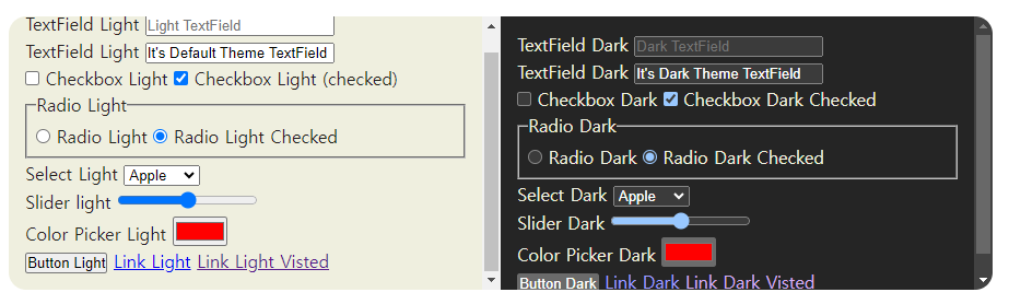
color-scheme 속성외에 색상은 div에만 적용했고, 나머지는 레이아웃을 짜는 프로퍼티로만 구성했습니다. 보시는 것과 같이 color-scheme을 dark로 적용한 컨테이너 안에 있는 모든 요소는 다크모드에 맞는 요소 색상으로 기본 스타일이 변경된 것을 볼 수 있습니다.
이것을 어떻게 활용할 수 있을까?
별도로 이쁘게 꾸밀 이유가 없고, 네이티브 컨트롤의 모양을 그대로 쓸 때 이 color-scheme 속성을 사용할 수 있는데, html 태그에 적용하여 하위에 있는 모든 요소에 속성값이 상속되도록 세팅하면 됩니다.
밝은 테마, 어두운 테마에 따라 전달되게 하려면 아래처럼 :root 선택자 규칙에 CSS-Variable을 활용하여 미디어쿼리로 추가해주면됩니다.
:root { /*...(생략)*/ --color-scheme: default; } @media (prefers-color-scheme:dark){ :root { /*...(생략)*/ --color-scheme: dark; } } html,body { /*...(생략)*/ color-scheme:var(--color-scheme); }댓글을 작성하려면 로그인 해주세요. -
tip[android view system] isTalkBackOn 유틸 클래스를 적용한 예제 코드 공유엔비전스 접근성 2023-08-20 21:25:45
바로 아래에서 공유한 코틀린에 적용된 isTalkBackOn 메서드를 적용한 간단한 앱 코드를 공유합니다.
새로운 프로젝트를 만들고 패키지만 변경한 후 코드를 그대로 복사하여 실행해볼 수 있습니다.
과일, 채소, 생선 3개의 페이지가 있으며 톡백이 켜졌을 때에는 3페이지로, 그렇지 않을 때는 무한 스크롤됩니다.
안드로이드 뷰 시스템이므로 레이아웃 파일과 액티비티 클래스 파일이 필요합니다.
따라서 아래에 각 파일별 코드를 붙여 놓겠습니다.
당연한 이야기이지만 AccessibilityKotlin 파일도 추가되어 있어야 합니다.
// activity_main.xml
<?xml version="1.0" encoding="utf-8"?>
<LinearLayout
    xmlns:android="http://schemas.android.com/apk/res/android"
    xmlns:app="http://schemas.android.com/apk/res-auto"
    xmlns:tools="http://schemas.android.com/tools"
    android:layout_width="match_parent"
    android:layout_height="match_parent"
    android:orientation="vertical"
    android:padding="16dp">

    <TextView
        android:id="@+id/screenTitle"
        android:layout_width="wrap_content"
        android:layout_height="wrap_content"
        android:text="ViewPager with TalkBack demo"
        android:textSize="20sp"
        android:textStyle="bold"
        android:layout_gravity="center_horizontal"
        android:layout_marginBottom="16dp"/>

    <TextView
        android:id="@+id/talkBackStatus"
        android:layout_width="wrap_content"
        android:layout_height="wrap_content"
        android:layout_gravity="center_horizontal"
        android:textSize="18sp"
        android:layout_marginBottom="16dp"/>

    <androidx.viewpager2.widget.ViewPager2
        android:id="@+id/viewPager"
        android:layout_width="match_parent"
        android:layout_height="0dp"
        android:layout_weight="1"/>

</LinearLayout>
// page_layout.xml
<?xml version="1.0" encoding="utf-8"?>
<LinearLayout xmlns:android="http://schemas.android.com/apk/res/android"
    android:layout_width="match_parent"
    android:layout_height="match_parent"
    android:gravity="center"
    android:orientation="vertical"
    android:padding="16dp">

    <TextView
        android:id="@+id/item1"
        android:layout_width="wrap_content"
        android:layout_height="wrap_content"
        android:layout_margin="8dp"
        android:textSize="16sp" />

    <TextView
        android:id="@+id/item2"
        android:layout_width="wrap_content"
        android:layout_height="wrap_content"
        android:layout_margin="8dp"
        android:textSize="16sp" />

    <TextView
        android:id="@+id/item3"
        android:layout_width="wrap_content"
        android:layout_height="wrap_content"
        android:layout_margin="8dp"
        android:textSize="16sp" />

    <TextView
        android:id="@+id/item4"
        android:layout_width="wrap_content"
        android:layout_height="wrap_content"
        android:layout_margin="8dp"
        android:textSize="16sp" />

    <TextView
        android:id="@+id/item5"
        android:layout_width="wrap_content"
        android:layout_height="wrap_content"
        android:layout_margin="8dp"
        android:textSize="16sp" />

</LinearLayout>
//MainActivity.kt
package com.example.myapplicationtalkbackdemo import android.os.Bundle import android.view.LayoutInflater import android.view.View import android.view.ViewGroup import android.widget.TextView import androidx.appcompat.app.AppCompatActivity import androidx.recyclerview.widget.RecyclerView import androidx.viewpager2.widget.ViewPager2 class MainActivity : AppCompatActivity() { private lateinit var viewPager: ViewPager2 override fun onCreate(savedInstanceState: Bundle?) { super.onCreate(savedInstanceState) setContentView(R.layout.activity_main) viewPager = findViewById(R.id.viewPager) AccessibilityKotlin.isTalkBackOn(this) { isTalkBackTurnOn -> val talkBackStatus = findViewById<TextView>(R.id.talkBackStatus) if (isTalkBackTurnOn) { talkBackStatus.text = "You are running TalkBack" viewPager.adapter = FinitePagerAdapter() } else { talkBackStatus.text = "You are not running TalkBack" viewPager.adapter = InfinitePagerAdapter() viewPager.setCurrentItem(Int.MAX_VALUE / 2, false) } } } override fun onDestroy() { super.onDestroy() AccessibilityKotlin.removeTalkBackStateListener(this) } private val pages = listOf( PageData("Fruits", listOf("Apple", "Banana", "Cherry", "Grape", "Mango")), PageData("Vegetables", listOf("Broccoli", "Cabbage", "Carrot", "Lettuce", "Spinach")), PageData("Fish", listOf("Salmon", "Trout", "Mackerel", "Tuna", "Sardine")) ) inner class FinitePagerAdapter : RecyclerView.Adapter<PageViewHolder>() { override fun onCreateViewHolder(parent: ViewGroup, viewType: Int): PageViewHolder { val view = LayoutInflater.from(parent.context).inflate(R.layout.page_layout, parent, false) return PageViewHolder(view) } override fun onBindViewHolder(holder: PageViewHolder, position: Int) { holder.bind(pages[position]) } override fun getItemCount(): Int = pages.size } inner class InfinitePagerAdapter : RecyclerView.Adapter<PageViewHolder>() { override fun onCreateViewHolder(parent: ViewGroup, viewType: Int): PageViewHolder { val view = LayoutInflater.from(parent.context).inflate(R.layout.page_layout, parent, false) return PageViewHolder(view) } override fun onBindViewHolder(holder: PageViewHolder, position: Int) { holder.bind(pages[position % pages.size]) } override fun getItemCount(): Int = Int.MAX_VALUE } inner class PageViewHolder(view: View) : RecyclerView.ViewHolder(view) { private val item1: TextView = view.findViewById(R.id.item1) private val item2: TextView = view.findViewById(R.id.item2) private val item3: TextView = view.findViewById(R.id.item3) private val item4: TextView = view.findViewById(R.id.item4) private val item5: TextView = view.findViewById(R.id.item5) fun bind(page: PageData) { item1.text = page.items[0] item2.text = page.items[1] item3.text = page.items[2] item4.text = page.items[3] item5.text = page.items[4] } } data class PageData(val title: String, val items: List<String>) }댓글을 작성하려면 로그인 해주세요. -
tip[android view system] isTalkBackOn 메서드 업데이트엔비전스 접근성 2023-08-20 21:04:18
오랜만에 안드로이드 유틸 클래스를 업데이트 합니다.
isTalkBackOn 메서드를 처음 공유할 당시에는 액티비티가 실행될 당시에만 톡백이 켜졌는지 꺼졌는지를 체크했었습니다.
그러나 이번에 업데이트 하는 isTalkBackOn은 중간에 톡백이 실행되거나 해제되더라도 이를 감지하여 원하는 UI를 변경하거나 기능을 변경할 수 있도록 기능을 추가했습니다.
파라미터 값으로는 context 즉 영향을 받는 액티비티(대부분 this가 될 것입니다), 조건문을 가진 콜백 함수입니다.
코틀린 예시:
AccessibilityKotlin.isTalkBackOn(this) { isTalkBackTurnOn ->여기서 콜백 함수는 isTalkBackTurnOn이므로 해당 함수가 true/false일 때 각각의 기능을 구현해 주기만 하면 됩니다.
자바 예시:
AccessibilityUtil.isTalkBackOn(this, new AccessibilityUtil.TalkBackCallback() {
    @Override
    public void onResult(boolean isTalkBackOn) {
        if (isTalkBackOn) {
            // 톡백이 켜지면 실행할 코드
        } else {
            // TalkBack이 꺼지면 실행할 코드
        }
    }
});
예를 들어보겠습니다.
좌우 스크롤되는 콘텐츠를 구현할 때 ViewPager 클래스를 많이 사용합니다.
광고 페이지가 총 10개인데 옆으로 무한 스크롤되게 구현하고 싶을 수 있습니다.
그런데 그렇게 구현하면 톡백에서는 페이지 개수를 모든 스크롤되는 페이지를 다 계산하므로 2천만 페이지가 넘는 페이지가 있다고 말할 것이고 페이지가 변경될 때마다 2300만 페이지 중 350페이지와 같이 읽어줄 것입니다.
이를 해결하려면 ViewPager 어댑터를 두 개 만들어 놓고 톡백이 켜지면 실제 10페이지가 있는 어댑터를 실행하고 꺼지면 무한 스크롤되는 어댑터를 실행하도록 콜백 조건문 안에서 실행하면 되는 것입니다.
다만 해당 액티비티가 destory될 때에는 유틸 클래스에 함께 추가되어 있는
removeTalkBackStateListener를 넣어서 불필요한 메모리 낭비를 줄여야 합니다.
해당 removeTalkBackStateListener의 파라미터는 context입니다.
댓글을 작성하려면 로그인 해주세요. -
tip[UIKit] 특정 요소로 포커스를 보내는 extension 공유엔비전스 접근성 2023-08-15 16:31:35
안드로이드 뷰 시스템에서 사용하는 sendAccessibilityEvent 메서드와 마찬가지로 UIKit에서는 layoutChanged 노티피케이션을 통해 접근성 초점을 다른 곳으로 보낼 수 있습니다.
이때도 항상 고생하는 것 중 하나가 딜레이를 적용하지 않아 초점이 가지 않는 경우가 많다는 것입니다.
레이아웃이 변경되고 내부적으로 요소들이 다시 그려지고 있는 상황에서 초점 보내기 액션이 실행되면 실패할 확률이 높기 때문에 항상 어느정도 딜레이를 주곤 합니다.
그래서 딜레이와 초점 보내는 것을 조금 더 간단한 코드로 구현할 수 있도록 sendFocusTo 라는 익스텐션을 만들어 공유하게 되었습니다.
인자 값으로는 초점을 보내고자 하는 요소만 넣어 주면 됩니다.
예시: self?.view.sendFocusTo(view: sender ?? UIView())
이렇게 하면 약 0.5초의 딜레이 후에 지정된 뷰로 초점을 보냅니다.
아래는 확장 익스텐션 코드입니다.
extension UIView {
func sendFocusTo(view: UIView) {
Task {
// Delay the task by 500 milliseconds
try await Task.sleep(nanoseconds: UInt64(0.5 * Double(NSEC_PER_SEC)))
// Send the VoiceOver focus to the specific view
UIAccessibility.post(notification: .layoutChanged, argument: view)
}
}
}해당 초점 보내기 예시는 바로 아래에 올려져 있는 팁의 예제 앱을 테스트해 보시면 됩니다.
5개의 과일 버튼이 있고 각 버튼을 누르면 얼럿 창이 표시됩니다.
그런데 확인을 누르면 초점이 항상 마지막 요소로 이동하는 이슈가 있습니다.
그래서 바로 위 익스텐션을 적용해서 기존 클릭한 뷰로 초점을 보내도록 한 예제입니다.
댓글을 작성하려면 로그인 해주세요. -
tip[UIKit] 보이스오버 실행 여부 감지하는 extension 추가엔비전스 접근성 2023-08-15 15:32:20
얼마 전 작성한 하나의 콜렉션뷰로 여러 페이지를 나누어 구현할 때 보이스오버 초점 해결방법 팁에서 언급한 것처럼 어쩔 수 없이 보이스오버가 실행되는지의 여부를 탐지하여 접근성을 구현해야 하는 경우가 있습니다.
이때 흔히 isVoiceOverRunning 조건문만 오버라이드 해서 구현하면 된다고 생각할 수 있습니다.
그러나 그렇게만 구현하면 해당 화면이 열린 상태에서 보이스오버를 끄거나 반대로 보이스오버가 꺼진 채로 해당 화면을 실행하고 중간에 보이스오버를 켜는 경우 접근성을 적용받을 수 없게 됩니다.
따라서 보이스오버를 켜고 끌 때마다 이를 캐치해서 조건문에 맞도록 구현을 해 주어야 합니다.
이때 사용할 수 있는 extension이 바로 아래에서 소개할 observeVoiceOverState입니다.
인자값으로는 보이스오버 실행 true false를 체크하는 변수와 핸들러 즉 변수가 트루, 폴스일 때 실행되는 메서드입니다.
다음과 같이 사용할 수 있습니다.
observeVoiceOverState { isRunning in
self.updateVoiceOverStatusLabel(isRunning)
}
extension을 적용하니 코드가 너무나도 간단해졌습니다.여기서는 isRunning이라는 변수가 보이스오버 캐치하는 트루, 폴스 변수로 사용되었고 트루, 폴스에 따라 self.updateVoiceOverStatusLabel 핸들러, 즉 메서드가 실행되게 한 것입니다.
아래는 extension 코드입니다.
extension UIViewController {
func observeVoiceOverState(using handler: @escaping (Bool) -> Void) {
NotificationCenter.default.addObserver(forName: UIAccessibility.voiceOverStatusDidChangeNotification, object: nil, queue: OperationQueue.main) { _ in
handler(UIAccessibility.isVoiceOverRunning)
}
}var isVoiceOverEnabled: Bool {
return UIAccessibility.isVoiceOverRunning
}
}
아래는 해당 익스텐션을 적용한 예제 앱입니다.
스토리보드가 없는 뷰 컨트롤러를 만들고 코드 전체를 복사하여 실행해볼 수 있습니다.
화면 하단에 보이스오버 실행중, 혹은 보이스오버 실행중 아님 메시지가 보이스오버 상태에 따라 출력되는 예제입니다.
import UIKit class ViewController: UIViewController { let fruits = ["Apple", "Banana", "Cherry", "Orange", "Kiwi"] var statusLabel: UILabel! override func viewDidLoad() { super.viewDidLoad() self.title = "Focus Test" setupUI() observeVoiceOverStates { isRunning in self.updateVoiceOverStatusLabel(isRunning) } } func setupUI() { let buttonHeight: CGFloat = 50 let spacing: CGFloat = 15 for (index, fruit) in fruits.enumerated() { let button = UIButton(frame: CGRect(x: 20, y: CGFloat(index) * (buttonHeight + spacing) + 100, width: view.bounds.width - 40, height: buttonHeight)) button.setTitle(fruit, for: .normal) button.backgroundColor = .blue button.addTarget(self, action: #selector(fruitButtonTapped(_:)), for: .touchUpInside) view.addSubview(button) } // VoiceOver status label let statusLabelY = CGFloat(fruits.count) * 65 + 150 statusLabel = UILabel(frame: CGRect(x: 20, y: statusLabelY, width: view.bounds.width - 40, height: 40)) statusLabel.textAlignment = .center statusLabel.font = UIFont.systemFont(ofSize: 24) statusLabel.textColor = .white statusLabel.backgroundColor = .darkGray statusLabel.layer.cornerRadius = 5 statusLabel.clipsToBounds = true view.addSubview(statusLabel) updateVoiceOverStatusLabel(isVoiceOver) } @objc func fruitButtonTapped(_ sender: UIButton) { var message = "You selected \(sender.titleLabel?.text ?? "")" if sender.Focused() { message += " with VoiceOver" } let alert = UIAlertController(title: "Selection", message: message, preferredStyle: .alert) alert.addAction(UIAlertAction(title: "OK", style: .default, handler: { [weak self, weak sender] _ in self?.view.sendFocusTo(view: sender ?? UIView()) })) self.present(alert, animated: true, completion: nil) } func updateVoiceOverStatusLabel(_ isRunning: Bool) { statusLabel.text = isRunning ? "You are running VoiceOver" : "You are not using VoiceOver" } } // Extensions extension UIViewController { func observeVoiceOverState(using handler: @escaping (Bool) -> Void) { NotificationCenter.default.addObserver(forName: UIAccessibility.voiceOverStatusDidChangeNotification, object: nil, queue: OperationQueue.main) { _ in handler(UIAccessibility.isVoiceOverRunning) } } var isVoiceOverEnabled: Bool { return UIAccessibility.isVoiceOverRunning } } extension UIView { var Focused: Bool { get { guard let focusedElement = UIAccessibility.focusedElement(using: .notificationVoiceOver) as? UIView else { return false } return focusedElement == self } }func sendFocusTo(view: UIView) { Task { // Delay the task by 500 milliseconds try await Task.sleep(nanoseconds: UInt64(0.5 * Double(NSEC_PER_SEC))) // Send the VoiceOver focus to the specific view UIAccessibility.post(notification: .layoutChanged, argument: view) } } }댓글을 작성하려면 로그인 해주세요. -
tip[UIKit] 특정 테이블 셀을 탭으로 구현할때엔비전스 접근성 2023-08-13 13:54:26
탭 콘텐츠를 구현할 때 특정 테이블 셀에 탭 개수만큼 UILabel을 만들고 각 탭을 눌러 아래 셀들의 콘텐츠가 변경되도록 구현하는 경우가 있습니다.
이런 경우 보이스오버 사용자에게 커스텀 탭을 탭으로 읽어주도록 하기 위한 구현 방법을 정리했습니다.
1. 우선 각 텍스트 레이블의 accessibilityTraits를 button으로 줍니다.
그렇지 않으면 각 탭으로 초점이 분리되지 않고 하나의 탭으로 인식하여 다른 탭으로 전환 자체가 불가능합니다.
2. 해당 텍스트들을 가진 셀에 accessibilityTraits .tabbar로 줍니다.
이렇게 하면 하위 텍스트는 버튼 트레이트를 가졌지만 상위가 탭바 트레이트 이므로 보이스오버에서 각 탭을 실제 탭처럼 요소 유형을 변경하여 읽어주게 됩니다.
3. 마지막으로 선택된 탭에 따라 selected 트레이트를 insert/remove 합니다.
아래는 관련 예제 코드를 만들어본 것입니다.
첫 번째 행의 셀에는 과일, 채소 탭이 있습니다.
그리고 선택된 탭에 따라 아래 셀의 콘텐츠가 표시됩니다.
스토리보드가 없는 뷰컨트롤러를 만들고 아래 코드를 넣어 테스트해볼 수 있습니다.
import UIKit class ViewController: UIViewController, UITableViewDataSource, UITableViewDelegate { let tableView = UITableView() var items = ["Apple", "Banana", "Orange", "Pineapple", "Strawberry"] let fruits = ["Apple", "Banana", "Orange", "Pineapple", "Strawberry"] let vegetables = ["Broccoli", "Carrot", "Spinach", "Tomato", "Pepper"] var isFruitSelected = true override func viewDidLoad() { super.viewDidLoad() title = "Tab Example" setupTableView() } func setupTableView() { tableView.frame = view.bounds tableView.delegate = self tableView.dataSource = self view.addSubview(tableView) tableView.register(UITableViewCell.self, forCellReuseIdentifier: "cell") } func numberOfSections(in tableView: UITableView) -> Int { return 2 } func tableView(_ tableView: UITableView, numberOfRowsInSection section: Int) -> Int { return section == 0 ? 1 : 5 } func tableView(_ tableView: UITableView, cellForRowAt indexPath: IndexPath) -> UITableViewCell { let cell = tableView.dequeueReusableCell(withIdentifier: "cell", for: indexPath) // Reset the default label of the cell cell.textLabel?.text = nil // Clean cell for reuse for view in cell.contentView.subviews { view.removeFromSuperview() } if indexPath.section == 0 { let fruitsLabel = UILabel(frame: CGRect(x: 20, y: 10, width: 100, height: 30)) fruitsLabel.text = "Fruits" fruitsLabel.textColor = isFruitSelected ? .blue : .black fruitsLabel.accessibilityTraits = .button if isFruitSelected { fruitsLabel.accessibilityTraits.insert(.selected) } cell.contentView.addSubview(fruitsLabel) let vegetablesLabel = UILabel(frame: CGRect(x: 140, y: 10, width: 100, height: 30)) vegetablesLabel.text = "Vegetables" vegetablesLabel.textColor = isFruitSelected ? .black : .blue vegetablesLabel.accessibilityTraits = .button if !isFruitSelected { vegetablesLabel.accessibilityTraits.insert(.selected) } cell.contentView.addSubview(vegetablesLabel) let tapGesture = UITapGestureRecognizer(target: self, action: #selector(self.toggleSelection)) cell.addGestureRecognizer(tapGesture) // Set the accessibility traits for this cell to indicate it's a tab bar cell.accessibilityTraits = .tabBar } else { cell.textLabel?.text = items[indexPath.row] } return cell } @objc func toggleSelection() { isFruitSelected.toggle() items = isFruitSelected ? fruits : vegetables tableView.reloadData() } }댓글을 작성하려면 로그인 해주세요. -
tip[UIKit] 하나의 콜렉션뷰로 여러 페이지를 나누어 구현할 때 보이스오버 초점 해결방법엔비전스 접근성 2023-08-12 17:22:09
각각의 페이지마다 별도의 뷰가 표시되는 형태이면 이슈가 없으나 하나의 콜렉션뷰 내에 콘텐츠 전체를 넣어 놓고 스크롤되는 페이지에 따라 일정 양만큼만 페이지가 표시되게끔 구현하는 경우가 있습니다.
이런 경우 보이스오버 사용자가 겪게 되는 크리티컬한 이슈가 있는데 첫 번째 페이지 콘텐츠 끝에 있는 페이지 컨트롤, 즉 보이스오버에서 조절 가능이라고 읽어주는 컨트롤에서 거꾸로 돌아오면 사용자의 의도와 상관 없이 무조건 마지막 페이지로 화면이 스크롤된다는 것입니다.
마찬가지로 2페이지 이상으로 페이지가 스크롤된 상태에서 페이지 콜렉션뷰 이전 콘텐츠를 탐색하다가 페이지 콜렉션뷰셀 쪽으로 초점을 이동하는 순간 역시나 사용자의 의도와 상관 없이 무조건 1페이지로 스크롤됩니다.
이것은 위에서 설명한대로 페이지마다 보여지는 콘텐츠는 다르지만 결국에는 하나의 콜렉션뷰이기 때문입니다.
따라서 이를 해결하기 위해서는 콜렉션뷰가 스크롤되었을 때 보이스오버가 실행중이면 스크롤되는 바운더리를 현재 선택된 페이지 내부에서만 스크롤되게 하라 라는 구현을 해 주어야 합니다.
대신 이렇게 하였을 때의 단점은 세 손가락으로 좌 우 스와이프 하여 페이지를 넘길 수 없습니다.
그러나 페이지를 구현하면 페이지 컨트롤을 함께 구현하므로 페이지 컨트롤을 통해 페이지를 넘기면 그만입니다.
아래의 코드와 같이 구현합니다.
func scrollViewDidScroll(_ scrollView: UIScrollView) {
if UIAccessibility.isVoiceOverRunning {
scrollView.contentOffset = CGPoint(x: CGFloat(pageControl.currentPage) * scrollView.bounds.width, y: -100)
}
}
여기서 y를 -100으로 준 이유는 0으로 설정할 경우 상단의 첫 번째 셀 아이템이 화면에 나타나지 않을 수 있기 때문입니다. 이 부분은 위치에 따라 조정해야 할 수 있습니다.
위와 같이 적용하면 세 손가락 스크롤은 할 수 없지만 페이지 컨트롤을 통해 페이지를 조정하면서 콘텐츠를 평소와 같이 탐색할 수 있게 됩니다.
아래는 위 코드가 적용된 샘플 앱으로 과일, 채소, 생선 3페이지로 구선된 하나의 콜렉션뷰가 있습니다.
스토리보드가 없는 뷰 컨트롤러를 만들고 아래 코드를 붙여 넣어 테스트해볼 수 있습니다.
import UIKit class ViewController: UIViewController, UICollectionViewDataSource, UICollectionViewDelegate, UICollectionViewDelegateFlowLayout { let pages = [ ["Apple", "Mango", "Banana", "Orange", "Grape"], ["Carrot", "Broccoli", "Lettuce", "Spinach", "Tomato"], ["Salmon", "Tuna", "Mackerel", "Trout", "Catfish"] ] var pageControl: UIPageControl! var collectionView: UICollectionView! let cellSpacing: CGFloat = 10.0 override func viewDidLoad() { super.viewDidLoad() self.navigationItem.title = "Page Control Example" let layout = UICollectionViewFlowLayout() layout.scrollDirection = .horizontal layout.minimumInteritemSpacing = cellSpacing collectionView = UICollectionView(frame: view.bounds, collectionViewLayout: layout) collectionView.register(ItemListCell.self, forCellWithReuseIdentifier: "cell") collectionView.isPagingEnabled = true collectionView.backgroundColor = .white collectionView.delegate = self collectionView.dataSource = self view.addSubview(collectionView) setupPageControl() } private func setupPageControl() { pageControl = UIPageControl(frame: CGRect(x: 0, y: view.frame.height - 50, width: view.frame.width, height: 50)) pageControl.numberOfPages = pages.count pageControl.currentPage = 0 pageControl.addTarget(self, action: #selector(pageControlChanged(_:)), for: .valueChanged) view.addSubview(pageControl) } @objc func pageControlChanged(_ sender: UIPageControl) { let offset = CGPoint(x: collectionView.bounds.width * CGFloat(sender.currentPage), y: 0) collectionView.setContentOffset(offset, animated: true) } func numberOfSections(in collectionView: UICollectionView) -> Int { return 1 } func collectionView(_ collectionView: UICollectionView, numberOfItemsInSection section: Int) -> Int { return pages.count } func collectionView(_ collectionView: UICollectionView, cellForItemAt indexPath: IndexPath) -> UICollectionViewCell { let cell = collectionView.dequeueReusableCell(withReuseIdentifier: "cell", for: indexPath) as! ItemListCell cell.items = pages[indexPath.item] cell.innerCollectionView.reloadData() return cell } func collectionView(_ collectionView: UICollectionView, layout collectionViewLayout: UICollectionViewLayout, sizeForItemAt indexPath: IndexPath) -> CGSize { return CGSize(width: view.frame.width - cellSpacing, height: view.frame.height - 50) } func scrollViewDidEndDecelerating(_ scrollView: UIScrollView) { let page = Int(round(scrollView.contentOffset.x / (scrollView.bounds.width + cellSpacing))) pageControl.currentPage = page } func scrollViewDidScroll(_ scrollView: UIScrollView) { if UIAccessibility.isVoiceOverRunning { scrollView.contentOffset = CGPoint(x: CGFloat(pageControl.currentPage) * scrollView.bounds.width, y: -100) } } } class ItemListCell: UICollectionViewCell, UICollectionViewDataSource, UICollectionViewDelegateFlowLayout { var items: [String] = [] fileprivate let innerCollectionView: UICollectionView = { let layout = UICollectionViewFlowLayout() let collectionView = UICollectionView(frame: .zero, collectionViewLayout: layout) collectionView.translatesAutoresizingMaskIntoConstraints = false collectionView.register(UICollectionViewCell.self, forCellWithReuseIdentifier: "innerCell") return collectionView }() override init(frame: CGRect) { super.init(frame: frame) contentView.addSubview(innerCollectionView) NSLayoutConstraint.activate([ innerCollectionView.topAnchor.constraint(equalTo: contentView.topAnchor), innerCollectionView.bottomAnchor.constraint(equalTo: contentView.bottomAnchor), innerCollectionView.leadingAnchor.constraint(equalTo: contentView.leadingAnchor), innerCollectionView.trailingAnchor.constraint(equalTo: contentView.trailingAnchor) ]) innerCollectionView.dataSource = self innerCollectionView.delegate = self innerCollectionView.backgroundColor = .white } required init?(coder: NSCoder) { fatalError("init(coder:) has not been implemented") } func collectionView(_ collectionView: UICollectionView, numberOfItemsInSection section: Int) -> Int { return items.count } func collectionView(_ collectionView: UICollectionView, cellForItemAt indexPath: IndexPath) -> UICollectionViewCell { let cell = collectionView.dequeueReusableCell(withReuseIdentifier: "innerCell", for: indexPath) cell.contentView.subviews.forEach { $0.removeFromSuperview() } let label = UILabel() label.text = items[indexPath.item] label.textAlignment = .center cell.contentView.addSubview(label) label.frame = cell.bounds return cell } func collectionView(_ collectionView: UICollectionView, layout collectionViewLayout: UICollectionViewLayout, sizeForItemAt indexPath: IndexPath) -> CGSize { return CGSize(width: collectionView.bounds.width, height: 50) } }댓글을 작성하려면 로그인 해주세요. -
tip[UIKit] VoiceOver 커서 초점이 View에 있는지 확인하는 속성 공유엔비전스 접근성 2023-08-08 18:35:38
보이스오버가 실행되고 있을 때 롤링되고 있는 배너를 정지시키거나 UISlider 내의 드래그 동작 없이도 값을 조절하도록 해야 할 때 isVoiceOverRunning 메서드를 오버라이드 해서 보이스오버가 실행되고 있는 동안에만 이를 적용할 수도 있지만 보이스오버가 해당 뷰에 포커스 했을 때를 캐치하여 접근성을 적용하는 것이 더욱 안정적입니다.
그래서 UIView를 포함한 UISlider와 같은 뷰에 보이스오버가 현재 포커스를 하고 있는지 그렇지 않은지를 간단하게 체크할 수 있는 extension을 만들어 공유하게 되었습니다.
메서드 이름은 Focused이며 사용 방법은 너무나 간단합니다.
아래 extension을 추가한 다음 다음 예시와 같이 사용할 수 있습니다.
if !self.accessibleView.Focused() {
self.nextSlide()}
아래는 extension 코드입니다.
extension UIView {
    var Focused: Bool {
        get {
            guard let focusedElement = UIAccessibility.focusedElement(using: .notificationVoiceOver) as? UIView else {
                return false
            }
            return focusedElement == self
        }
    }
}
아래는 해당 메서드를 적용한 배너 정지 재생하기 예시입니다.
보이스오버가 배너 캐러셀에 포커스 되면 배너가 정지되는 예시이며 스토리보드가 없는 뷰 컨트롤러를 만들고 해당 코드를 붙여 넣으면 그대로 빌드하여 테스트해 보실 수 있습니다.
import UIKit extension UIView { var Focused: Bool { get { guard let focusedElement = UIAccessibility.focusedElement(using: .notificationVoiceOver) as? UIView else { return false } return focusedElement == self } } }class ViewController: UIViewController { let fruits = ["Apple", "Banana", "Cherry", "Grape", "Orange"] var index = 0 let label = UILabel() let accessibleView = AccessibleView() let titleLabel = UILabel() var timer: Timer? override func viewDidLoad() { super.viewDidLoad() titleLabel.text = "Carousel Test" titleLabel.textAlignment = .center titleLabel.translatesAutoresizingMaskIntoConstraints = false view.addSubview(titleLabel) NSLayoutConstraint.activate([ titleLabel.topAnchor.constraint(equalTo: view.safeAreaLayoutGuide.topAnchor), titleLabel.centerXAnchor.constraint(equalTo: view.centerXAnchor) ]) label.text = fruits[index] label.textAlignment = .center label.translatesAutoresizingMaskIntoConstraints = false accessibleView.addSubview(label) NSLayoutConstraint.activate([ label.centerXAnchor.constraint(equalTo: accessibleView.centerXAnchor), label.centerYAnchor.constraint(equalTo: accessibleView.centerYAnchor) ]) accessibleView.isAccessibilityElement = true accessibleView.accessibilityLabel = "Carousel" accessibleView.accessibilityValue = label.text accessibleView.accessibilityTraits = .adjustable accessibleView.viewController = self accessibleView.translatesAutoresizingMaskIntoConstraints = false view.addSubview(accessibleView) NSLayoutConstraint.activate([ accessibleView.centerXAnchor.constraint(equalTo: view.centerXAnchor), accessibleView.centerYAnchor.constraint(equalTo: view.centerYAnchor), accessibleView.widthAnchor.constraint(equalToConstant: 100), accessibleView.heightAnchor.constraint(equalToConstant: 100) ]) timer = Timer.scheduledTimer(withTimeInterval: 2, repeats: true) { _ in if !self.accessibleView.isFocused() { self.nextSlide() } } } func nextSlide() { index = (index + 1) % fruits.count label.text = fruits[index] accessibleView.accessibilityValue = label.text } func previousSlide() { index = (index - 1 + fruits.count) % fruits.count label.text = fruits[index] accessibleView.accessibilityValue = label.text } } class AccessibleView: UIView { weak var viewController: ViewController? override func accessibilityIncrement() { super.accessibilityIncrement() viewController?.nextSlide() } override func accessibilityDecrement() { super.accessibilityDecrement() viewController?.previousSlide() } }댓글을 작성하려면 로그인 해주세요. -
tip[jetpack compose] 커스텀 모달 대화상자 구현 시 clearAndSetSemantics 사용하기 및 초점엔비전스 접근성 2023-08-07 06:45:08
대화상자 모달을 표시할 때 기존 콘텐츠가 백그라운드로 화면 상에서만 숨겨지는 경우 당연하게도 접근성 서비스에서 기존 콘텐츠가 접근되지 못하게 구현을 해 주어야 합니다.
이때 사용할 수 있는 메서드가 semantics 모디파이어 내의 clearAndSetSemantics 입니다.
예시:
Column(
    modifier = Modifier.fillMaxSize()
        .then(if (showModal) Modifier.clearAndSetSemantics {} else Modifier),
즉 백그라운드 콘텐츠를 담고 있는 컨테이너가 숨겨질 때를 조건문으로 설정하여 해당 메서드를 사용하는 것입니다.
안드로이드 뷰 시스템에서 android:importantForAccessibility="no-hide-descendants" 속성과 같다고 보시면 되니다.
또한 레이어를 닫으면 초점을 기존 레이어를 여는 버튼으로 되돌려 주어야 하는데 이때는 지난 번 소개한 아티클의 sendFocus 모디파이어를 사용할 수 있습니다.
아래는 이 두 가지 접근성을 적용한 샘플 앱입니다.
필요시 젯팩 컴포즈 프로젝트에 복사하여 테스트해볼 수 있습니다.
화면에는 5개의 과일이 있습니다.
각 과일을 누르면 간단한 과일에 대한 설명이 모달 형태로 표시되고 닫기를 누르면 기존 화면으로 돌아오는 구조입니다.
import android.os.Bundle import androidx.activity.ComponentActivity import androidx.activity.compose.setContent import androidx.compose.foundation.background import androidx.compose.foundation.focusable import androidx.compose.foundation.layout.* import androidx.compose.material3.* import androidx.compose.runtime.* import androidx.compose.ui.Alignment import androidx.compose.ui.Modifier import androidx.compose.ui.focus.FocusRequester import androidx.compose.ui.focus.focusRequester import androidx.compose.ui.graphics.Color import androidx.compose.ui.semantics.clearAndSetSemantics import androidx.compose.ui.unit.dp import kotlinx.coroutines.delay import kotlinx.coroutines.launch class MainActivity : ComponentActivity() { override fun onCreate(savedInstanceState: Bundle?) { super.onCreate(savedInstanceState) setContent { var showModal by remember { mutableStateOf(false) } var selectedFruit by remember { mutableStateOf("") } var focusState by remember { mutableStateOf(false) } Column( modifier = Modifier.fillMaxSize() .then(if (showModal) Modifier.clearAndSetSemantics {} else Modifier), verticalArrangement = Arrangement.Center, horizontalAlignment = Alignment.CenterHorizontally ) { Text("Select a fruit to learn more") Spacer(modifier = Modifier.height(16.dp)) FruitButton("Apple", selectedFruit == "Apple" && focusState) { selectedFruit = "Apple" showModal = true } FruitButton("Banana", selectedFruit == "Banana" && focusState) { selectedFruit = "Banana" showModal = true } FruitButton("Orange", selectedFruit == "Orange" && focusState) { selectedFruit = "Orange" showModal = true } FruitButton("Mango", selectedFruit == "Mango" && focusState) { selectedFruit = "Mango" showModal = true } FruitButton("Pineapple", selectedFruit == "Pineapple" && focusState) { selectedFruit = "Pineapple" showModal = true } } if (showModal) { MyCustomModal( fruit = selectedFruit, onClose = { showModal = false focusState = true } ) } val scope = rememberCoroutineScope() SideEffect { if (!showModal && focusState) { scope.launch { delay(500) focusState = false } } } } } } @Composable fun FruitButton(fruit: String, focusState: Boolean, onClick: () -> Unit) { Button( onClick = onClick, modifier = sendFocus(focusState) ) { Text(fruit) } } @Composable fun MyCustomModalSurface(fruit: String, onClose: () -> Unit) { Surface( shape = MaterialTheme.shapes.medium, modifier = Modifier.padding(16.dp) ) { Column( modifier = Modifier.padding(16.dp), horizontalAlignment = Alignment.CenterHorizontally ) { Text(fruit) Text(getFruitDescription(fruit)) Spacer(modifier = Modifier.height(16.dp)) Button(onClick = onClose) { Text("Close") } } } } @Composable fun MyCustomModal(fruit: String, onClose: () -> Unit) { Box( modifier = Modifier.fillMaxSize() .background(Color.Black.copy(alpha = 0.5f)), contentAlignment = Alignment.Center, ) { MyCustomModalSurface(fruit, onClose) } } fun getFruitDescription(fruit: String): String { return when (fruit) { "Apple" -> "An apple is a sweet, edible fruit produced by an apple tree." "Banana" -> "A banana is an elongated, edible fruit produced by several kinds of large herbaceous flowering plants." "Orange" -> "The orange is the fruit of various citrus species. It is a hybrid between pomelo and mandarin." "Mango" -> "A mango is a juicy stone fruit produced from numerous species of tropical trees." "Pineapple" -> "The pineapple is a tropical plant with an edible fruit and the most economically significant plant in the family Bromeliaceae." else -> "" } } @Composable fun sendFocus(focusState: Boolean): Modifier { val focusRequester = remember { FocusRequester() } LaunchedEffect(focusState) { if (focusState) { focusRequester.requestFocus() } } return Modifier .focusRequester(focusRequester) .focusable(focusState) }댓글을 작성하려면 로그인 해주세요. -
tip[HTML-CSS-Javascript] 모바일에서 IR로 숨겨진 체크박스의 문제점과 해결방안엔비전스 접근성 2023-07-25 12:22:20
HTML 표준 태그만으로 요소를 만들다보면 기업에서 원하는 디자인과는 거리가 먼 경우가 대부분입니다.
요소 모양을 수정할 수 있으면 가장좋겠지만 디자인을 고칠 수 있는 방법을 제공하지 않거나 크로스 브라우징 문제 등, 발목을 잡는 요소가 많습니다. 그래서, 직접 요소를 수정하는 방법보다는 커스텀 요소를 만들거나 원레 요소를 쓰되 IR기법으로 숨기는 방법이 주로 사용되고 있습니다.
그 중, 가장 간단한 방법으로 사용되는 것이 위에서 얘기한 IR기법으로 input 요소를 숨기고 label 태그에 요소 유형을 제공하는 것입니다. 레이블에 for만 잘 연결해 준다면, 마우스 사용 시 input의 상태는 잘 반영되기 때문에 스타일을 변경해야 할 때 오래전부터 쓰이던 방식입니다.
오래전부터 써오던 방식인 만큼, PC 환경만 고려했기 때문에 모바일 환경에서의 UI 사용자 경험이 떨어진다는 단점이 있습니다. IR기법 특성상 초점이 매우 작고 엉뚱한 곳에 표시되거나 아예 보이지 않는 이슈가 대표적입니다. 이는 PC 브라우저에서도 비슷한 양상을 보입니다.
또 한가지는 터치 크기와 요소 유형 이슈가 있습니다. label 태그이 for 속성으로 레이블과 체크박스를 올바르게 짝지어놓더라도 별도의 객체이기 때문에 초점이 분리되며, 겉으로 보이는 요소는 label 요소이므로, 임의로 탐색 시 상태정보와 유형정보를 못 들을 가능성이 생깁니다.
이 팁에서는 label 안에 checkbox를 숨겼을 때 생기는 이런 문제를 가장 쉽게 해결하는 CSS, 자바스크립트 기법을 설명하고자 합니다.
가급적 IR기법을 누를 수 있는 컨트롤 요소 자신에게 사용하지 말 것
IR 기법의 IR은 Image Replacement의 약자로, 눈에는 보이지만 스크린리더로 볼 수 없는 방법으로 표시된 이미지에 대체텍스트를 숨겨서 다는 기법입니다. 링크나, 버튼 내부에 IR기법을 사용하는 요소를 쓸 수는 있지만, input 태그나 button, a태그 자체를 IR로 숨기는 것은 바람직하지 않습니다. 그러면 가장 좋은 방법은 무엇일까요?
WAI-ARIA를 남용하는 것은 바람직하지 않지만, 올바르게만 사용한다면 웹접근성에 있어서 그 어떤 방법보다 강력합니다. 스마트폰 환경이 대세가 된 후, button 태그나, a태그에 텍스트 없이 아이콘만 넣는 사례가 늘었습니다. 화면 가로 폭이 좁으니, 가로로 긴 버튼보단, 가로 폭이 좁은 정사각형이나, 세로로 긴 직사각형 버튼을 선호하게 된 것이 그 이유라고 봅니다. 이럴 때 aria-label은 IR기법의 좋은 대안이 될 수 있습니다.
aria-label을 잘못썼을 때 무서운 점은 적용된 요소의 하위 요소에 어떤 텍스트가 있든, 덮어씌워버린다는 점입니다. 때문에 레이블을 제공할 때, 꼼꼼히 눈에 보이는 텍스트 중 빠진 내용이 없는지 확인할 필요가 있습니다.
또 한가지 주의할 점은, WAI-ARIA 명세에 따라 aria-label이 사용 가능한 태그나 role이 정해져 있다는 겁니다. IR기법은 설명이 복잡한 이미지(예:조직도)나, background-image에 대체텍스트를 제공할 목적으로 사용되는데, 컨트롤 요소 대부분은 aria-label을 지원하므로 링크나, 버튼, 체크박스 등은 aria-label을 활용하는 것이 아주 깔끔하고 좋은 대안이 될 수 있습니다.
2: 불가피하게 사용해야 한다면 초점 시각화를 고려할 것
1번과 겹치는 내용이나, IR기법을 컨트롤 요소에 쓰고, 디자인을 별도로 하게 되면 브라우저나 스크린리더 기본 초점이 제 역할을 할 수 없게 됩니다. 기본 요소를 숨기는 경우, 반드시 초점을 받았을 때 outline을 재정의해줘야만 합니다. 방법은 아래와 같습니다.
label:has(input[type=checkbox].blind):focus-within {
  outline:auto;
}
초점이 overflow에 의해 잘리는 경우는 요소가 크다면, outline-offset을 음수값으로 지정해서 해결할 수 있습니다.
3: 모바일 페이지라면 label에 role 사용과 스크립트 적용을 고려해볼 것
모바일, 특히 iOS에서는 초점 분리 이슈가 매우 많이 발생합니다. 또한, 초점 시각화 문제와 터치 크기 이슈도 같이 발생하게 되는데, 그럴 때, 간단하게 체크박스의 터치 크기를 키우고, 초점을 하나로 합치는 기법이 있습니다. IR로 숨긴 체크박스를 display:none으로 숨기고, label에 상태정보, 유형, 초점을 제공하는 것입니다.
체크박스를 display:none으로 숨기는 것은 기본적으로 안 되지만, label을 WAI-ARIA 체크박스로 만든다면 그 문제가 말끔히 해결됩니다. 물론 label과 input이 for 속성으로 잘 연결되어 있다는 것을 조건으로 합니다. 또한, 레이블에 도움말 같은 컨트롤이 포함되어있지 않아야 합니다.
<label for="chk-1">
    <input type="checkbox" id="chk-1">
    <div class="checkmark material-icons" aria-hidden="true">check</div>
    Give me disposable forks, spoons, and chopsticks
  </label>
  <label>
    <input type="checkbox">
    <div class="checkmark material-icons" aria-hidden="true">check</div>
    Give me disposable forks, spoons, and chopsticks
  </label>
  <script>

    function generateUUID() {
      let d = new Date().getTime();

      if (window.performance && typeof window.performance.now === "function") {
        d += performance.now(); // 추가적인 고유성을 위해 performance.now() 사용
      }

      const uuid = "xxxxxxxx-xxxx-4xxx-yxxx-xxxxxxxxxxxx".replace(/[xy]/g, function (c) {
        const r = (d + Math.random() * 16) % 16 | 0;
        d = Math.floor(d / 16);
        return (c === "x" ? r : (r & 0x3 | 0x8)).toString(16);
      });

      return uuid;
    }

    const checkboxes = document.querySelectorAll('label:has(input[type="checkbox"])');
    for(const checkbox of checkboxes){
      const nativeCheckbox = checkbox.querySelector('input[type="checkbox"]');
      const generatedID = generateUUID();
      if(!checkbox.id) {
        checkbox.id = `customCheckbox-${generatedID}`;
      }
      if(!nativeCheckbox.id) {
        nativeCheckbox.id = `nativeCheckbox-${generatedID}`;
      }
      if(nativeCheckbox.id && !checkbox.htmlFor) {
        checkbox.htmlFor = nativeCheckbox.id;
      }

      checkbox.setAttribute('role','checkbox');
      checkbox.setAttribute('aria-labelledby',checkbox.id);

      const updateAriaChecked=()=>{
        checkbox.setAttribute('aria-checked',nativeCheckbox.checked);
      }
      const updateAriaDisabled=()=>{
        checkbox.setAttribute('aria-disabled',nativeCheckbox.disabled);
        checkbox.tabIndex = nativeCheckbox.disabled === "true" ? -1 : 0;
      }
      updateAriaDisabled();
      updateAriaChecked();
      new MutationObserver((records)=>records.forEach(record=>{
        updateAriaDisabled();
      })).observe(nativeCheckbox,{attributes:true,attributeFilter:["disabled"]})

      // events
      checkbox.addEventListener('keydown',(evt)=>{if ( evt.key == " " ) {evt.preventDefault();nativeCheckbox.click();}})
      nativeCheckbox.addEventListener("change",(evt)=>{checkbox.setAttribute('aria-checked',nativeCheckbox.checked);});
    }
  </script>
display가 none이여도 label-for로 잘 연결만 되어있다면 레이블을 눌렀을 때, 눈에는 보이지 않고 스크린리더로 들을 수는 없지만, 실제로는 체크박스가 눌리게 됩니다. 레이블 안에 체크박스만 있는 경우, 이렇게 change 이벤트와 keydown 이벤트만으로 label와 input[type=checkbox] 태그를 하나의 checkbox로 만들 수 있습니다.
이 스크립트는 레이블과 체크박스 사이에 도움말 버튼 등이 있는 사례에는 적합하지 않으나, 충분히 이런 방식으로 응용하여 기존에 IR기법으로 숨겨놓은 체크박스의 모바일 UX를 향상시킬 수 있습니다.
댓글을 작성하려면 로그인 해주세요. -
tip[jetpack compose] stateDescription 사용하여 직관적인 상태정보 제공해주기엔비전스 접근성 2023-07-23 10:40:48
안드로이드 뷰 시스템을 다룰 때 언급한 적이 있지만 읽지 않음, 읽음과 같은 조금 더 직관적인 상태정보를 제공해 주기 위해서는 stateDescription을 사용할 수 있습니다.
젯팩 컴포즈에서는 roleDescription은 지원하지 않지만 stateDescription은 지원하기에 아래에 해당 예제를 만들어 보았습니다.
구현 방법은 간단합니다.
해당 상태정보가 필요한 요소에 semantics 모디파이어를 주고 그 안에서 읽음, 읽지 않음과 같은 상태정보를 제공해 주기만 하면 됩니다.
.semantics { stateDescription = if (unread) "Unread" else "Read" },아래는 이와 관련된 샘플 앱입니다.
1번부터 5번까지의 알림이 있으며 기본은 읽지 않음 상태이고 한번 누르면 읽음 상태로 변경됩니다.
그리고 초기화 버튼을 누르면 다시 읽지 않음 상태로 변경됩니다.
import android.os.Bundle import androidx.activity.ComponentActivity import androidx.activity.compose.setContent import androidx.compose.foundation.layout.* import androidx.compose.material3.* import androidx.compose.runtime.* import androidx.compose.ui.Alignment import androidx.compose.ui.Modifier import androidx.compose.ui.graphics.Color import androidx.compose.ui.platform.LocalContext import androidx.compose.ui.semantics.semantics import androidx.compose.ui.semantics.stateDescription import androidx.compose.ui.unit.dp import android.widget.Toast import androidx.compose.foundation.background import androidx.compose.foundation.clickable class MainActivity : ComponentActivity() { override fun onCreate(savedInstanceState: Bundle?) { super.onCreate(savedInstanceState) setContent { val context = LocalContext.current var notifications = remember { mutableStateListOf(true, true, true, true, true) } Column( modifier = Modifier.fillMaxSize(), verticalArrangement = Arrangement.SpaceBetween, horizontalAlignment = Alignment.CenterHorizontally ) { notifications.forEachIndexed { index, unread -> Notification( text = "Notification ${index + 1}", unread = unread, onClick = { notifications[index] = false Toast.makeText(context, "You read notification ${index + 1}", Toast.LENGTH_SHORT).show() } ) } Button(onClick = { notifications.fill(true) }) { Text("Reset") } } } } @Composable fun Notification(text: String, unread: Boolean, onClick: () -> Unit) { Row( modifier = Modifier .fillMaxWidth() .padding(16.dp) .clickable(onClick = onClick) .semantics { stateDescription = if (unread) "Unread" else "Read" }, verticalAlignment = Alignment.CenterVertically, horizontalArrangement = Arrangement.SpaceBetween ) { Text(text) if (unread) { Box( modifier = Modifier .size(10.dp) .background(MaterialTheme.colorScheme.secondary) ) } else { Box( modifier = Modifier .size(10.dp) .background(Color.Gray) ) } } } }댓글을 작성하려면 로그인 해주세요. -
tip[jetpack compose] 커스텀 라디오버튼, 탭 등 구현 시 몇 개 중 몇 개 읽어주게 하기엔비전스 접근성 2023-07-22 18:43:24
네이티브 라디오버튼이나 탭의 경우 현재 포커스 하고 있는 요소가 총 개수 중 몇 번째인지를 톡백에서 자동으로 읽어줍니다.
그런데 semantics 모디파이어를 통해서 라디오버튼, 탭 구현 시에도 톡백에서 이를 읽어줄 수 있도록 할 수 있습니다.
방법은 너무나도 간단합니다.
커스텀 라디오버튼이나 탭을 감싸고 있는 Row와 같은 컨테이너에 selectableGroup semantics 모디파이어를 추가해 주기만 하면 됩니다.
예시:
Row(
    modifier = Modifier.semantics { selectableGroup()
    contentDescription = "tab control"}아래에 이와 관련된 샘플 앱을 공유합니다.
패키지를 추가한 다음 빌드하여 톡백에서 바로 테스트해 보실 수 있습니다.
화면은 간단합니다.
커스텀 과일, 채소 탭이 있고 선택된 탭에 따라 콘텐츠가 변경됩니다.
import android.os.Bundle import androidx.activity.ComponentActivity import androidx.activity.compose.setContent import androidx.compose.foundation.layout.* import androidx.compose.material3.* import androidx.compose.runtime.* import androidx.compose.ui.Alignment import androidx.compose.ui.Modifier import androidx.compose.ui.semantics.Role import androidx.compose.ui.semantics.contentDescription import androidx.compose.ui.semantics.role import androidx.compose.ui.semantics.selected import androidx.compose.ui.semantics.selectableGroup import androidx.compose.ui.semantics.semantics import androidx.compose.ui.unit.dp class MainActivity : ComponentActivity() { override fun onCreate(savedInstanceState: Bundle?) { super.onCreate(savedInstanceState) setContent { var selectedTab by remember { mutableStateOf("Fruit") } val fruits = listOf("Apple", "Banana", "Orange", "Strawberry", "Grapes") val vegetables = listOf("Carrot", "Broccoli", "Cauliflower", "Spinach", "Peas") MaterialTheme { Column( modifier = Modifier.fillMaxSize(), horizontalAlignment = Alignment.CenterHorizontally, verticalArrangement = Arrangement.Center ) { Row( modifier = Modifier.semantics { selectableGroup() contentDescription = "tab control"} ) { Button( onClick = { selectedTab = "Fruit" }, colors = if (selectedTab == "Fruit") ButtonDefaults.buttonColors() else ButtonDefaults.outlinedButtonColors(), modifier = Modifier.semantics { role = Role.Tab this.selected = (selectedTab == "Fruit") } ) { Text("Fruit") } Spacer(modifier = Modifier.width(8.dp)) Button( onClick = { selectedTab = "Vegetable" }, colors = if (selectedTab == "Vegetable") ButtonDefaults.buttonColors() else ButtonDefaults.outlinedButtonColors(), modifier = Modifier.semantics { role = Role.Tab this.selected = (selectedTab == "Vegetable") } ) { Text("Vegetable") } } Spacer(modifier = Modifier.height(16.dp)) when (selectedTab) { "Fruit" -> fruits.forEach { Text(it) } "Vegetable" -> vegetables.forEach { Text(it) } } } } } } }댓글을 작성하려면 로그인 해주세요. -
tip[jetpack compose] 커스텀 체크박스 또는 스위치 구현엔비전스 접근성 2023-07-22 17:46:54
네이티브가 아닌 커스텀 체크박스나 스위치를 구현할 때에는 semantics 모디파이어 안에서 role = Role.Checkbox 또는 role = Role.Switch를 사용하여 요소 유형을 줄 수 있습니다.
그리고 상태정보는 선택과 해제를 할 수 있는 토글 속성을 가지므로 semantics가 아닌 .toggleable 모디파이어를 사용하면 됩니다.
해당 toggleable 모디파이어 안에서 체크 해제 혹은 체크됨 조건 변수를 다음 예시와 같이 대입해줍니다.
.toggleable(
    value = vegetableChecked,
    onValueChange = { vegetableChecked = it }
)
이렇게 하면 지정된 밸류 값의 true, false 상태정보에 따라서 체크됨, 체크 안 됨 또는 켜짐, 꺼짐 상태정보를 출력하게 됩니다.
아래는 커스텀 체크박스와 스위치 적용 예제입니다.
화면에는 Box 위젯을 사용하여 구현된 과일 체크박스와 채소 스위치가 있습니다.
톡백으로 해당 요소들을 빌드하여 테스트 해 보실 수 있습니다.
import android.os.Bundle import androidx.activity.ComponentActivity import androidx.activity.compose.setContent import androidx.compose.foundation.layout.Box import androidx.compose.foundation.layout.Column import androidx.compose.foundation.layout.fillMaxSize import androidx.compose.material3.* import androidx.compose.runtime.* import androidx.compose.ui.Alignment import androidx.compose.ui.Modifier import android.widget.Toast import androidx.compose.foundation.selection.toggleable import androidx.compose.ui.semantics.Role import androidx.compose.ui.semantics.role import androidx.compose.ui.semantics.semantics class MainActivity : ComponentActivity() { override fun onCreate(savedInstanceState: Bundle?) { super.onCreate(savedInstanceState) setContent { var fruitChecked by remember { mutableStateOf(false) } var vegetableChecked by remember { mutableStateOf(false) } MaterialTheme { Column( modifier = Modifier.fillMaxSize(), horizontalAlignment = Alignment.CenterHorizontally ) { Box( modifier = Modifier .semantics { role = Role.Checkbox } .toggleable( value = fruitChecked, onValueChange = { fruitChecked = it } ) ) { Text("Fruit", style = if (fruitChecked) MaterialTheme.typography.bodyMedium else MaterialTheme.typography.bodySmall) } Box( modifier = Modifier .semantics { role = Role.Switch } .toggleable( value = vegetableChecked, onValueChange = { vegetableChecked = it } ) ) { Text("Vegetable", style = if (vegetableChecked) MaterialTheme.typography.bodyMedium else MaterialTheme.typography.bodySmall) } Button(onClick = { val message = when { fruitChecked && vegetableChecked -> "You checked both fruit and vegetable" fruitChecked -> "You only checked fruit" vegetableChecked -> "You only checked vegetable" else -> "You did not check both" } Toast.makeText(this@MainActivity, message, Toast.LENGTH_SHORT).show() }) { Text("Submit") } } } } } }댓글을 작성하려면 로그인 해주세요. -
tip[jetpack compose] 확장 축소 상태정보 제공해주기엔비전스 접근성 2023-07-22 12:06:09
안드로이드 뷰 시스템에서는 저희가 제공한 라이브러리 메서드 중 expandCollapseButton을 통해서 접힘, 펼쳐짐 상태 정보를 톡백에서 읽어줄 수 있도록 구현하는 방법을 공유했었습니다.
컴포즈에서는 semantics 속성 중 expand, collapse action을 통해서 톡백에게 접힘, 펼쳐짐 상태 정보를 전달할 수 있습니다.
인자값은 사용자가 해당 액션을 수행했을 때의 동작 및 리턴 트루 값입니다.
즉 확장되었을 때에는 축소되는 액션 동작을, 축소되었을 때에는 확장하는 액션 동작을 추가해 주면 되는 것입니다.
왜냐하면 접힘 펼쳐짐 상태정보는 단순한 상태값 속성으로 들어가지 않고 접근성 액션 형태로 추가되기 때문에 해당 액션을 사용자가 수행할 때의 동작을 정의해 주어야 하기 때문입니다.
그래서 다음과 같이 적용할 수 있습니다.
if (expandedFruits) {
    this.collapse(action = { expandedFruits = false; true })
} else {
    this.expand(action = { expandedFruits = true; true })
}위와 같이 적용하면 스크린 리더 사용자는 두 번 탭을 해서 확장 또는 축소할 수도 있고 접근성 개액션이 추가되었으므로 톡백에서 추가된 액션 리스트를 열어서도 확장 축소를 실행할 수 있게 됩니
다.
해당 액션 동작은 심지어 웹에서의 aria-expanded true false 적용 시에도 동일하게 적용되지만 웹에서는 클릭 액션이 확장, 축소 액션으로 자동 적용됩니다.
아래는 젯팩 컴포즈에서 확장 축소가 구현된 전체 코드 예제입니다.
패키지를 제외한 전체 코드를 복사하여 직접 실행해볼 수 있습니다.
본 코드에서는 과일, 채소 버튼이 있어 확장 축소가 가능하게 되어 있으며 제출 버튼을 누르면 두 버튼 중 어떤 버튼이 확장되었는지를 토스트 메시지로 알려주게끔 구현되어 있습니다.
import android.os.Bundle import android.widget.Toast import androidx.activity.ComponentActivity import androidx.activity.compose.setContent import androidx.compose.foundation.clickable import androidx.compose.foundation.layout.Box import androidx.compose.foundation.layout.Column import androidx.compose.foundation.layout.Spacer import androidx.compose.foundation.layout.fillMaxWidth import androidx.compose.foundation.layout.height import androidx.compose.foundation.layout.padding import androidx.compose.material3.* import androidx.compose.runtime.Composable import androidx.compose.runtime.getValue import androidx.compose.runtime.mutableStateOf import androidx.compose.runtime.remember import androidx.compose.runtime.setValue import androidx.compose.ui.Modifier import androidx.compose.ui.platform.LocalContext import androidx.compose.ui.semantics.Role import androidx.compose.ui.semantics.collapse import androidx.compose.ui.semantics.contentDescription import androidx.compose.ui.semantics.expand import androidx.compose.ui.semantics.role import androidx.compose.ui.semantics.semantics import androidx.compose.ui.text.style.TextAlign import androidx.compose.ui.unit.dp class MainActivity : ComponentActivity() { override fun onCreate(savedInstanceState: Bundle?) { super.onCreate(savedInstanceState) setContent { MaterialTheme { ExpandableList() } } } } @Composable fun ExpandableList() { val fruits = listOf("Apple", "Banana", "Mango", "Pineapple", "Strawberry") val vegetables = listOf("Carrot", "Broccoli", "Spinach", "Cucumber", "Tomato") var expandedFruits by remember { mutableStateOf(false) } var expandedVegetables by remember { mutableStateOf(false) } val context = LocalContext.current Column { Text( text = "Fruits", modifier = Modifier .fillMaxWidth() .clickable { expandedFruits = !expandedFruits } .semantics { role = Role.Button if (expandedFruits) { this.collapse(action = { expandedFruits = false; true }) } else { this.expand(action = { expandedFruits = true; true }) } }, textAlign = TextAlign.Center ) if (expandedFruits) { fruits.forEach { fruit -> Text(text = fruit, modifier = Modifier.padding(start = 24.dp)) } } Spacer(modifier = Modifier.height(16.dp)) Text( text = "Vegetables", modifier = Modifier .fillMaxWidth() .clickable { expandedVegetables = !expandedVegetables } .semantics { role = Role.Button if (expandedVegetables) { this.collapse(action = { expandedVegetables = false; true }) } else { this.expand(action = { expandedVegetables = true; true }) } }, textAlign = TextAlign.Center ) if (expandedVegetables) { vegetables.forEach { vegetable -> Text(text = vegetable, modifier = Modifier.padding(start = 24.dp)) } } Spacer(modifier = Modifier.height(16.dp)) Box( modifier = Modifier.fillMaxWidth().clickable { val message = when { expandedFruits && expandedVegetables -> "Both fruits and vegetables are expanded" expandedFruits -> "Only fruits are expanded" expandedVegetables -> "Only vegetables are expanded" else -> "Neither fruits nor vegetables are expanded" } Toast.makeText(context, message, Toast.LENGTH_SHORT).show() }.semantics { role = Role.Button }, ) { Text( text = "Submit", textAlign = TextAlign.Center, modifier = Modifier.fillMaxWidth(), ) } } }댓글을 작성하려면 로그인 해주세요. -
tip[jetpack compose] selected semantics modifier 특징 정리엔비전스 접근성 2023-07-15 17:55:49
접근성 정보를 추가할 때 사용하는 semantics modifier 속성 중 selected 속성에 대해 아래와 같이 정리합니다.
1. 선택됨 상태 정보를 접근성 노드에 전달해야 할 때 사용할 수 있습니다.
2. true 상태일 때에는 힌트 메시지를 전달하지 않으며 false 일 때에는 전환하려면 또는 활성화 하려면 두 번 탭하라는 힌트 메시지를 전달합니다.
selected 객체를 가진 요소의 accessibility role 즉 요소 유형이 없는 경우 및 라디오버튼은 전환하려면 두 번 탭하세요, 요소 유형이 탭일 때에는 활성화 하려면 두 번 탭하라는 힌트 메시지를 출력합니다.
3. 요소 유형이 없거나 라디오버튼일 경우에는 선택안됨 상태 정보를 함께 출력합니다. 그러나 요소 유형이 탭일 때에는 선택안됨 정보를 출력하지 않습니다.
아래에 참고하실 수 있도록 이와 관련된 드랍다운 예제를 만들어 보았습니다.
1. 과일, 채소 리스트 드랍다운을 누르면 과일 혹은 채소 리스트가 나타납니다.
드랍다운 메뉴의 경우 드랍다운 요소 유형이 없기 때문에 onClickLabel 속성을 통해 힌트 메시지를 추가하였습니다.
2. semantics modifier 내에서 특정 리스트를 누르면 해당 리스트가 선택됨 상태로 변경되는데 이를 접근성 노드에 알려주기 위해서 selected 속성을 사용하였습니다.
3. 또한 여러 요소 중 하나만 선택되므로 요소 유형은 라디오버튼을 사용하였습니다.
예를 들어 과일 리스트를 누르면 사과, 바나나와 같은 요소를 라디오버튼으로 읽어주며 선택안됨, 선택됨 상태 정보를 함께 출력합니다.
아래 코드를 복사하여 상단의 package 부분만 추가하면 톡백으로 바로 테스트 하실 수 있습니다.
import android.os.Bundle import androidx.activity.ComponentActivity import androidx.activity.compose.setContent import androidx.compose.foundation.clickable import androidx.compose.foundation.layout.Arrangement import androidx.compose.foundation.layout.Column import androidx.compose.foundation.layout.fillMaxSize import androidx.compose.material3.DropdownMenu import androidx.compose.material3.DropdownMenuItem import androidx.compose.material3.MaterialTheme import androidx.compose.material3.Text import androidx.compose.runtime.* import androidx.compose.ui.Alignment import androidx.compose.ui.Modifier import androidx.compose.ui.semantics.Role import androidx.compose.ui.semantics.role import androidx.compose.ui.semantics.selectableGroup import androidx.compose.ui.semantics.selected import androidx.compose.ui.semantics.semantics class MainActivity : ComponentActivity() { override fun onCreate(savedInstanceState: Bundle?) { super.onCreate(savedInstanceState) setContent { MaterialTheme { Column( modifier = Modifier.fillMaxSize(), horizontalAlignment = Alignment.CenterHorizontally, verticalArrangement = Arrangement.Center ) { // Fruit dropdown list var fruitExpanded by remember { mutableStateOf(false) } var selectedFruit by remember { mutableStateOf("Fruit") } Text( text = selectedFruit, modifier = Modifier.clickable( onClick = { fruitExpanded = true }, onClickLabel = "Open fruit dropdown menu" ) ) DropdownMenu( expanded = fruitExpanded, onDismissRequest = { fruitExpanded = false } ) { listOf("Apple", "Banana", "Orange", "Grapes", "Mango").forEach { fruit -> DropdownMenuItem( text = { Text( text = fruit, style = if (fruit == selectedFruit) MaterialTheme.typography.bodyLarge.copy(color = MaterialTheme.colorScheme.primary) else MaterialTheme.typography.bodyLarge ) }, onClick = { selectedFruit = fruit fruitExpanded = false }, modifier = Modifier.semantics { this.selected = (fruit == selectedFruit) this.role = Role.RadioButton } ) } } // Vegetable dropdown list var vegetableExpanded by remember { mutableStateOf(false) } var selectedVegetable by remember { mutableStateOf("Vegetable") } Text( text = selectedVegetable, modifier = Modifier.clickable( onClick = { vegetableExpanded = true }, onClickLabel = "Open vegetable dropdown menu" ) ) DropdownMenu( expanded = vegetableExpanded, onDismissRequest = { vegetableExpanded = false } ) { listOf("Carrot", "Broccoli", "Spinach", "Peas", "Corn").forEach { vegetable -> DropdownMenuItem( text = { Text( text = vegetable, style = if (vegetable == selectedVegetable) MaterialTheme.typography.bodyLarge.copy(color = MaterialTheme.colorScheme.primary) else MaterialTheme.typography.bodyLarge ) }, onClick = { selectedVegetable = vegetable vegetableExpanded = false }, modifier = Modifier.semantics { this.selected = (vegetable == selectedVegetable) this.role = Role.RadioButton } ) } } } } } } }댓글을 작성하려면 로그인 해주세요. -
tip[jetpack compose] 포커스를 다른 요소로 보낼 수 있는 모디파이어, fun sendFocus(focusState: Boolean): Modifier 공유엔비전스 접근성 2023-07-12 06:46:57
지난 번 젯팩 컴포즈에서 다른 요소로 포커스를 보내는 방법에 대해 다룬 적이 있습니다.
오늘은 해당 기능을 조금 더 간단하게 구현할 수 있도록 관련 모디파이어를 만들어 공유하게 되었습니다.
해당 모디파이어를 사용하면 스테이트 변수를 만들어서 포커스를 보내고자 하는 대상을 조금 더 간단하게 설정할 수 있습니다.
포커스를 보내고자 하는 요소가 하나라면 focusState와 같은 변수 초기 값은 false로 설정하고 포커스를 보내야 하는 시점에, 즉 해당 벼누가 트루가 되는 시점에 modifier = sendFocus(focusState) 와 같이 만들어 주기만 하면 됩니다.
포커스를 보내야 하는 대상이 여러 개라면 FocusState와 같은 enum class를 만들어 놓고 초기 컨스턴트를 none으로 설정한 다음 초점을 보내야 하는 각 대상에
modifier = sendFocus(focusState == FocusState.Banana) 와 같이 사용할 수 있습니다.
그리고 대상은 설정되어 있으므로 초점을 보내야 하는 시점에는
onClick = { setFocusState(FocusState.Orange) } 와 같이 사용할 수 있습니다.
@Composable
fun sendFocus(focusState: Boolean): Modifier {
    val focusRequester = remember { FocusRequester() }

    LaunchedEffect(focusState) {
        if (focusState) {
            focusRequester.requestFocus()
        }
    }

    return Modifier
        .focusRequester(focusRequester)
        .focusable(focusState)
}
아래는 해당 모디파이어를 적용한 샘플 앱입니다.
사과, 바나나 버튼과 오렌지 텍스트가 있습니다.
사과를 누르면 바나나로, 바나나를 누르면 오렌지로 초점이 이동됩니다.
package com.example.talkbackdetection import android.os.Bundle import androidx.activity.ComponentActivity import androidx.activity.compose.setContent import androidx.compose.foundation.focusable import androidx.compose.foundation.layout.Column import androidx.compose.material3.Button import androidx.compose.material3.MaterialTheme import androidx.compose.material3.Text import androidx.compose.runtime.Composable import androidx.compose.runtime.LaunchedEffect import androidx.compose.runtime.mutableStateOf import androidx.compose.runtime.remember import androidx.compose.ui.Modifier import androidx.compose.ui.focus.FocusRequester import androidx.compose.ui.focus.focusRequester class MainActivity : ComponentActivity() { override fun onCreate(savedInstanceState: Bundle?) { super.onCreate(savedInstanceState) setContent { MaterialTheme { MainContent() } } } } enum class FocusState { None, Banana, Orange } @Composable fun MainContent() { val (focusState, setFocusState) = remember { mutableStateOf(FocusState.None) } Column { Button( onClick = { setFocusState(FocusState.Banana) } ) { Text("Apple") } Button( onClick = { setFocusState(FocusState.Orange) }, modifier = sendFocus(focusState == FocusState.Banana) ) { Text("Banana") } Text( "Orange", modifier = sendFocus(focusState == FocusState.Orange) ) } } @Composable fun sendFocus(focusState: Boolean): Modifier { val focusRequester = remember { FocusRequester() } LaunchedEffect(focusState) { if (focusState) { focusRequester.requestFocus() } } return Modifier .focusRequester(focusRequester) .focusable(focusState) }댓글을 작성하려면 로그인 해주세요. -
tip[python qt] 키보드 이벤트 적용하기엔비전스 접근성 2023-07-10 19:39:15
접근성에서 항상 중요한 것 중 하나가 키보드 이벤트입니다.
이는 앱이 개발될 때 마우스 클릭에 대해서만 구현하는 경우가 많으며 커스텀 컨트롤의 경우 여러 번 말씀드렸지만 키보드 이벤트가 기본적으로 시스템 상에서 구현되어 있지 않기 때문입니다.
python qt에서 키보드 이벤트를 적용할 때에는 keypress event type을 사용합니다.
예를 들어 엔터키에 대한 이벤트를 적용한다면 if event.type() == QEvent.KeyPress and event.key() == Qt.Key_Return: 과 같이 적용할 수 있습니다.
아래는 샘플 코드 예제입니다.
리스트박스로 10개의 과일을 표시하고 있습니다.
특정 과일을 마우스로 클릭하면 선택한 과일을 얼럿으로 띄우는 아주 간단한 코드입니다.
그런데 리스트 위젯에서는 위 아래 화살표키로 다른 리스트 아이템을 선택할 수는 있지만 기본적으로 엔터키에 대한 키보드 이벤트가 없습니다.
그래서 키보드 이벤트를 적용해 주지 않으면 키보드 사용자는 각 리스트 아이템을 실행할 수 없게 되므로 엔터 키 이벤트를 적용한 것입니다.
import sys from PyQt5.QtWidgets import QApplication, QWidget, QListWidget, QListWidgetItem, QVBoxLayout, QMessageBox from PyQt5.QtCore import Qt, QEvent fruits = ["Apple", "Banana", "Orange", "Watermelon", "Pineapple", "Strawberry", "Mango", "Peach", "Grapes", "Blueberry"] class MyApp(QWidget): def __init__(self): super().__init__() self.list_widget = QListWidget() for fruit in fruits: item = QListWidgetItem(fruit) self.list_widget.addItem(item) layout = QVBoxLayout() layout.addWidget(self.list_widget) self.setLayout(layout) self.setWindowTitle("Fruit List") self.resize(300, 200) self.list_widget.itemClicked.connect(self.on_item_clicked) def on_item_clicked(self, item): fruit = item.text() QMessageBox.information(self, "Fruit Selected", "You selected the " + fruit + " fruit.") def event(self, event): if event.type() == QEvent.KeyPress and event.key() == Qt.Key_Return: selected_item = self.list_widget.currentItem() if selected_item: self.on_item_clicked(selected_item) return True return super().event(event) if __name__ == "__main__": app = QApplication(sys.argv) window = MyApp() window.show() sys.exit(app.exec_())댓글을 작성하려면 로그인 해주세요. -
tip[python qt] 네이티브 체크박스와 setAccessibleName, setAccessibleDescription 관련엔비전스 접근성 2023-07-08 18:47:57
앞으로 틈틈이 윈도 응용 프로그램의 접근성 구현에 대해서도 팁을 작성해 보려고 합니다.
당분간 저희 팀에서 연구를 시작한 python qt를 기준으로 팁을 작성해 보도록 하겠습니다.
첫 번째로 다루고 싶은 것은 체크박스 입니다.
모든 접근성이 그렇듯이 네이티브 체크박스를 사용하면 탭키를 사용하여 초점이 가고 스페이스로 체크 또는 체크를 해제할 수 있습니다.
그리고 체크박스에 대한 레이블을 기본적으로 self.like_fruits_checkbox = QCheckBox("Like") 와 같이 줄 수 있는데 이렇게 하면 탭키를 눌렀을 때 체크박스와 함께 레이블을 읽어주게 됩니다.
그런데 여기서 살펴보고자 하는 것은 체크박스에 대한 접근성 레이블을 별도로 주거나 체크박스에 대한 접근성 힌트 메시지를 줄 때 어떻게 하느냐 하는 것입니다.
이때 사용할 수 있는 것이 setAccessibleName, setAccessibleDescription 입니다.
네임을 사용하면 스크린 리더가 기존 체크박스 레이블을 무시하고 지정한 스트링으로 읽어줍니다.
디스크립션을 사용하면 마치 웹에서 title 속성을 사용한 것처럼 요소 유형 뒤에 디스크립션에서 지정한 힌트 메시지를 읽습니다.
아래에 관련 샘플 코드를 공유합니다.
참고: 윈도 응용 프로그램에는 웹과 같이 가상 커서라는 것이 없습니다. 따라서 초점이 가지 않는 일반 텍스트의 경우에는 스크린 리더가 지원하는 객체 탐색 기능을 사용하여 탐색합니다.
import sys from PyQt5.QtWidgets import QApplication, QWidget, QVBoxLayout, QCheckBox, QPushButton, QMessageBox, QLabel class MainWindow(QWidget): def __init__(self): super().__init__() self.setWindowTitle("Fruit Preference") self.setup_ui() def setup_ui(self): layout = QVBoxLayout() # Create label label = QLabel("Do you like fruits?") layout.addWidget(label) # Create checkbox self.like_fruits_checkbox = QCheckBox("Like") self.like_fruits_checkbox.setAccessibleDescription("Do you like fruits?") self.like_fruits_checkbox.setAccessibleName("like fruit") layout.addWidget(self.like_fruits_checkbox) # Create OK button ok_button = QPushButton("OK") ok_button.clicked.connect(self.show_message) layout.addWidget(ok_button) self.setLayout(layout) def show_message(self): if self.like_fruits_checkbox.isChecked(): QMessageBox.information(self, "Message", "You checked 'Like Fruits'.") else: QMessageBox.information(self, "Message", "You did not check 'Like Fruits'.") if __name__ == "__main__": app = QApplication(sys.argv) window = MainWindow() window.show() sys.exit(app.exec_())댓글을 작성하려면 로그인 해주세요. -
tip[jetpack compose] 톡백 실행 여부 탐지하여 특정 메서드 적용 또는 제거하기엔비전스 접근성 2023-07-06 07:04:29
젯팩 컴포즈에서 톡백 실행 여부를 탐지할 때에는 안드로이드 뷰 시스템에 있는 AccessibilityManager class 의
exploreByTouchEnabled 조건문 변수를 그대로 사용합니다.
또한 액티비티가 실행된 상태에서 중간에 저시력 사용자가 톡백을 켜고 끄거나 스크린 리더 사용자가 특정 조건에서 톡백을 켜는 상황을 대비하여
accessibilityManager.addTouchExplorationStateChangeListener,
accessibilityManager.removeTouchExplorationStateChangeListener 메서드를 활용합니다.
방법은 너무나도 간단합니다.
talkBackEnabled 와 같은 특정 변수를
private var talkBackEnabled by mutableStateOf(false) 와 같이 만들어 놓고 exploreByTouchEnabled 조건문을 따르도록 한 다음 true, false 일 때 관련 코드를 만들어 주기만 하면 됩니다.
아래는 관련 예제입니다.
톡백이 켜져 있을 때와 꺼져 있을 때 화면에 표시되는 텍스트를 달리하였습니다.
아래 코드를 패키지만 바꾸어서 바로 테스트 해 볼 수 있습니다.
package com.example.talkbackdetection import android.content.Context import android.os.Bundle import android.view.accessibility.AccessibilityManager import androidx.activity.ComponentActivity import androidx.activity.compose.setContent import androidx.compose.foundation.layout.Box import androidx.compose.foundation.layout.Column import androidx.compose.foundation.layout.fillMaxSize import androidx.compose.foundation.layout.padding import androidx.compose.material3.MaterialTheme import androidx.compose.material3.Surface import androidx.compose.material3.Text import androidx.compose.runtime.Composable import androidx.compose.runtime.LaunchedEffect import androidx.compose.runtime.mutableStateOf import androidx.compose.runtime.getValue import androidx.compose.runtime.setValue import androidx.compose.ui.Alignment import androidx.compose.ui.Modifier import androidx.compose.ui.platform.LocalContext import androidx.compose.ui.tooling.preview.Preview import androidx.compose.ui.unit.dp import com.example.talkbackdetection.ui.theme.TalkBackDetectionTheme class MainActivity : ComponentActivity() { private lateinit var accessibilityManager: AccessibilityManager private var talkBackEnabled by mutableStateOf(false) override fun onCreate(savedInstanceState: Bundle?) { super.onCreate(savedInstanceState) accessibilityManager = getSystemService(Context.ACCESSIBILITY_SERVICE) as AccessibilityManager setContent { TalkBackDetectionTheme { Surface( modifier = Modifier.fillMaxSize(), color = MaterialTheme.colorScheme.background ) { MyScreen() } } } } override fun onStart() { super.onStart() accessibilityManager.addTouchExplorationStateChangeListener(touchExplorationStateChangeListener) } override fun onStop() { super.onStop() accessibilityManager.removeTouchExplorationStateChangeListener(touchExplorationStateChangeListener) } private val touchExplorationStateChangeListener = AccessibilityManager.TouchExplorationStateChangeListener { _ -> // Update the talkBackEnabled variable based on the TalkBack status val exploreByTouchEnabled = accessibilityManager.isTouchExplorationEnabled talkBackEnabled = exploreByTouchEnabled } @Composable fun MyScreen() { val context = LocalContext.current val accessibilityManager = context.getSystemService(Context.ACCESSIBILITY_SERVICE) as AccessibilityManager val exploreByTouchEnabled = accessibilityManager.isEnabled && accessibilityManager.isTouchExplorationEnabled talkBackEnabled = exploreByTouchEnabled Box(modifier = Modifier.fillMaxSize(), contentAlignment = Alignment.Center) { Column(horizontalAlignment = Alignment.CenterHorizontally) { Text( text = "Hello, this screen is demonstrating TalkBack detection with Jetpack Compose", modifier = Modifier.padding(16.dp) ) Text( text = if (talkBackEnabled) { "You are running TalkBack" } else { "You are not running TalkBack" }, modifier = Modifier.padding(16.dp) ) } } } @Preview(showBackground = true) @Composable fun MyScreenPreview() { TalkBackDetectionTheme { MyScreen() } } }댓글을 작성하려면 로그인 해주세요. -
tip[android view system] onTouchListener 적용시 더욱 간편한 접근성 적용방법엔비전스 접근성 2023-07-01 17:42:48
톡백에서 두 번 탭을 했을 때 발생하는 이벤트는 클릭입니다.
물론 디폴트 클릭 리스너 자체가 없는 이미지뷰, 텍스트뷰와 같은 곳에 온터치 리스너를 적용하면 클릭 리스너 자체가 없어서 두 번 탭해서 온터치 이벤트를 실행시킬 수 있기는 하지만 클릭에 대한 힌트 메시지도 들을 수 없고 블루투스 키보드에서도 액션이 불가능한 이슈가 있습니다.
그렇다고 슬라이드를 해서 특정 도구모음을 닫는다든지 하는 액션이 있는 경우 온터치 이벤트가 들어가야 하기 때문에 대부분 클릭 이벤트로 구현하기는 하지만 온터치 이벤트를 전혀 사용하지 않을 수는 없습니다.
그래서 지난 번 온터치 이벤트 적용 시에 performClick 메서드의 디폴트 동작을 오버라이드하여 온터치 이벤트가 발생할 때 클릭 이벤트도 함께 구현하도록 가이드를 했었습니다.
그런데 이 performClick 구현보다 조금 더 간편한 방법이 있어 오늘 예제와 함께 공유하려고 합니다.
바로 지난 번 소개해 드린 replaceAccessibilityAction 메서드를 활용하는 것입니다.
해당 액션 가운데 클릭 액션이 있고 클릭 액션에는 힌트만 재정의할 수 있는게 아니라 접근성 서비스로 클릭을 했을 때 수행될 동작도 정의할 수 있습니다.
따라서 온터치 이벤트로 구현한 펑션을 해당 클릭 액션 안에 넣어주면 접근성 서비스로는 클릭을 해도 해당 이벤트가 발생하게 되는 것입니다.
이렇게 하면 클릭 액션도 쉽게 정의할 수 있고 온터치와 퍼폼 클릭만으로 지원되지 않는 실행하려면 두 번 탭하라는 힌트 메시지도 자연스럽게 적용시켜줄 수 있습니다.
아래는 코드 예시입니다.
참고로 가장 마지막에 클릭 접근성 이벤트도 함께 포함시켜 주었습니다. 이유는 기본적으로 네이티브 클릭 이벤트는 자체적으로 접근성 클릭 이벤트를 가지고 있어서 클릭했을 때 선택됨 상태 정보가 변경되면 이를 자동으로 읽어주는데 온터치에 클릭 이벤트를 커스텀으로 적용했을 때 접근성 클릭 이벤트를 시스템에서 보내주지 않아서 이를 피드백하지 못하기 때문입니다.
// Add click actions to the views
        ViewCompat.replaceAccessibilityAction(
            tab1TextView,
            AccessibilityNodeInfoCompat.AccessibilityActionCompat.ACTION_CLICK,
            null
        ) { _, _ ->
            selectedTab = 0
            updateTabSelection()
            updateContents()
            tab1TextView.sendAccessibilityEvent(AccessibilityEvent.TYPE_VIEW_CLICKED)
            true
        }
아래는 전체 코드입니다.
안드로이드 뷰 프로젝트를 만들고 MainActivity.kt, activity_main.xml 파일에 각각 코드 붙여넣기 후 실행하면 톡백으로 바로 테스트해볼 수 있습니다.
단 MainActivity 클래스의 패키지는 수정하셔야 합니다.
//레이아웃 xml
<?xml version="1.0" encoding="utf-8"?>
<LinearLayout xmlns:android="http://schemas.android.com/apk/res/android"
    android:layout_width="match_parent"
    android:layout_height="match_parent"
    android:orientation="vertical">

    <LinearLayout
        android:layout_width="match_parent"
        android:layout_height="0dp"
        android:layout_weight="1"
        android:orientation="vertical"
        android:gravity="center">

        <TextView
            android:id="@+id/fruits_text_view"
            android:layout_width="wrap_content"
            android:layout_height="wrap_content"
            android:text="Fruits" />

        <TextView
            android:id="@+id/vegetables_text_view"
            android:layout_width="wrap_content"
            android:layout_height="wrap_content"
            android:text="Vegetables" />

        <TextView
            android:id="@+id/fishes_text_view"
            android:layout_width="wrap_content"
            android:layout_height="wrap_content"
            android:text="Fishes" />
    </LinearLayout>

    <LinearLayout
        android:layout_width="match_parent"
        android:layout_height="wrap_content"
        android:orientation="horizontal">

        <TextView
            android:id="@+id/tab1_text_view"
            android:layout_width="0dp"
            android:layout_height="wrap_content"
            android:layout_weight="1"
            android:gravity="center"
            android:text="Fruits" />

        <TextView
            android:id="@+id/tab2_text_view"
            android:layout_width="0dp"
            android:layout_height="wrap_content"
            android:layout_weight="1"
            android:gravity="center"
            android:text="Vegetables" />

        <TextView
            android:id="@+id/tab3_text_view"
            android:layout_width="0dp"
            android:layout_height="wrap_content"
            android:layout_weight="1"
            android:gravity="center"
            android:text="Fishes" />

    </LinearLayout>

</LinearLayout>
//MainActivity
package com.example.talkbacktest import android.os.Bundle import android.view.MotionEvent import android.view.View import android.view.accessibility.AccessibilityEvent import android.view.accessibility.AccessibilityNodeInfo import android.widget.TextView import androidx.appcompat.app.AppCompatActivity import androidx.core.view.ViewCompat import androidx.core.view.accessibility.AccessibilityNodeInfoCompat import com.example.talkbacktest.R class MainActivity : AppCompatActivity() { private lateinit var fruitsTextView: TextView private lateinit var vegetablesTextView: TextView private lateinit var fishesTextView: TextView private lateinit var tab1TextView: TextView private lateinit var tab2TextView: TextView private lateinit var tab3TextView: TextView private val fruits = listOf("Apple", "Banana", "Orange", "Watermelon", "Grapes") private val vegetables = listOf("Potato", "Carrot", "Onion", "Cucumber", "Tomato") private val fishes = listOf("Salmon", "Tuna", "Mackerel", "Halibut", "Sardines") private var selectedTab = 0 override fun onCreate(savedInstanceState: Bundle?) { super.onCreate(savedInstanceState) setContentView(R.layout.activity_main) fruitsTextView = findViewById(R.id.fruits_text_view) vegetablesTextView = findViewById(R.id.vegetables_text_view) fishesTextView = findViewById(R.id.fishes_text_view) tab1TextView = findViewById(R.id.tab1_text_view) tab2TextView = findViewById(R.id.tab2_text_view) tab3TextView = findViewById(R.id.tab3_text_view) fruitsTextView.text = fruits[0] vegetablesTextView.text = vegetables[0] fishesTextView.text = fishes[0] updateTabSelection() tab1TextView.setOnTouchListener { _, event -> if (event.action == MotionEvent.ACTION_UP) { selectedTab = 0 updateTabSelection() updateContents() } true } tab2TextView.setOnTouchListener { _, event -> if (event.action == MotionEvent.ACTION_UP) { selectedTab = 1 updateTabSelection() updateContents() } true } tab3TextView.setOnTouchListener { _, event -> if (event.action == MotionEvent.ACTION_UP) { selectedTab = 2 updateTabSelection() updateContents() } true } // Add click actions to the views ViewCompat.replaceAccessibilityAction( tab1TextView, AccessibilityNodeInfoCompat.AccessibilityActionCompat.ACTION_CLICK, null ) { _, _ -> selectedTab = 0 updateTabSelection() updateContents() tab1TextView.sendAccessibilityEvent(AccessibilityEvent.TYPE_VIEW_CLICKED) true } ViewCompat.replaceAccessibilityAction( tab2TextView, AccessibilityNodeInfoCompat.AccessibilityActionCompat.ACTION_CLICK, null ) { _, _ -> selectedTab = 1 updateTabSelection() updateContents() tab2TextView.sendAccessibilityEvent(AccessibilityEvent.TYPE_VIEW_CLICKED) true } ViewCompat.replaceAccessibilityAction( tab3TextView, AccessibilityNodeInfoCompat.AccessibilityActionCompat.ACTION_CLICK, null ) { _, _ -> selectedTab = 2 updateTabSelection() updateContents() tab3TextView.sendAccessibilityEvent(AccessibilityEvent.TYPE_VIEW_CLICKED) true } } private fun updateTabSelection() { tab1TextView.isSelected = selectedTab == 0 tab2TextView.isSelected = selectedTab == 1 tab3TextView.isSelected = selectedTab == 2 } private fun updateContents() { when (selectedTab) { 0 -> { fruitsTextView.text = fruits[0] vegetablesTextView.text = fruits[1] fishesTextView.text = fruits[2] } 1 -> { fruitsTextView.text = vegetables[0] vegetablesTextView.text = vegetables[1] fishesTextView.text = vegetables[2] } 2 -> { fruitsTextView.text = fishes[0] vegetablesTextView.text = fishes[1] fishesTextView.text = fishes[2] } } } }댓글을 작성하려면 로그인 해주세요. -
tip[swift UI] systemName image checkmark와 접근성엔비전스 접근성 2023-06-24 16:48:15
iOS 네이티브 앱에는 체크박스라는 뷰 혹은 접근성 트레이트가 없기 때문에 무엇인가를 선택 또는 해제하는 체크박스의 경우 button, selected accessibilityTraits를 조합하여 사용합니다.
그런데 swiftUI에서 지원하고 있는 systemName 이미지 중 checkmark라는 이미지를 선택되었다는 용도로 사용하면 selected 트레이트를 사용하지 않아도 보이스오버에서 선택됨으로 읽어줍니다. 즉 해당 checkmark가 마치 선택됨의 네이티브처럼 작동되는 것입니다.
아래에 이와 관련된 샘플 코드를 공유합니다.
import SwiftUI struct ContentView: View { @State private var age = "" @State private var displayAge = false @State private var showAlert = false var body: some View { VStack { Button(action: { displayAge.toggle() }) { Text("Display Age") Image(systemName: displayAge ? "checkmark" : "") } .padding() TextField("Age", text: $age) .textFieldStyle(RoundedBorderTextFieldStyle()) .keyboardType(.numberPad) // Display number keyboard .padding() Button("Submit") { showAlert = true } .disabled(age.isEmpty) // This line of code will disable the submit button if the age text field is empty. .alert(isPresented: $showAlert) { if displayAge { return Alert(title: Text("Your age"), message: Text(age), dismissButton: .default(Text("OK"))) } else { return Alert(title: Text("Error"), message: Text("You did not turn on the display age switch"), dismissButton: .default(Text("OK"))) } } } } }댓글을 작성하려면 로그인 해주세요. -
tip[react native] 보이스오버, 톡백으로 두 번 탭하는 동작 재정의하기엔비전스 접근성 2023-06-14 07:44:58
상황에 따라 두 번탭하는 디폴트 액션을 재정의하거나 클릭 이벤트가 없는 특정 요소를 보이스오버, 톡백으로 두 번 탭하여 실행 시 특정 이벤트가 실행되게 해야 하는 경우가 있을 수 있습니다.
이때 우리는 accessibilityActions, onAccessibilityAction을 사용하여 이를 구현할 수 있습니다.
accessibilityActions 안에는 activate, increment, decrement와 같은 디폴트 접근성 액션들이 있습니다. 이러한 액션을 사용하게 되면 두 번 탭, 슬라이더 등의 접근성 액션을 재정의할 수 있습니다.
만약 디폴트 액션 네임이 아닌 커스텀 네임을 사용하게 되면 커스텀 액션으로 구현됩니다.
이렇게 구현한 액션네임은 onAccessibilityAction 안에서 각 액션 네임에 대한 이벤트를 정의합니다.
액션이 두 개 이상 등록되었다면 조건문을 통해 a 액션 실행시 수행해야 할 동작, b 액션 실행 시 수행해야 할 동작과 같은 형식으로 코드를 만들어 주어야 합니다.
참고: activate 사용 시 action label은 필수가 아닙니다.
그러나 label을 사용하게 되면 안드로이드에서 활성화 하려면 두 번 탭하세요 대신에 레이블을 가지고 와서 힌트로 출력하게 됩니다.
아래는 두 번탭을 오버라이드 하는 코드 예시입니다.
아래 코드에는 증가, 감소 버튼이 있습니다.
증가 버튼을 탭하면 원래 1씩 숫자가 증가합니다.
그러나 스크린 리더로 두 번탭을 재정의하였기 때문에 스크린 디러를 실행한 채로 증가 버튼을 두 번 탭하면 2씩 증가합니다.
import React, { useState } from 'react'; import { View, Text, Button, StyleSheet } from 'react-native'; const App = () => { const [number, setNumber] = useState(0); const incrementNumber = () => { setNumber(number + 1); }; const decrementNumber = () => { setNumber(number - 1); }; const onIncrementAccessibilityAction = () => { setNumber(number + 2); }; return ( <View style={styles.container}> <Text style={styles.numberText}>{number}</Text> <Button title="Increment" onPress={incrementNumber} accessibilityLabel="Increment" onAccessibilityAction={onIncrementAccessibilityAction} accessibilityActions={[{ name: 'activate', label: 'Activate' }]} /> <Button title="Decrement" onPress={decrementNumber} accessibilityLabel="Decrement" /> </View> ); }; const styles = StyleSheet.create({ container: { flex: 1, alignItems: 'center', justifyContent: 'center', }, numberText: { fontSize: 24, marginBottom: 20, }, }); export default App;댓글을 작성하려면 로그인 해주세요. -
tip[jetpack compose] 버튼 텍스트가 클릭 시마다 변경될 때엔비전스 접근성 2023-06-06 11:47:24
안드로이드 뷰 시스템에서는 버튼 텍스트가 변경될 때 변경된 텍스트를 바로 읽어줄 수 있도록 하기 위해서 접근성 이벤트중 하나인 sendAccessibilityEvent 를 활용하였습니다.
그러나 아직 jetpack compose 에는 강제로 접근성 이벤트를 보낼 수 있는 방법이 없습니다.
따라서 버튼 텍스트가 반복재생, 한번 재생, 렌덤재생과 같이 클릭 시마다 변경되는 경우 liveRegion 시맨틱스 모디파이어를 활용하여 접근성을 적용해줄 수 있습니다.
다만 처음부터 버튼에 해당 모디파이어를 추가하게 되면 해당 화면이 실행되자마자 무조건 버튼 텍스트를 읽게 됩니다.
우리가 원하는 것은 클릭을 할 때 변경되는 텍스트를 읽도록 하는 것이기 때문에 liveRegion 속성을 컨트롤할 수 있는 조건문 boolean 변수를 하나 만들고 기본은 false 로 설정한 다음 클릭했을 때 true 가 되고 true 가 되었을 때 버튼에 liveRegion 시맨틱스가 설정되게 하는 것이 현재로서는 최선인 것으로 보여집니다.
아래에 관련 샘플 코드를 공유합니다.
@Composable fun TalkBackTest() { var currentText by remember { mutableStateOf("Fruit") } var hasClicked by remember { mutableStateOf(false) } Column { Text( text = "Sample App", modifier = Modifier.semantics {heading() } ) Button( onClick = { currentText = if (currentText == "Fruit") "Vegetable" else "Fruit" hasClicked = true }, modifier = Modifier.semantics { if (hasClicked) { liveRegion = LiveRegionMode.Polite } } ) { Text(text = currentText) } } }댓글을 작성하려면 로그인 해주세요. -
tip[jetpack compose] paneTitle 코드 예시엔비전스 접근성 2023-06-06 10:23:29
안드로이드 뷰 시스템을 다룰 때 언급한 바와 같이 화면 전환에 대한 접근성 이벤트를 구현하는 가장 쉬운 방법은 accessibilityPaneTitle 속성을 활용하는 것입니다.
컴포즈에서도 시맨틱스 안의 paneTitle 모디파이어를 활용하면 이를 쉽게 구현할 수 있습니다.
여러 화면들이 나뉘어져 있다고 가정하고 특정 화면 컴포저블이 있다면 해당 화면의 상위 레이아웃에 다음 예시와 같이 panetitle 속성을 추가하면 됩니다.
@Composable fun VegetableScreen(onButtonClick: (Screen) -> Unit, currentScreen: Screen) { val vegetables = listOf("Potato", "Carrot", "Broccoli", "Cauliflower", "Cucumber") Column( Modifier.fillMaxWidth().padding(8.dp) .semantics() { this.paneTitle = "Vegetable Screen" } ) { vegetables.forEach { vegetable -> Text(vegetable) } Button(onClick = { if (currentScreen is Screen.Vegetable) onButtonClick(Screen.Fruit) }) { Text("Change to fruit") } } }댓글을 작성하려면 로그인 해주세요. -
tip[javascript] passiveRadio(radioGroup) 메서드 추가엔비전스 접근성 2023-06-04 21:59:31
라디오버튼의 경우 기본적으로 화살표를 누르면 같은 name 속성을 가진 라디오버튼들 사이에서 이전 또는 다음 라디오버튼으로 포커스 되면서 포커스된 라디오버튼이 자동으로 체크됩니다.
그런데 라디오버튼이 체크되는 동시에 라디오버튼이 포함된 요소들의 구조가 변경되거나 얼럿이 표시되는 경우 라디오버튼을 전환할 때마다 초점을 잃어버리거나 메시지가 출력되므로 키보드 사용을 통한 라디오버튼 조작 자체가 어렵게 됩니다.
지난번에 이를 해결하고자 라디오버튼 선택시 동적으로 페이지가 변경되는 경우 라디오버튼과 연결되어 있는 레이블 태그를 마치 버튼처럼 만들어 사용할 수 있는 radioAsButton 메서드를 공유한 적이 있습니다.
이번에는 조금 다른 접근법으로 라디오버튼은 유지하되 화살표를 움직여 라디오버튼 사이를 이동할 때 라디오버튼이 자동으로 체크되지 않도록 하는 메서드를 만들어 공유합니다.
passiveRadio(radioGroup) 인자 값으로는 라디오버튼들을 품고 있는 라디오그룹을 참조합니다.
이렇게 하면 적용된 라디오그룹 안의 모든 라디오버튼들에 대해서는 화살표 이동시 이전 혹은 다음 라디오버튼으로 포커스는 되지만 자동으로 선택되지 않으며 선택은 스페이스로 할 수 있습니다.
따라서 라디오버튼이 선택되자마자 동적으로 라디오버튼을 포함한 요소들이 업데이트 되거나 얼럿이 표시될 때 자동 체크되는 것을 막는 목적으로 사용할 수 있습니다.
댓글을 작성하려면 로그인 해주세요. -
tip[javascript] afterDeleteFocusManage(container, buttonClassName) 메서드 추가엔비전스 접근성 2023-06-04 21:45:37
최근 검색어리스트, 즐겨찾기 리스트, 장바구니 리스트 등에는 각 리스트마다 삭제 버튼이 표시되는 경우가 많습니다.
문제는 삭제 버튼을 눌러 특정 리스트를 삭제하면 그 버튼 자체가 사라지게 되므로 스크린 리더에 따라 초점 자체를 잃어버리는 경우가 많다는 것입니다.
이렇게 되면 초점이 초기화 되고 포커스가 웹페이지 상단으로 튀어버리게 되므로 연속적인 탐색이 상당히 어렵습니다.
이를 조금이나마 해결하고자 function afterDeleteFocusManage(container, buttonClassName) 메서드를 만들어 공유하게 되었습니다.
인자 값으로는 삭제 버튼들이 들어 있는 div, ul 과 같은 컨테이너와 삭제버튼이 가지고 있는 클래스 이름 입니다.
예시: afterDeleteFocusManage(deleteContainer, deleteButton)
해당 메서드를 적용하게 되면 다음과 같이 동작합니다.
1. 인자 값으로 지정한 클래스 네임을 가진 요소를 클릭하게 되면 다음 리스트에 해당 클래스를 가진 요소가 있을 경우 해당 요소로 포커스 시킵니다.
2. 만약 없으면 이전의 동일한 클래스를 가진 요소가 있을 경우 해당 요소로 포커스 시킵니다.
이렇게 하면 일일이 삭제 버튼 동작 시 초점 관리를 구현하지 않아도 초점 관리에 대한 접근성 적용이 가능합니다.
댓글을 작성하려면 로그인 해주세요. -
tip[jetpack compose] Jetpack Compose에서 View를 활용한 announceForAccessibility 구현하기엔비전스 접근성 2023-05-29 15:40:38
스크린 리더 사용자에게 화면에 없지만 중요한 메시지를 전달하는 것은 Jetpack Compose에서 직접 `announceForAccessibility` API가 없어 어려울 수 있습니다. 그러나 레거시 View 시스템을 Compose와 결합하여 이를 가능하게 할 수 있습니다.
단계 1: Composable 함수 생성
먼저 UI 구성 요소를 설정할 Composable 함수를 만듭니다. 이 Composable 내에서 `LocalView.current`를 사용하여 현재 View에 대한 참조를 얻습니다.@Composable
fun ScreenReaderTestScreen() {
val localView = LocalView.current
// Your UI components go here
}단계 2: announce 함수 정의
Composable 범위 외부에서 View와 메시지를 매개변수로 받는 함수를 정의합니다. 이 함수는 `announceForAccessibility`를 사용하여 메시지를 스크린 리더에게 전달하는 역할을 합니다.fun announce(view: View, message: String) {
view.announceForAccessibility(message)
}단계 3: 함수 트리거
Composable 내에서 메시지를 전달해야 할 때 `announce` 함수를 사용하여 `localView와 원하는 메시지를 호출합니다. 이는 버튼 클릭과 같은 View 기반 컨텍스트 내에서 수행되어야 합니다.
Button(
onClick = {
announce(localView, "You clicked the screen")
}
) {
Text("Test Button")
}
댓글을 작성하려면 로그인 해주세요. -
tip[javascript] improveAccessibility.js 파일에 setAriaHiddenExceptForThis 메서드 추가엔비전스 접근성 2023-05-27 19:34:05
모달 대화상자나 기타 가려진 부분을 접근성에서 접근되지 않도록 해야 할 때 적용할 수 있는 setHiddenExceptForThis 메서드를 예전에 공유한 적이 있습니다.
현재 해당 setHiddenExceptForThis 속성은 접근되어야 하는 영역 엘리먼트만 제대로 지정하면 가려진 부분을 다 inert 속성으로 적용하여 접근성 구현을 도울 수 있도록 만들어져 있습니다.
그러나 상황에 따라서 inert 속성 보다는 aria-hidden true 속성으로 대체하여 사용하여야 할 경우가 있을 수도 있어 inert 속성이 아닌 aria-hidden 속성으로 적용할 수 있는 setAriaHiddenExceptForThis 메서드를 만들어 공유하게 되었습니다.
따라서 화면에서 가려진 부분을 aria-hidden 속성으로 처리하기를 원하는 경우에는 setAriaHiddenExceptForThis 메서드를 활용하시기 바랍니다.
1. 활용 방법은 완전히 동일합니다. 접근되어야 하는 콘텐츠가 포함되어 있는 div 와 같은 요소를 엘리먼트로 지정해 줍니다.
예시:
const modalContainer = document.querySelector("#box__layer")
setAriaHiddenExceptForThis(modalContainer)
기본으로 on 으로 설정되어 있고 on 은 엘리먼트가 포함된 줄기를 제외한 나머지 모든 요소를 접근성에서 제거할 때, off 는 원래대로 되돌릴 때 사용하면 됩니다.
따라서 가려진 요소들을 원래대로 되돌릴 때에는 'off' 스트링만 추가해 주면 되니다.
예시:
setAriaHiddenExceptForThis(modalContainer, 'off')
2. 다만 해당 메서드에 새로 추가된 기능은 on 으로 설정 시 가려진 모든 요소에 tabindex -1 속성이 붙게 된다는 것입니다.
off 설정 시에는 on 일때 설정된 tabindex -1 속성은 다 제거하고 기존에 tabindex 속성이 마크업되어 있는 요소들은 기존 tabindex 속성으로 값을 되돌립니다.
해당 기능을 추가한 이유는 모달 대화상자 구현 시 탭 혹은 쉬프트 탭키를 통해 레이어 바깥으로 빠져 나가지 못하게 하는 구현을 항상 해 주어야 하는데 포커스 관련 구현 없이도 해당 메서드 적용만으로 탭키로는 가려지지 않은 부분만 탐색되도록 하기 위해서입니다.
따라서 키보드에서는 마치 inert 속성을 적용한 것처럼 동작됩니다.
물론 실제 inert 속성이 적용되지 않았으므로 마우스와는 아무런 상관이 없습니다.
댓글을 작성하려면 로그인 해주세요. -
tip[React-Next.js] 실시간 페이지 제목 변경 시 주의점엔비전스 접근성 2023-05-26 14:30:39
React는 누가 뭐라고 하더라도 가장 핫한 웹 프레임워크입니다. React로 인해 생겨난 다양한 리액트 기반 프레임워크나 라이브러리들이 넘처나지요.
그중에서도 Next.js는 실 서비스에서 아주 많이 사용됩니다. 그 이유는 서버, 라우팅, 페이지 렌더링을 하나로 묶어서 진행할 수 있기 때문입니다.
Next.js는 React-Router와 유사한 라우팅 기능이 내장되어 있어서, 페이지 폴더 내에 리액트 컴포넌트 파일을 작성하면 페이지로 인식합니다. 그 페이지에 접속하려면, 개발자가 만든 그 페이지 컴포넌트 파일명을 주소 파라미터로 입력하면 되지요.
Next.js는 이러한 라우팅 기능에 기존 React-Router와 다른 좋은 점이 하나 있는데, 페이지 로드 시, 타이틀을 지정했을 때, 스크린리더가 페이지 열림s을 인지할 수 있도록, aria-live로 알려주는 컴포넌트가 기본으로 적용되어 있다는 점입니다.
Next.js로 만들어진 페이지에 들어가서 렌더링된 태그를 뜯어보면 next-route-announcer라는 커스텀 태그가 있을 것입니다. 이 영역에서 스크린리더 사용자에게 페이지 변경을 안내하는 것이지요.
그런데, 페이지 타이틀이 바로 바뀌는 것을 원치 않는 개발자도 있을 겁니다. 그래서, 기본적으로 타이틀이 없고, 나중에 개발자가 수동으로 DOM에 접근하여 타이틀을 추가하는 사례가 있습니다. 꽤 자주 보이는 사례인데요. next의 동작과 접근성을 잘 모르는 사람은 잘 모르는 문제점이 있습니다.
실시간 title 변경 시 Next는 스크린리더에서 실시간으로 변경정보를 전달할 수 없다.
타이틀을 개발자가 원하는 시점에 적용할 때, next.js에서는 next-route-announcer를 업데이트해줘야 하지만 수동으로 변경된 타이틀은 해당 영역에 반영되지 않습니다. 즉, 스크린리더 사용자는 페이지 타이틀이 바뀌었지만, 적절한 때 바뀐 타이틀 정보를 전달받지 못한다는 뜻이죠.
위 예제 페이지에 접속하면 홈 링크를 제외하고 두 개의 페이지 링크가 있습니다.
첫번째 링크는 페이지가 2초 뒤에 바뀌는 더미 페이지이고, 두번째 페이지는 이 포럼 게시글 데이터를 가져와서 뿌리는 긴 로딩이 필요한 페이지로, 해결방법을 담고 있습니다.
두번째 페이지에서는 로딩 커포넌트가 적용돼 있어서, axios요청이 끝나서 데이터가 불러와지면 role="alert"을 통해 사용자에게 페이지가 완전히 로드되었음을 안내합니다.
그래서 결론이 뭘까?
결론은, next/head안에 title태그로 제공하는 기본 방법 외에 타이틀을 조작하는 일(useEffect을 통한 조작)을 하지 말자는 겁니다.
물론, 웹메신저같이, 새 메시지 등을 타이틀에 표시한다거나 그런 기능이필요하면 타이틀을 실시간으료 고체해야겠지만, 기본적으로는 지양하는 것이 좋습니다. 대신에, 로딩중 상태를 알리는 컴포넌트를 별도로 두고, 데이터 요청에 성공했을 때, 그 컴포넌트를 숨기는 방식을 사용해야 합니다.
만약에 title을 실시간으로 교체해야만 한다면, 반드시, 타이틀을 상태로서 업데이트하고, useEffect를 통해, next-route-announcer 안에 있는 p 태그에 직접 바뀐 타이틀을 전달해야 합니다.
참고:
데이터를 불러오는 페이지는 링크를 누른 후 페이지에 접속하기까지 다소 느릴 수 있습니다.
댓글을 작성하려면 로그인 해주세요. -
tip[javascript] improveAccessibility.js 파일에 joinSplitedTexts 메서드 추가엔비전스 접근성 2023-05-22 15:42:17
바로 아래의 팁을 통하여 웹에서의 텍스트 콘텐츠 내의 스크립트로 추가된 별도의 텍스트 노드는 하나의 태그 내에 포함되어 있음에도 불구하고 노드가 분리되기 때문에 모바일에서 초점이 분리되는 이슈가 있다는 것과 이를 미연에 방지하는 방법에 대해 살폈습니다.
이번에는 이미 개발되어 있는 페이지의 p, div, span 과 같은 텍스트 콘텐츠 내의 텍스트 노드가 두 개 이상인 요소를 다 찾아서 초점을 하나로 합치는 메서드를 공유합니다.
메서드 이름은 joinSplitedTexts() 이며 보시다시피 인자 값은 비어 있습니다.
해당 스크립트를 실행하면 텍스트 콘텐츠 태그 안에서 텍스트 노드가 두 개 이상 분리된 요소들을 찾습니다.
그리고 iOS 이면 role text, 안드로이드이면 role paragraph 속성을 해당 태그에 추가합니다.
이렇게 하면 적어도 텍스트 노드가 두 개 이상이서 초점이 분리되는 이슈는 없어지게 됩니다.
댓글을 작성하려면 로그인 해주세요. -
tip[HTML-JS] Text Node 분리 피하기엔비전스 접근성 2023-05-22 14:16:55
웹 페이지를 파싱하는 DOM의 기본 구성 요소는 Node입니다. 태그도 Node의 한 종류이고, 태그 없이 작성된 텍스트도 text라는 하나의 Node입니다. 즉 웹페이지의 가장 기초단위라고 할 수 있으며, Node가 아닌 것이 거의 없다고 보면 됩니다.
Javascript는 정적인 HTML의 사용자 경험을 조금 더 풍성하고 다이너믹하게 만들어줍니다. Javascript가 없는 웹페이지는 지금으로서는 상상하기 어려울 정도로 의존도가 높습니다. 의존도가 높은 수준을 넘어서, HTML은 미리 짜여진 코드로 구성되고, 개발자는 다른 개발자가 만든 프레임워크를 통해 Javascript만을 작성하여 페이지를 렌더링하지요. Vue, React, Svelte등이 대표적이죠.
모든걸 자바스크립트로 처리하다보니, 한가지 문제점이 있습니다. 자바스크립트와 DOM의 기본동작을 이해하지 않고 마크업하거나, 개발자가 의도치 않는 문제가 생기는 것이죠. 아래 코드를 봅시다.
<p> Hello, World! </p>HTML에서는 아무리 줄을 바꾼다고 해도, inline과 block개념에 의해 줄이 바뀌므로 한 줄로 표시됩니다. 코드상에는 두 줄로 주랍꿈이 되어있지만, 실제로 렌더링된 페이지는 한줄로 나오지요. 그리고, 스크린리더도 한줄로 자연스럽게 읽게됩니다.
그런데, 문제는 React같은 HTML형식으로 마크업하는 다른 프레임워크에서 발생합니다.
const LoginGreeting=({userName}:GreetingProps)=>{
  return (
    <span className="greeting">
      {userName}님 반갑습니다.
    </span>
  )
};
개발자가 보기에는 아무런 문제가 없는 코드입니다. 실제로 잘 동작하고, 보이는 사람한테는 아무런 영향도 미치지 않습니다.
그러나, 스크린리더 사용자는 사정이 다릅니다. 특히 모바일 환경에서 아주 다른데요. 태그 안에 작성되는 텍스트도 하나의 노드라고 말씀드렸습니다. 위 코드를 보면 userName을 props에서 받아서 span.greeting에 뿌려주고 있습니다. 우리는 저 {userName}에 주목해야합니다. React나 Vue, Svelte등에서는 일반 텍스트에 변수를 참조하여 섞어 쓰는 것을 허용하는 문법들이 있습니다. 바로 그 문법이죠.
React 기준으로 {variableName}을 사용하면 원하는 변수를 텍스트에 포함시킬 수가 있습니다. 문제는, 이렇게 포함시킨 변수는 하나의 TextNode가 아닌 새로운 텍스트로서 추가된다는 겁니다.
그래서, TextNode는 기본적으로는 inline이기 때문에 TextNode끼리는 서로 붙지만, 스크린리더에서 객체를 탐색 할 때, 따로 떨어지게 됩니다. 저 예제의 결과를 말씀드리자면, 총 두개의 텍스트 노드가 문단안에 생성됩니다.
- 접근성
- 님 반갑습니다.
이렇게 두 개로 쪼게지게 되는 것이죠. 실제로 개발자 도구로 열었을 때도, 두 노드로 나눠져있는걸 확인하실 수 있습니다. 큰 문제는 아니지만, 모바일 스크린리더 사용자 입장에서는 조금 많이 불편할 수도 있습니다. 중간에 링크가 있는 것도 아니고, 버튼이 있는것도 아닌데 초점이 나눠져버리니까요.
자, 그러면 이걸 어떻게 방지할 수 있을까요? 해답은 간단합니다. 하나의 텍스트로 합쳐서 넣어주면 됩니다. 아래처럼요.
const loginGreeting=({userName}:GreetingProps)=>{
  return (
    <span className="greeting">
      {`${userName}님 반갑습니다.`}
    </span>
  )
};
이렇게, 백틱 문자열 안에 ${}를 통해 변수를 포함시켜서 텍스트를 넣으면, 프레임워크에서 하나의 스트링이기 때문에 텍스트 노드를 하나로 렌더링하게 됩니다.
댓글을 작성하려면 로그인 해주세요. -
tip[javascript] improveAccessibility.js 파일에 setViewMoreLinkLabel(sectionHeaders, viewMoreLinks) 메서드 추가엔비전스 접근성 2023-05-22 07:58:48
웹페이지에서 여러 섹션에 더보기 링크나 버튼을 추가하는 경우 이에 대한 접근성을 조금 더 쉽게 구현할 수 있도록 메서드를 추가합니다.
기본적으로 링크나 버튼의 레이블이 더보기 라고만 되어 있으면 스크린 리더 사용자는 무엇에 대한 더보기인지 알기 어려우며 주위를 탐색하여 더보기에 대한 섹션 헤더 레이블을 찾아야하는 불편함이 있습니다.
본 메서드를 사용하게 되면 더보기에 대한 텍스트가 제목으로 포함되어 있을 경우 텍스트 제목을 그 제목 다음에 나오는 더보기 링크와 매칭시켜 aria-label 안에 섹션제목 더보기 와 같은 형식으로 삽입하게 됩니다.
따라서 스크린 리더 사용자는 공지사항 더보기, 베스트 영화 더보기 와 같이 조금 더 명확한 레이블을 들을 수 있게 되는 것입니다.
사용방법은 너무나 간단합니다.
1. 더보기에 해당하는 제목이 들어가 있는 요소에 고유한 header 와 같은 class 또는 name 속성을 지정해줍니다.
2. 마찬가지로 더보기 링크들이 있는 곳에도 고유한 클래스 또는 네임을 지정해 줍니다.
참고로 제목과 더보기가 하나만 있다면 아이디를 사용할 수도 있겠습니다.
그리고 setViewMoreLinkLabel(sectionHeaders, viewMoreLinks) 메서드의 인자값에 위에서 만들어준 클래스 또는 네임 값을 다음 예시와 같이 적용해 줍니다.
setViewMoreLinkLabel('.header', '.more')
단 반드시 제목 1, 제목 더보기, 제목 2, 제목 2 더보기와와 같이 하나의 쌍으로 존재해야 오류가 없습니다.
댓글을 작성하려면 로그인 해주세요. -
tipCCA(Colour Contrast Analyzer) 다크모드 업데이트 소식엔비전스 접근성 2023-05-16 16:17:43
이번 5월, CCA(Colour Contrast Analyzer)가 버전 3.3.0(다운로드)으로 업데이트 되었습니다! 이번 CCA에는 한가지 기능적인 부분이 새로 추가되어 이렇게 소개드리게 되었습니다.
새로 업데이트된 기능은 바로 다크모드 지원입니다. CCA(CCAe)는 오픈소스 기반의 프로젝트로, 누구나 번역 및 코드 추가 작업을 Git을 통해 참여할 수 있습니다.
저희 팀에서 올해 4월부터 CCA에 다크모드를 지원하는 작은 프로젝트를 코딩하여 pull-request했고, 그것이 받아들여져 정식으로 이렇게 소개드릴 수 있게 된 것입니다.
그리고, 기존에 CCA에서 결과 텍스트 복사 기능을 사용했을 때, 영문으로 나오던 결과 텍스트도 한글로 번역되었어요! Control-Shift-C로 지금 결과 텍스트를 복사해보세요.
원레 릴리즈되고나서 바로 작성할 예정이었으나, 조금 늦어졌네요 :)
이제, 다크모드를 사용할 때, 눈부신 CCA는 그만! 이제 CCA도 다크모드로 사용하세요!
 댓글을 작성하려면 로그인 해주세요.
 -
qnacheckbox 접근성 질문 드립니다.능소니 2023-05-10 11:04:01
안녕하세요
보이스오버와 톡백 환경에서 체크박스 포커스 영역표시에 대해 질문 드립니다.
아래와 같이 input 과 label이 별도로 분리가 되어 있으면
iOS 보이스오버 에서는 input에 포커스가 가면 input과 label의 영역을 함께 잡고, label영역만 임의탐색도 가능한 반면
AOS 톡백에서는 input만 영역을 잡고 label 영역은 무시를 하며 임의탐색 또한 불가능하더라고요
그래서 아래와 같이 사용하게되면 접근성에 위배가 되는지 궁금합니다.
<input type="checkbox" id=chk1"> <label for="chk1">체크박스</label>댓글을 작성하려면 로그인 해주세요. -
tip[HTML] <select> 태그의 레이블이 label for, title 또는 aria-label로 제공되는 경우엔비전스 접근성 2023-05-05 11:16:43
우리가 콤보상자라고 부르는 <select> 태그를 구현할 경우 접근성을 위해 label for, aria-label 또는 title 속성으로 어떤 콤보상자인지에 대한 레이블을 정의합니다.
그런데 콤보상자에 현재 선택된 밸류가 포함되어 있고 접근성 레이블이 포함된 경우 톡백에서 레이블만 읽고 정작 선택된 밸류는 읽어주지 못하는 이슈가 있습니다.
예를 들어 현재 5월이 선택되어 있고 접근성 레이블은 월 선택이라고 가정한다면 톡백에서는 월선택만 읽어주고 선택된 값은 읽어주지 못한다는 것입니다.
물론 해당 문제는 톡백과 크롬 웹뷰 엔진에서 이슈를 해결해 주어야 하는 이슈이지만 임시 방편으로 간단하게 이를 해결할 수 있는데 바로 role combobox 속성을 select 태그에 추가하는 것입니다.
이렇게 되면 톡백에서 콤보상자를 안드로이드 네이티브에서 사용되는 드롭다운 요소로 읽어주고 레이블 및 밸류를 다 읽어주게 됩니다.
접근성 적용 시 참고하시기 바랍니다.
댓글을 작성하려면 로그인 해주세요. -
tip[react native] onPress 이벤트가 포함될 수 있는 곳에 커스텀 텍스트를 표시하는 경우 접근성 적용 방법엔비전스 접근성 2023-05-04 15:44:53
안드로이드에서는 클릭 속성이 있으면 활성화 하려면 두 번 탭하세요 라는 힌트 메시지를 출력합니다.
따라서 요소 유형이 없어도 스크린 리더 사용자가 텍스트 요소와 실행 가능한 요소를 구분할 수 있는 단서가 됩니다.
그러나 만약 실행 가능하지 않음에도 힌트 메시지를 잘못 출력한다면 오히려 혼란만 줄 것입니다.
리액트 네이티브에서 View > Text 객체는 기본적으로 순수한 텍스트이기 때문에 톡백에서 일반 텍스트로만 처리를 합니다.
그러나 onPress 이벤트가 포함될 수 있는 TouchableOpacity 같은 객체에 onPress 이벤트 없이 TouchableOpacity > Text 와 같은 구조로 텍스트만 표시할 경우에도 안드로이드에서는 무조건 활성화 하려면 두 번 탭하라는 힌트 메시지를 출력합니다.
따라서 가능하면 순수한 텍스트만을 사용하는 경우 접근성을 위해 텍스트 상위에는 onPress 이벤트를 포함하는 객체를 사용하지 않는 것이 좋습니다.
그러나 어쩔 수 없는 경우라면 Touchable 혹은 Pressable 객체에 importantForAccessibility="no" 속성을 설정합니다.
이렇게 하면 톡백에서 클릭 가능하다는 요소의 정보를 수신받지 못하게 되어 불필요한 힌트 메시지를 출력하지 않게 됩니다.
아래에 이와 관련된 샘플 코드를 공유합니다.
import React from 'react'; import { View, Text, TouchableOpacity, Platform, StyleSheet } from 'react-native'; const CustomText = ({ text, style }) => { return ( <TouchableOpacity importantForAccessibility="no" > <Text style={style}>{text}</Text> </TouchableOpacity> ); }; const App = () => { return ( <View style={styles.container}> <CustomText text="Hello, all." style={styles.text} /> <CustomText text="I'm testing accessibility." style={styles.text} /> </View> ); }; const styles = StyleSheet.create({ container: { flex: 1, justifyContent: 'center', alignItems: 'center', }, text: { fontSize: 20, fontWeight: 'bold', textAlign: 'center', }, }); export default App;댓글을 작성하려면 로그인 해주세요. -
tip[react native] 다른 요소로 접근성 초점 보내기엔비전스 접근성 2023-05-04 06:33:02
모달이 표시되거나 닫힐 때 혹은 여러 옵션을 선택 또는 해제하는 과정에서 view 들이 사라졌다 다시 생성되는 경우 등에서는 스크린 리더 사용자의 연속적인 탐색을 위해 특정 요소로 접근성 초점을 보내 주어야 하는 경우가 많습니다.
리액트 네이티브에서는 AccessibilityInfo.setAccessibilityFocus(findNodeHandle API를 사용하여 접근성 초점을 다른 곳으로 보낼 수 있습니다.
1. 접근성 초점을 보내고자 하는 버튼, 텍스트와 같은 컴퍼넌트에 ref를 설정합니다.
예: ref={test1Ref}
2. 위에서 만든 ref와 이름이 같은 const 변수를 만들고 useRef 훅은 널로 설정합니다.
const test1Ref = useRef(null);
3. 접근성 초점을 보내야 하는 시점에 다음 예시와 같이 접근성 초점을 보내줍니다.
AccessibilityInfo.setAccessibilityFocus(findNodeHandle(test2Ref.current));
주의하실 것은 접근성 초점을 보내야 할 요소가 초점을 보내는 시점보다 늦게 생성될 경우 당연히 작동하지 않게 되므로 상황에 따라 딜레이를 걸어 주어야 할 수 있습니다.
아래는 접근성 초점을 보내는 간단한 예제입니다.
import React, { useRef } from 'react'; import { View, Text, Button, StyleSheet, AccessibilityInfo, findNodeHandle } from 'react-native'; export default function App() { const test1Ref = useRef(null); const test2Ref = useRef(null); const textRef = useRef(null); const handleTest1Press = () => { AccessibilityInfo.setAccessibilityFocus(findNodeHandle(test2Ref.current)); }; const handleTest2Press = () => { AccessibilityInfo.setAccessibilityFocus(findNodeHandle(textRef.current)); }; return ( <View style={styles.container}> <View style={styles.buttonContainer}> <Button title="test1" ref={test1Ref} onPress={handleTest1Press} accessibilityLabel="test1" /> <Button title="test2" ref={test2Ref} onPress={handleTest2Press} accessibilityLabel="test2" /> </View> <Text style={styles.text} ref={textRef}>This is a test</Text> </View> ); } const styles = StyleSheet.create({ container: { flex: 1, justifyContent: 'center', alignItems: 'center', }, buttonContainer: { flexDirection: 'row', justifyContent: 'space-evenly', alignItems: 'center', marginBottom: 20, }, text: { fontSize: 20, }, });댓글을 작성하려면 로그인 해주세요. -
tip[react native] 모달 대화상자 닫기 제스처, 아이폰에서 두 손가락 문지르기 구현하기엔비전스 접근성 2023-05-03 22:17:00
UIKit, swiftUI 에서 모달 대화상자 닫기 혹은 커스텀 뒤로 가기 버튼 구현 시 두 손가락 문지르기 동작을 정의하는 방법에 대해 다루었습니다.
리액트 네이티브에서도 모달 대화상자와 같은 대화상자를 닫는 목적으로 onAccessibilityEscape 속성을 통해 이를 구현할 수 있습니다.
방법은 너무나도 간단합니다.
Modal 컴포넌트를 사용하는 경우: Modal > View 안에 onAccessibilityEscape 속성을 추가하고 대화상자를 닫는 펑션을 추가해 주기만 하면 됩니다.
커스텀 모달인 경우: 모달 컨테이너 View 안에 accessibilityViewIsModal 속성과 함께 onAccessibilityEscape 속성을 추가해 주면 됩니다.
예시:
<View style={styles.dialogContainer} accessibilityViewIsModal={true} onAccessibilityEscape={handleCloseDialog} >댓글을 작성하려면 로그인 해주세요. -
tip[react native] 보이스오버 및 톡백 실행여부 탐지하기엔비전스 접근성 2023-05-02 14:21:39
스크린 리더나 확대와 같은 접근성이 실행되든 그렇지 않든 동일한 기능을 제공해야 하는 것은 틀림이 없습니다.
그러나 롤링되는 배너를 정지하는 버튼을 어쩔 수 없이 접근성에서만 지원해야 하거나 특정 버튼을 추가로 제공해야 하는 경우에는 접근성 실행 여부를 체크해야 할 수 있습니다.
리액트 네이티브에서는 AccessibilityInfo 내의 isScreenReaderEnabled 와 같은 여러 조건들을 사용하여 접근성 실행 여부를 캐치하고 addEventListener 함수를 통해 접근성이 중간에 실행되거나 종료됨을 캐치합니다.
아래에 스크린 리더가 실행되었을 때를 캐치하는 샘플 코드를 공유합니다. 리액트 네이티브에서 스크린 리더 실행에 따른 접근성 구현 시 참고하시기 바랍니다.
참고: 아래 예제에서는 스크린 리더가 실행되면 screen reader is running, 실행되지 않을 때에는 screen reader is not running 이라는 텍스트가 표시됩니다.
import React, { useEffect, useState } from 'react'; import { View, Text, TouchableOpacity, Platform, StyleSheet, AccessibilityInfo } from 'react-native'; const CustomText = ({ text, style }) => { return ( <TouchableOpacity accessibilityState={Platform.OS === 'android' ? { disabled: true } : {}} > <Text style={style}>{text}</Text> </TouchableOpacity> ); }; const App = () => { const [isScreenReaderEnabled, setIsScreenReaderEnabled] = useState(false); useEffect(() => { const handleScreenReaderToggled = (isEnabled) => { setIsScreenReaderEnabled(isEnabled); }; AccessibilityInfo.addEventListener('screenReaderChanged', handleScreenReaderToggled); AccessibilityInfo.isScreenReaderEnabled().then((isEnabled) => { setIsScreenReaderEnabled(isEnabled); }); return () => { AccessibilityInfo.removeEventListener('screenReaderChanged', handleScreenReaderToggled); }; }, []); return ( <View style={styles.container}> <CustomText text="Hello, all." style={styles.text} /> <CustomText text="I'm testing accessibility." style={styles.text} /> {isScreenReaderEnabled ? ( <CustomText text="Screen reader is running." style={styles.text} /> ) : ( <CustomText text="Screen reader is not running." style={styles.text} /> )} </View> ); }; const styles = StyleSheet.create({ container: { flex: 1, justifyContent: 'center', alignItems: 'center', }, text: { fontSize: 20, fontWeight: 'bold', textAlign: 'center', }, }); export default App;댓글을 작성하려면 로그인 해주세요. -
tip[react native] 커스텀 모달 대화상자 시 가려진 콘텐츠 탐색되지 않게 하기엔비전스 접근성 2023-05-02 07:33:06
리액트 네이티브에서 접근성을 적용할 때에는 iOS, android 모두를 다 대응해야 합니다.
Modal 컴포넌트를 사용해서 대화상자를 구현할 때에는 특별한 접근성 적용이 필요 없습니다.
그러나 커스텀으로 대화상자를 구현할 경우에는 가려진 뒷배경을 탐색되지 않게 하기 위해서 별도의 접근성 대응이 필요합니다.
1. iOS: 비교적 간단합니다. 대화상자를 품고 있는 부모 컨테이너에 accessibilityViewIsModal={true} 속성을 추가해 주기만 하면 됩니다.
2. 안드로이드: 대화상자가 열렸을 때에는 대화상자 이외의 다른 콘텐츠를 품고 있는 부모 영역들을 찾아서 importantForAccessibility="no-hide-descendants" 속성을 일일이 추가해 주어야 합니다. 컨테이너에 추가하면 하위 콘텐츠들은 다 숨겨지며 이는 안드로이드 네이티브와 같습니다.
대화상자가 닫히면 다시 yes 로 변경합니다.
아래는 이 두 접근성을 적용한 샘플 코드입니다. 접근성 적용시 참고하시기 바랍니다.
import React, { useState, useRef } from 'react'; import { View, Text, TouchableOpacity, Animated } from 'react-native'; const App = () => { const [isDialogVisible, setIsDialogVisible] = useState(false); const [importantForAccessibility, setImportantForAccessibility] = useState('yes') const fadeAnim = useRef(new Animated.Value(0)).current; const handleOpenDialog = () => { setIsDialogVisible(true); setImportantForAccessibility('no-hide-descendants') Animated.timing(fadeAnim, { toValue: 1, duration: 300, useNativeDriver: true, }).start(); }; const handleCloseDialog = () => { setImportantForAccessibility('yes') Animated.timing(fadeAnim, { toValue: 0, duration: 300, useNativeDriver: true, }).start(() => setIsDialogVisible(false)); }; return ( <View style={{ flex: 1, justifyContent: 'center', alignItems: 'center' }}> <Text importantForAccessibility={importantForAccessibility} style={{ fontSize: 24, fontWeight: 'bold', marginBottom: 20 }}> Hello, I'm N-Visions. </Text> <Text importantForAccessibility={importantForAccessibility} style={{ fontSize: 20, marginBottom: 20 }}> I want to try to improve accessibility. </Text> <TouchableOpacity accessibilityLabel="open dialog" accessibilityRole="button" importantForAccessibility={importantForAccessibility} onPress={handleOpenDialog}> <Text style={{ fontSize: 20, fontWeight: 'bold', marginBottom: 20 }}> Open Dialog </Text> </TouchableOpacity> {isDialogVisible && ( <View style={{ position: 'absolute', top: 0, left: 0, right: 0, bottom: 0, justifyContent: 'center', alignItems: 'center', }} accessibilityViewIsModal={true} > <Animated.View style={[ { backgroundColor: 'white', padding: 20, borderRadius: 10, alignItems: 'center', }, { opacity: fadeAnim, transform: [ { scale: fadeAnim.interpolate({ inputRange: [0, 1], outputRange: [0.5, 1], }), }, ], }, ]} > <Text accessibilityRole="header" style={{ fontSize: 24, fontWeight: 'bold', marginBottom: 20 }}> Dialog Title </Text> <Text>This is the content of the dialog.</Text> <TouchableOpacity accessibilityRole="button" accessibilityLabel="close dialog" onPress={handleCloseDialog}> <Text style={{ fontSize: 18, color: 'blue', marginTop: 20 }}> Close Dialog </Text> </TouchableOpacity> </Animated.View> </View> )} </View> ); }; export default App;댓글을 작성하려면 로그인 해주세요. -
tip[react native] 커스텀 라디오버튼 접근성 적용엔비전스 접근성 2023-05-01 14:59:27
옵션 1부터 옵션 3과 같은 리스트에서 단 하나의 옵션만 선택할 수 있는 경우 이를 라디오버튼으로 정의합니다.
리액트 네이티브에서 커스텀 라디오버튼 구현 시 다음과 같이 접근성을 적용합니다.
1. onPress 이벤트가 들어가는 객체에 accessibilityRole="radio" 적용.
참고로 아이폰에는 라디오버튼이라는 요소 유형이 없기 때문에 보이스오버에서는 radiobutton 이라는 문자가 대체 텍스트로 삽입됩니다.
2. onPress 이벤트가 적용된 객체에 체크됨 상태를 적용하기 위해 accessibilityState={{checked: true/false}} 적용.
주의할 것은 라디오버튼과 관련된 선택됨 스타일이 View 에 적용되더라도 accessibilityRole, accessibilityState 는 반드시 onPress 이벤트가 있는 곳에 적용해야 합니다.
참고로 아이폰에는 체크됨 상태정보가 없기 때문에 대체 텍스트 형태로 checked, not checked 문자가 추가됩니다.
다음은 커스텀 라디오버튼에 접근성을 적용한 코드 예시입니다.
import React, { useState } from 'react'; import { View, Text, TouchableWithoutFeedback, StyleSheet, SafeAreaView } from 'react-native'; const RadioButton = ({ label }) => { const [selectedOption, setSelectedOption] = useState(''); const handleOptionSelect = (option) => { setSelectedOption(option); }; return ( <SafeAreaView style={styles.container}> <View style={styles.titleContainer}> <Text accessibilityRole="header" style={styles.titleText}>Radio Example</Text> </View> <View style={styles.radioGroupContainer} accessibilityRole="radiogroup"> <Text style={styles.label}>{label}</Text> <TouchableWithoutFeedback accessibilityLabel="Option 1" accessibilityRole="radio" accessibilityState={{ checked: selectedOption === 'option1' }} onPress={() => handleOptionSelect('option1')} > <View style={selectedOption === 'option1' ? styles.selectedOption : styles.unselectedOption}> <Text>Option 1</Text> </View> </TouchableWithoutFeedback> <TouchableWithoutFeedback accessibilityLabel="Option 2" accessibilityRole="radio" accessibilityState={{ checked: selectedOption === 'option2' }} onPress={() => handleOptionSelect('option2')} > <View style={selectedOption === 'option2' ? styles.selectedOption : styles.unselectedOption}> <Text>Option 2</Text> </View> </TouchableWithoutFeedback> <TouchableWithoutFeedback accessibilityLabel="Option 3" accessibilityRole="radio" accessibilityState={{ checked: selectedOption === 'option3' }} onPress={() => handleOptionSelect('option3')} > <View style={selectedOption === 'option3' ? styles.selectedOption : styles.unselectedOption}> <Text>Option 3</Text> </View> </TouchableWithoutFeedback> </View> </SafeAreaView> ); }; const styles = StyleSheet.create({ container: { flex: 1, justifyContent: 'center', alignItems: 'center', }, titleContainer: { marginBottom: 20, }, titleText: { fontSize: 20, fontWeight: 'bold', }, radioGroupContainer: { alignItems: 'center', }, label: { fontWeight: 'bold', marginBottom: 10, }, selectedOption: { backgroundColor: '#333', padding: 10, borderRadius: 5, marginBottom: 10, }, unselectedOption: { backgroundColor: '#eee', padding: 10, borderRadius: 5, marginBottom: 10, }, }); export default RadioButton;댓글을 작성하려면 로그인 해주세요. -
tip[react native] 톡백 스크린 리더 호환성을 고려한 accessibilityLabel 적용 관련엔비전스 접근성 2023-05-01 13:40:15
보이스오버와 달리 톡백의 경우 상태정보, 레이블, 요소 유형을 기준으로 요소의 읽는 순서를 톡백 설정에서 사용자화 할 수 있습니다.
그래서 기본적으로는 상태정보, 레이블, 요소 유형 순으로 읽어주지만 이것을 레이블을 먼저 읽도록 설정할 수도 있는 것입니다.
그런데 라디오버튼, 버튼과 같은 요소 유형이 있는 리액트 네이티브에서 톡백으로 탐색해보면 무조건 요소 유형을 앞에 읽는 것을 알 수 있습니다.
예: 버튼, 확인. 버튼, 공지사항.
물론 읽어주는 것만 보면 이슈가 없다고 생각할 수 있지만 사용성 측면에서는 스크린 리더의 호환성과 맞지 않아 불편할 수 있습니다.
예를 들어 한 화면에 버튼이 10개가 있는데 레이블을 빠르게 듣고 싶음에도 불구하고 항상 버튼이라는 요소 유형을 먼저 들어야 한다고 생각해 보세요.
이러한 이슈가 발생하는 원인은 요소 유형 하위에 텍스트가 표시될 경우 톡백은 이를 구분하여 처리하기 때문입니다.
예를 들어 TouchableOpacity > Text 객체가 있다면 accessibilityRole="button" 은 TouchableOpacity 에 추가될 것입니다.
그러면 버튼 하위에 텍스트가 있기 때문에 버튼에는 레이블이 없는 셈이 되므로 요소 유형을 먼저 읽는 것입니다.
그러면 accessibilityRole 자체를 Text 객체에 주면 안 되느냐는 질문을 할 수 있습니다.
결론은 그렇게 할 경우 보이스오버에서는 요소 유형을 읽지 못합니다.
따라서 다음 샘플과 같이 번거롭더라도 요소 유형이 있는 객체에는 하위에 텍스트 또는 버튼 타이틀이 존재하더라도 accessibilityLabel 을 텍스트 혹은 타이틀과 동일하게 제공해 주는 것이 사용성을 더 높일 수 있습니다.
import React, { useState } from 'react'; import { View, Button, Text } from 'react-native'; const PlayPauseButton = () => { const [title, setTitle] = useState('Play'); const handlePress = () => { setTitle(title === 'Play' ? 'Pause' : 'Play'); }; return ( <View style={{ flex: 1, justifyContent: 'center', alignItems: 'center' }}> <Button title={title} onPress={handlePress} accessibilityLabel={title} /> <Text style={{ marginTop: 16 }}>Sample text</Text> </View> ); }; export default PlayPauseButton;댓글을 작성하려면 로그인 해주세요. -
tip[react native] announceForAccessibility 구현 시 참고사항엔비전스 접근성 2023-05-01 11:16:21
리액트 네이티브에서는 AccessibilityInfo.announceForAccessibility 를 지원하여 스크린 리더 사용자에게 토스트 형태로 무언가를 알려 주어야 할 때 해당 코드를 활용할 수 있습니다.
다만 버튼을 누르는 동시에 무언가를 토스트 형태로 알려 주어야 할 때에는 해당 코드를 딜레이 없이 사용하게 되면 iOS에서는 어나운스로 출력되는 메시지를 읽지 못하는 이슈가 있습니다.
이는 보이스오버의 경우 버튼을 누르면 버튼 텍스트가 변경되든 그렇지 않든 버튼의 레이블을 무조건 다시 읽기 때문입니다.
물론 AccessibilityInfo.announceForAccessibilityWithOptions 를 활용하면 기존에 읽던 것을 끝내고 어나운스를 하게 할지 등을 설정할 수 있는데 이 역시도 AccessibilityInfo.announceForAccessibilityWithOptions 가 실행되기 전에 약 0.1초 정도의 딜레이를 주어야 어나운스가 잘 작동합니다.
따라서 특정 버튼을 눌렀을 때 버튼의 텍스트 변경 없이 복사 완료, 하단에 콘텐츠 표시됨과 같은 어나운스를 표시해야 할 때는 아래 예시와 같이 약 0.1초 정도의 setTimeout 딜레이를 주면 iOS android 두 스크린 리더에서 모두 작동할 것입니다.
import React, { useState } from 'react'; import { View, Text, Button, AccessibilityInfo, StyleSheet } from 'react-native'; const MyComponent = () => { const [count, setCount] = useState(0); const handlePress = () => { const newCount = count + 1; setCount(newCount); setTimeout(() => { AccessibilityInfo.announceForAccessibility(`Count is now ${newCount}`); }, 100); }; return ( <View style={styles.container}> <Text style={styles.text}>Count: {count}</Text> <Button accessibilityLabel="Increment" title="Increment" onPress={handlePress} /> </View> ); }; const styles = StyleSheet.create({ container: { flex: 1, justifyContent: 'center', alignItems: 'center', }, text: { fontSize: 20, fontWeight: 'bold', textAlign: 'center', }, }); export default MyComponent;댓글을 작성하려면 로그인 해주세요. -
qna톡백에서 selectbox 선택시 포커스 문의 드립니다.능소니 2023-04-14 17:55:43
안녕하세요.
안드로이드 톡백에서 select의 option을 이미 선택된 값과 동일한 값을 다시 선택하는 경우 포커스를 select에 유지를 시켜야 하는데 포커스가 사라지거나 랜덤한 곳으로 위치하게 됩니다.. iOS는 정상이에요.
예를 들어 아래와 같은 코드에서 '서울'이 선택된 상태로 '경기도'를 선택한다면 change이벤트를 사용해서 select 제어가 가능하지만
'서울'이 선택된 상태에서 '서울'을 선택하면 change이벤트가 먹지 않고 그 외 다른 이벤트들도 전부 안먹더라고요..
그래서 다시 포커스를 select로 보낼 방법이 없습니다..
<select title="전화번호" name="telnum">
    <option value="02">서울</option>
    <option value="031">경기도</option>
</select>
혹시 방법이 있을까요?
확인 부탁드립니다. 감사합니다!
댓글을 작성하려면 로그인 해주세요. -
tip[DOM] event.preventDefault()를 함부로 쓰지 마세요.Webacc NV 2023-04-06 10:41:26
개발자가 EventListener를 등록할 때, 얘기치 않거나 원치 않는 동작을 제어하기 위해서 Handler 함수 내부에서 event.preventDefault()를 호출하여, 기본 이벤트를 제거합니다.
이러한 기본 이벤트 방지는 개발자가 원하는 결과 동작을 빠르게 만들어 낼 수 있습니다. 그런데, 모르고 사용하면 정말 곤란한 상황이 발생할 수도 있습니다. 버튼에 click이벤트를 걸었는데 아무리 눌러도 눌리지 않거나 하는 문제가 생길 수 있지요.
<button class="touchstart">touchstart</button>
<button class="touchend">touchend</button>
<button class="mouseup">mouseup</button>
<button class="mousedown">mousedown</button>
<button class="keyup">keyup</button>
실험을 위해 HTML에 각각 class 이름을 이벤트 이름으로 지정한 버튼을 만들었습니다.
그리고, 자바스크립트에서는 forEach로 요소를 순회하며 아래처럼 이벤트를 걸었습니다.
[...document.querySelectorAll("button")].forEach(el=>{
  el.addEventListener('click', ()=>{alert("success")});
  el.addEventListener(el.className,(evt)=>{evt.preventDefault()});
})
눌렀을 때, click 이벤트가 동작하는지 확인하기 위해 "success"라는 글자가 표시되는 브라우저 alert 대화상자를 뛰우는 click 이벤트도 등록 했습니다.
결과
PC: PC에서는 keyup 이벤트 외에는 아무런 문제가 생기지 않았습니다. keyup 이벤트의 기본 동작이 방지 되었기 때문에, Enter나 Space키로 해당 버튼을 누를 수 없음을 확인했습니다. mouseup이나 mousedown에는 문제가 생기지 않았습니다.
Mobile: 문제는 모바일에서 매우 뚜렷하게 발생했습니다. 분명 click 이벤트를 수신하고 있음에도, touchend 나 touchstart이벤트가 방지된 요소는 스마트폰 같은 터치 화면에서 누를 수 없었습니다.
이렇게, click 이벤트 하나 갖고도, 여러 이벤트 동작이 혼합되어 있는 걸 알 수 있고, click 이벤트가 실행되기 위해 선행되는 이벤트의 동작을 막아버린다면, click 이벤트 리스너에 전달되지 않는다는 걸 알 수 있습니다.
event.preventDefault(), 잘 알고 사용합시다.
댓글을 작성하려면 로그인 해주세요. -
tip[HTML-Javascript] 별점 막대 아이디어 공유Webacc NV 2023-04-05 13:25:56
모바일에서 흔히 볼 수 있는 레이팅 바를 <input type="range"> 네이티브 슬라이더로 구현한 아이디어입니다.
바로 전에 소개한 role="switch"와 달리 Javascript에 많이 의존해야 하지만, role="slider"로 구현하는 것보다, 조금 더 빠른 방법입니다.
<!-- HTML 코드 -->
<div class="wrapper">
    <h1>별점 막대</h1>
    <label for="rating">
        <b>이 컴포넌트를 평가해주세요!</b>
        <input type="range" id="rating" class="rating-bar" step="0.5" max="5" min="0">
    </label>
</div>
기본 마크업 코드는 간단합니다. 다음은 스타일입니다.
/* Common */
*{margin:0; padding:0; box-sizing: border-box;}
:root {font-size:1rem;}
@media (max-width:1024px) {
    :root{font-size: 1.1em;}
    html, body{width: 100%; height: 100%;}
}

html,body{width: 100%; height: 100%; box-sizing: border-box;}
div.wrapper { width: 98%; margin:0 auto;}


label{
    vertical-align: middle; display: inline-flex;
    justify-content: center; align-items: center;
}


/* 여기서부터 range 서식의 스타일을 지우는 Rule입니다.*/
input[type="range"].rating-bar {
    appearance: none; -webkit-appearance: none; -moz-appearance: none;
    margin-left:0.5em;  background-color: transparent;
    width: fit-content; display: inline-flex; position: relative;
    vertical-align: middle;
    align-items: center;
}

input[type="range"].rating-bar.firefox-polyfill { position: absolute; left:0; height: 100%; width: fit-content;}
input[type="range"].rating-bar:focus{outline: none;}
input[type="range"].rating-bar:not(.firefox-polyfill):focus-within {outline: auto;}
.rating-bar-wrapper:focus-within {outline: auto; }

input[type="range"].rating-bar::-moz-range-thumb{ background-color: transparent; border:none; }


input[type="range"].rating-bar::-webkit-slider-thumb,
input[type="range"].rating-bar::-webkit-slider-runnable-track {
    display: none;
}

/* Firefox용 wrapper */
.rating-bar-wrapper {
    display: inline-flex; position: relative;
    width: auto; height: auto;
    align-items: center;
}


/* 여기서부터 별점에 사용될 별 디자인입니다.
before는 그림자 효과를 위해 넣은것입니다. */
input[type="range"].rating-bar::before, input[type="range"].rating-bar::before{
    font-family: 'Courier New', Courier, monospace;
    position: absolute; content: "★★★★★"; display: block;
    color:transparent; font-size:2rem; top:50%; transform: translateY(-50%);
    text-shadow: 1px 0 1px #000;
}
/*after가 슬라이더에 몇점이 들어갔는지에 따라 별이 노란색으로 보이게 할 요소입니다. */
input[type="range"].rating-bar::after{
    font-family: 'Courier New', Courier, monospace;
    background: linear-gradient(90deg, gold var(--stared), #431 var(--remain));
    background-color: transparent;
    content: "★★★★★"; position: absolute; display: block;
    background-clip: text; -webkit-background-clip: text;
    color:transparent; font-size:2rem;
}
/* 아래는 firefox에서는 <input type="range">에 after와 before가 허용되지 않아 대체수단을 위해 넣어놨씁니다. */
.rating-bar-wrapper::before{
    font-family: 'Courier New', Courier, monospace;
    content: "★★★★★"; display: block;
    color:transparent; top:0; text-shadow: 1px 0 1px #000;
    font-size:2rem;
}

.rating-bar-wrapper::after {
    font-family: 'Courier New', Courier, monospace;
    background: linear-gradient(90deg, gold var(--stared), #431 var(--remain));
    content: "★★★★★"; position: absolute; display: block;
    background-clip: text; -webkit-background-clip: text;
    color:transparent; font-size:2rem;
}

/* background-clip:text 효과로 배경색상이 별 글자에 체워지도록 할 예정 */
var(--stared)와 var(--remain)은 각각 현재 별 개수, 남은 별 개수 비율입니다. 자바스크립트로 퍼센트가 조절될겁니다.
/** @param {HTMLInputElement} ratingSlider */
        const setRatingBar = (ratingSlider) => {
            // <input type="range">를 받습니다.
            let mousedown = false; /* 이벤트에 사용될 mousedown 변수입니다. 마우스가 눌렸거나
            손가락으로 누르고 있는지를 확인합니다. */
            const wrapper = document.createElement("div"); // firefox를 위한 컨테이너입니다.
            const isFirefox = /Firefox/.test(navigator.userAgent) // 파이어폭스임을 확인하는 부울값
            const pointerElement = isFirefox ? wrapper : ratingSlider; /*
                브라우저가 파이어폭스이냐 아니냐에 따라, 마우스 이벤트가 적용될 요소를 다르게 합니다.
                firefox이면 컨테이너에, chrome이면 slider에 직접 마우스 이벤트를 넣습니다.
             */
            if( isFirefox ) {

                // 파이어폭스이면?
                ratingSlider.parentElement.replaceChild(wrapper,ratingSlider);
                /* 레이팅 슬라이더 부모요소 안에서 아까 만들어둔 wrapper와 ratingSlider를 DOM 상에서
                   교체합니다. */
                ratingSlider.classList.add('firefox-polyfill');
                /* 파이어폭스 전용 스타일링을 위해 ratingSlider에 서브클래스를 추가합니다. */
                wrapper.classList.add('rating-bar-wrapper');//wrapper를 위한 클래스를 추가합니다.
                wrapper.appendChild(ratingSlider);/*wrapper로 ratingSlider가 교체되었으므로
                  wrapper 안에 슬라이더가 들어갈 수 있도록 appendChild로 넣어줍니다.
                */
            };
            const valueUpdate = ()=>{ // 컴포넌트를 초기화하거나 업데이트하는 함수
                const style = pointerElement.style; // 마우스 이벤트가 걸릴 요소의 스타일객체
                const max = Number(ratingSlider.max); // 슬라이더 최댓값
                const value = Number(ratingSlider.value); // 슬라이더 현재값
                const stared = (value/max)*100; // 현재 별점의 퍼센트를 구함.
                const remain = 100-stared; // 현재 별점의 퍼센트를 100에서 뺴서 남은 별 퍼센트를 구함.

                ratingSlider.setAttribute('aria-valuetext',`별점 총 5점 중 ${ratingSlider.value}점`)              /*aria-valuetext로 슬라이더 값이 숫자가 아닌 별점으로 나오도록 업데이트*/
                /*
                  아래에서는 스타일 객체에 아까 CSS에서 쓴 변수 등록함.
                  값은 위에서 구한 퍼센트를 등록. remain은 linear-gradient 특성상 음수값으로 넣음.
                */
                style.setProperty("--stared",`${stared}%`);
                style.setProperty("--remain",`${-remain}%`);
            };

            /*
               마우스 / 터치 이벤트
               포인터 땜, 터치 종료, 포인터 이탈 시 마우스다운 변수가 false로 바뀜.
               포인터 누름, 터치 시작 시 mousedown을 true로 설정함.

               mousedown이 true이고 마우스 포인터나 터치 포인터가 움직이는 경우,
               기본 이벤트를 막고, 슬라이더의 넓이를 구한 후, 마우스가 누른 지점과 계산하여
               퍼센트로 변환하여, 별점을 줄 수 있게 함.
            */
            const mouseAdjustment = (evt)=>{
                if(/pointerup|touchend|pointerout/.test(evt.type)) {
                    mousedown = false;
                }
                if ( /pointerdown|touchstart/.test(evt.type) ) {
                    mousedown = true;
                }
                if(mousedown && /touchmove|pointermove/.test(evt.type)){
                    evt.preventDefault();
                    const width = ratingSlider.offsetWidth;
                    const pos = evt.type === "touchmove" ? evt.changedTouches[0].clientX - ratingSlider.offsetLeft : evt.offsetX;
                    const value = Number((5*(pos / width)).toFixed(1));
                    ratingSlider.value = value > 100 ? 100 : value < 0.5 ? 0 : value;
                    valueUpdate();
                }
            };
            valueUpdate()// 초기에도 별점이 올바르게 표시되어야하니 함수를 호출.
            ratingSlider.addEventListener('input',valueUpdate); // 사용자가 값을 입력할때 업데이트 함수 호출
            ratingSlider.addEventListener('change',valueUpdate); // 사용자가 값을 변경했을 때 업데이트 호출

            //위에서 만든 마우스 이벤트를 모두 적용
            pointerElement.addEventListener('pointermove',mouseAdjustment)
            pointerElement.addEventListener('touchmove',mouseAdjustment)
            pointerElement.addEventListener('pointerdown',mouseAdjustment)
            pointerElement.addEventListener('pointerup',mouseAdjustment)
            pointerElement.addEventListener('pointerout',mouseAdjustment)
            pointerElement.addEventListener('touchstart',mouseAdjustment)
            pointerElement.addEventListener('touchend',mouseAdjustment)
        };

        setRatingBar(document.querySelector(".rating-bar"));
        // HTML에 마크업한 슬라이더에 적용
결과물:
 댓글을 작성하려면 로그인 해주세요.
 -
tip자바스크립트 없이 role="switch"와 CSS만으로 WAI-ARIA 스위치 컨트롤 만들기Webacc NV 2023-04-04 11:23:52
웹에서 종종 스위치 컨트롤을 만들어야 하는 상황이 생깁니다. 그럴 때, 가장 간편하게 이를 해결할 수 있는 방법을 소개하고자 합니다.
오래전에 체크 박스나 라디오 버튼은 레이블로 스타일을 씌우지 않고, after와 before를 사용할 수 있다는 사실을 알려드린 적이 있습니다.
시각적인 모양은 CSS만 활용할 겁니다.
그런데, 어떻게 자바스크립트도 없이 단 한 개의 속성 만으로 스위치를 구현 하냐고요? 스크린 리더 사용자에게는 스위치라는 정보를 WAI-ARIA 유형으로 주는 겁니다. 잘 모르신다면 농담처럼 들릴 수도 있겠지만 WAI-ARIA 명세를 깊게 이해하시는 분이라면 금세 아실 겁니다.
WAI-ARIA 명세를 보시면, switch, radio, checkbox는 모두 aria-checked 속성을 통해 선택 정보를 제공합니다. 그런데, 표준 컨트롤인 <input type="checkbox">는 aria-checked는 아니지만, 이미 aria-checked와 내부적으로 동일한 정보를 AT에게 전달합니다. 즉, aria-checked를 자바스크립트 DOM 이벤트로 업데이트하지 않아도 브라우저 기본 이벤트가 있기 때문에 role만 주면 스위치로 둔갑하게 됩니다.
<!DOCTYPE html>
<html lang="ko">
<head>
    <meta charset="UTF-8">
    <meta http-equiv="X-UA-Compatible" content="IE=edge">
    <meta name="viewport" content="width=device-width, initial-scale=1.0">
    <title>스위치</title>
    <link rel="stylesheet" type="text/css" href="./switch.css">
</head>
<body>
    <h1>초간단 스위치</h1>
    <div>
        <label for="switch1">
            스위치 끔 예제
            <input type="checkbox" role="switch" name="switch1" id="switch1" />
        </label>
    </div>
    <div>
        <label for="switch2">
            스위치 켬 예제
            <input type="checkbox" role="switch" name="switch2" id="switch2" checked />
        </label>
    </div>
    <label for="switch3">
        스위치 끔 비활성 예제
        <input type="checkbox" role="switch" name="switch3" id="switch3" disabled />
    </label>
    <label for="switch4">
        스위치 켬 비활성 예제
        <input type="checkbox" role="switch" name="switch4" id="switch4" disabled checked />
    </label>
</body>
</html>
HTML 코드입니다. 그냥 일반적인 input 태그를 사용하듯 마크업했습니다. 여기다가 role="switch"를 추가했습니다. 이제 CSS만 추가하면 완성입니다.
/* switch.css */
*{margin:0; padding: 0; box-sizing: border-box;}
html,body{width: 100%; height: 100%;}

input[type="checkbox"][role=switch] {
    display: inline-flex; appearance: none; -webkit-appearance: none;
    outline-offset: 0.2em; position: relative; margin: 0.5em;
    border-radius: 1em; vertical-align: middle;
    width:2.5rem; height: 1.25rem; max-height: fit-content; max-width: fit-content;
}
input[type="checkbox"][role=switch]:focus{outline: none;}
input[type="checkbox"][role=switch]:focus::before {
    outline: auto; outline-offset: 0.3em;
}
input[type="checkbox"][role=switch]:disabled {
    opacity: 0.5; filter: grayscale(1);
}
input[type="checkbox"][role=switch]::before {
    position: relative; top:0; left:0; content:""; display: block;
    width:2.5rem; height: 1.25rem; border:solid 1px; border-radius: 1em;
    background-color: white;
    border-radius: 1em; box-shadow: inset 0.1em 0.1em 0.3em 0.1em rgba(0, 0, 0, 0.5);
}
input[type="checkbox"][role=switch]::after {
    content:""; border-radius: 50%; position: absolute;
    box-shadow: 0 0.1em 0.2em 0.1em #000;
    width:1.3rem; height: 1.4rem;
    left:0; top:50%; transform: translateY(-50%);
    transition: left 0.2s, background-color 0.2s;
    background-color: #f47590;
}
input[type="checkbox"][role=switch]:checked::after {
    left:calc(100% - 1.3rem); background-color: #149d20;
}
CSS입니다. 체크 박스 ::after에 동그라미 단추를 넣어주고, before에는 틀을 만들어줬습니다. checked 상태에 따라 동그라미가 좌/우 끝으로 왔다 갔다 하게 됩니다. 결과물도 보시지요.
결과물 렌더링 모습
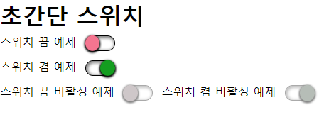
첫번째는 크롬에서 렌더링 된 모습입니다.
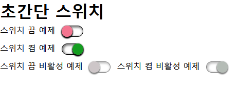
파이어폭스에서 렌더링 된 모습입니다. 단추가 살짝 밑으로 치우쳐 보이지만, 방법을 조금 달리하면 차이점을 줄일 수 있을겁니다.
MacOS 사파리에서 렌더링 된 모습입니다.
스크린 리더 호환성
가장 중요한 부분입니다. 현재 VoiceOver를 제외한 스크린 리더에서 나름대로 해당 유형을 제공하고 있습니다.
Sense Reader: 선택, 이름, 버튼
NVDA: 켬, 이름 전환 버튼
Narrator: 이름, 단추, 켬
VoiceOver(macOS): 이름, 끔, 전환
Talkback: 켬, 이름, 전환
VoiceOver(iOS/iPadOS): 선택됨, 이름, 체크 박스
JAWS는 테스트해보지 않았으나, iOS VoiceOver를 제외한 국내에서 많이 쓰거나 무료인 스크린 리더에서는 읽는 방식은 다르지만 잘 읽는 것을 볼 수 있습니다.
댓글을 작성하려면 로그인 해주세요. -
news[기업 서비스 접근성 구현 사례 공유] 기획전 a11y 개선 프로젝트Webacc NV 2023-01-17 14:57:04
최근 지마켓에서 발행된 접근성 적용을 위한 기획전 OCR 이미지 인식 적용 사례 관련 아티클이 있어 공유합니다. 좋은 접근성 적용 사례로 참고가 되었으면 좋겠습니다.
댓글을 작성하려면 로그인 해주세요. -
tip[android view system] containerAsCheckbox, containerAsSwitch 자바 및 코틀린 접근성 메서드 추가Webacc NV 2023-01-17 11:09:39
접근성 유틸 클래스에 제목에서 언급한 바와 같이 두 가지 메서드를 추가하여 공유합니다.
얼마전 작성한 동일한 클릭 속성을 가진 스위치, 체크박스와 텍스트뷰의 초점 합치기 팁에서 작성한 가이드 내용과 몇 가지 접근성을 조금 더 업데이트 하여 메서드 화 한 것입니다.
해당 메서드는 체크박스와 텍스트뷰 또는 스위치와 텍스트뷰가 존재하고 클릭 속성이 두 뷰를 감싸는 컨테이너에 걸려 있어 접근성 초점이 두 개로 나누어지는 요소에 적용이 가능합니다.
해당 메서드를 적용하면 다음과 같이 접근성 이슈가 해결됩니다.
1. 힌트 메시지가 전환하려면 두 번 탭하세요로 변경됩니다. 이는 스위치, 체크박스는 전환 작업을 하는 요소이기 때문입니다.
2. 텍스트뷰의 텍스트를 contentDescription 형태로 가져와서 컨테이너뷰에 삽입하므로 상태정보 레이블, 요소 유형을 스크린 리더에서 설정한대로 들을 수 있습니다.
3. 초점이 하나로 합쳐집니다.
사용법은 간단합니다.
뷰가 로딩되었을 때, 그리고 클릭 리스너가 실행되었을 때 해당 메서드를 실행하고 인자 값으로는 containerView, checkbox 또는 switchView, textView를 넣어줍니다.
예시: a11yClass.containerAsCheckBox(clickableContainer, agreementCheckbox, contentText)
이렇게만 적용하면 초점도 하나로 합쳐지고 마치 체크박스에 초점이 맞춰진 것처럼 힌트 메시지도 전환하려면 두 번 탭하세요로 출력되며 상태정보, 레이블, 요소 유형을 톡백에서 설정한 대로 읽어주게 됩니다.
댓글을 작성하려면 로그인 해주세요. -
tip[android view system] 접근성 적용 유틸 클래스에 viewAsRoleDescription 메서드 추가Webacc NV 2023-01-14 17:31:30
커스텀 뷰를 접근성에서 의미 있는 요소 유형으로 변경하기 위해서 만들어진 유틸 클래스에 viewAsRoleDescription 메서드를 추가합니다.
요소 유형이 지정되어 있든 그렇지 않든 메뉴항목과 같은 새로운 요소 유형으로 변경해야 할 때 사용할 수 있습니다.
따라서 viewAsRoleDescription 메서드를 사용하여 새로운 요소 유형을 문자로 제공해 주면 해당 요소 유형으로 변경됩니다.
인자 값으로는 뷰에 해당하는 객체와 요소 유형 스트링 메시지입니다.
따라서 다음 예시와 같이 적용할 수 있습니다.
accessibilityUtil.viewAsRoleDescription(buttonView, "목록항목")
댓글을 작성하려면 로그인 해주세요. -
tip[jetpack compose] 제목 유형 주기와 관련된 참고사항Webacc NV 2023-01-05 16:33:53
Jetpack compose에서는 다음 예시와 같이 semantics 모디파이어 내에서 heading() 속성을 추가하여 스크린 리더가 제목이라고 읽어주도록 구현할 수 있습니다.
.semantics { heading() }
단 제목 요소는 안드로이드에서는 요소 유형으로 취급하지 않기 때문에 jetpack compose에서도 다음 예시와 같이 버튼 제목과 같이 추가
요소 유형을 추가할 수 있습니다.
.semantics { heading() role = Role.Button}
단 iOS VoiceOver와 달리 제목을 제외한 버튼 슬라이드와 같은 요소 유형 두 개는 추가할 수 없습니다.
댓글을 작성하려면 로그인 해주세요. -
tip[HTML] prefers-reduced-motion 탐지하여 롤링되는 배너, 처음부터 정지된 채로 구현하기Webacc NV 2022-12-31 17:53:04
예전에 prefers-reduced-motion 미디어 쿼리 사용법에 대해 널리 블로그에서 다루었습니다.
과도한 애니메이션에 대해 심한 불편함을 느끼는 분들을 위해 만들어진 미디어 쿼리입니다.
그런데 해당 미디어 쿼리를 응용하여 애니메이션 줄이기 설정이 켜져 있으면 웹/앱에서 롤링되는 배너가 정지된 채로 로딩되게끔 구현하는 것을 고려해 볼 수 있습니다.
게다가 이렇게 구현하면 스크린 리더 사용자에게도 사용성에 큰 도움을 줄 수 있습니다.
스크린 리더 사용자도 웹 탐색 시 롤링되는 배너 때문에 많은 어려움을 겪는 경우가 많은데 웹페이지 구현 시에는 스크린 리더가 켜져 있는지를 캐치하여 스크린 리더 사용자를 위한 접근성을 조금 더 높인다든지 할 수 있는 방법이 없습니다.
그러나 해당 미디어 쿼리는 주요 브라우저에서 다 동작하며 스크린 리더 사용자분들 중에는 반응 속도를 조금 더 빠르게 하기 위해서 설정에서 애니메이션 동작 줄이기를 켜 놓고 사용하는 분들도 있기 때문에 해당 쿼리를 캐치하여 배너가 롤링되지 않게 한다면 사용성이 훨씬 향상될 것이라 생각합니다.
물론 이러한 부분들이 조금 더 우리나라에서 많이 활성화 되면 스크린 리더 사용자분들에게도 이러한 설정에 대해 알려야 할 수는 있을 것입니다.
방법은 간단합니다. 아래 예시와 같이 스크립트에서 모션 동작 줄이기가 켜져 있으면 배너가 정지된 채로 있도록 조건문을 설정하면 됩니다.
const reducedMotionMedia = matchMedia('(prefers-reduced-motion: reduce)'); reducedMotionMedia.addEventListener("change",(media)=>{ // 중간에 켜거나 꺼도 작동하도록 설정 options.paused = media.matches; }); reducedMotionMedia.dispatchEvent(new Event("change")); // 이벤트를 발생시켜 페이지에 접속했을 때 멈춤 적용댓글을 작성하려면 로그인 해주세요. -
tip[HTML] 이제 aria-hidden, tabindex-1 대신 inert 속성 사용을 고려해야 할 때Webacc NV 2022-12-31 10:39:34
롤링되는 배너에서의 현재 화면에 보여진 배너와 감춰진 배너, 확장/축소되는 위젯의 애니메이션 기획으로 인해 하위 콘텐츠가 display:none / block, 혹은 visibility:hidden, visible로 감춰지거나 보여지는 경우가 아닐 때 탭이나 가상커서 상에서의 화살표 탐색, 모바일에서의 한 손가락 좌 또는 우 쓸기로 탐색 시 가려지는 요소들이 다 탐색되는 문제가 발생하게 됩니다.
따라서 이를 해결하기 위하여 가려진 요소에는 aria-hidden true, 키보드 초점을 받는 곳에는 tabindex -1 속성을 적용하여 가려진 부분에 대한 접근성 문제를 해결해 왔습니다.
그러나 이러한 방식은 해결방식에 대해 완전히 이해하지 못하고 반만 적용하거나 잘못 적용할 경우 오히려 적용을 하지 않는 것보다 못한 접근성 이슈들이 상당히 발생한 것이 사실입니다.
대표적인 예가 aria-hidden 속성은 잘 적용했는데 tabindex -1 속성은 제공하지 않아 초점만 이동하는 경우입니다.
이런 경우 스크린 리더가 지원하는 단축키 또는 제스처로 탐색하면 콘텐츠는 읽어주지 않는데 탭키로 접근하면 스크린 리더에 따라 내용을 읽어주거나 아무 것도 읽어주지 않는 희한한 상황이 나타나게 됩니다.
반대로 tabindex -1 속성은 잘 제공되었는데 aria-hidden 속성을 제대로 적용하지 않은 경우에는 키보드 테스트를 하면 전혀 문제가 없어 보이는데 스크린 리더가 지원하는 제스처 및 단축키로 탐색하면 의도하지 않은 콘텐츠들이 다 접근됩니다.
그런데 최근에 Chrome 기반의 브라우저, Safari 브라우저에서 inert라는 속성을 공식 지원하기 시작하였습니다.
inert 속성은 aria-hidden, tabindex -1 속성을 동시에 적용해 주는 속성이라고 생각하시면 됩니다.
즉 해당 속성은 시각적으로는 아무런 영향을 주지 않으며 숨겨야 하는 영역이 포함된 div, li 등에 적용하면 하위의 요소들을 접근성 트리에서 제외함은 물론 키보드 이벤트 초점도 제외시키게 됩니다.
따라서 해당 속성을 잘만 사용한다면 조금 더 쉽게 접근성 이슈를 해결할 수 있습니다.
주의하실 것은 aria-hidden과 같이 inert 속성이 적용된 하위의 모든 요소가 다 사라지므로 여러 li 리스트 중 하나씩 보여지는 구조에서는 보여지는 li만 제외하고 각 li를 스크립트로 처리하여 inert 속성을 별도로 포함시켜 주어야 합니다.
또한 롤링되는 배너에서는 배너 리스트 이전에 정지 버튼을 두어야 스크린 리더 사용자가 배너 정지를 먼저 한 상태로 배너 영역을 지나칠 수 있습니다.
이는 배너 영역을 먼저 탐색하면 특정 배너에 초점을 받고 있다가 다른 배너로 교체되면서 초점을 잃을 수 있기 때문입니다.
참고로 firefox에서는 베타 버전으로 해당 속성을 지원하기 시작하였습니다.
다만 현재는 firefox에서는 inert 속성이 반만 동작하여 키보드 초점에서만 사라지고 접근성 트리에서는 사라지지 않는 이슈가 있으며 해당 문제는 조속히 해결될 것이라 기대합니다.
그러나 앞에서도 언급한 바와 같이 크롬 및 사파리 기반 브라우저에서는 잘 동작하고 있습니다.
아래는 저희가 제작한 inert 속성을 체험해 볼 수 있는 페이지입니다.
댓글을 작성하려면 로그인 해주세요. -
tip[UIKit] 테이블뷰 셀 내의 요소들을 접근성 배열에 담아야 할 때 주의사항Webacc NV 2022-12-30 16:32:23
일반적으로 보이스오버에서는 접근성 순서가 틀어질 경우 틀어지는 요소들이 있는 상위 수퍼뷰를 기준으로 containerView.accessibilityElements = [b, c, a, d]와 같이 배열을 정의함으로써 초점 순서를 재정의합니다.
이 방법은 초점 순서가 틀어졌을 때 재정의할 때도 사용하지만 특정 요소들만 접근성 초점으로 제공해야 할 때에도 사용할 수 있습니다.
문제는 특정 테이블뷰셀 내의 요소들을 접근성 배열에 담는 경우입니다.
TestTableCell.swift라는 파일이 있다고 가정하고 다음과 같이 접근성 배열을 정의하였다고 생각해 봅시다.
self.accessibilityElements = [2, 1, 4, 3]
그러면 어떤 문제가 있을까요?
테이블뷰 요소를 한 손가락 쓸기로 탐색할 때 스크롤이 안 됩니다.
즉 총 30행까지 있다고 가정하고 한 화면에 6행까지 있다고 가정하면 7행부터는 한 손가락 쓸기를 통해서는 탐색을 할 수 없다는 이야기입니다.
이유는 각 셀에 기본적으로 생성되는 contentView라는 요소를 거치지 못하기 때문에 발생하는 것으로 파악하였습니다.
따라서 테이블뷰셀 내의 여러 요소들을 accessibilityElements로 배열에 담을 때에는 반드시 contentView를 거치도록 합니다.
self.contentView.accessibilityElements = [2, 1, 4, 3]
댓글을 작성하려면 로그인 해주세요. -
tip[swiftUI] UIKit과의 컨테이너 뷰 처리 방식의 차이 이해하기Webacc NV 2022-12-30 12:54:37
테이블, 탭, 리스트와 같은 위젯 형태를 구현하는 것이 아닌, 일반 버튼이나 텍스트를 나열하는 경우 UIKit에서는 UIView를 사용하여 각 하위에 들어갈 요소들을 구성합니다.
swiftUI에서는 배열하고자 하는 목적에 따라 VStack, HStack, Zstack과 같은 컨테이너를 사용합니다.
그런데 하위 뷰들의 초점이 여러 개인 경우 이를 합치기 위해서 UIKit에서는 상위 컨테이너인 UIView의 isAccessibilityElement를 true로 설정하고 accessibilityLabel, accessibilityTraits, 필요한 경우 accessibilityActivate 메서드를 사용하여 접근성을 적용하게 되는데 이때 UIView의 isAccessibilityElement를 true로 설정하는 순간 하위 뷰들의 접근성 초점은 다 무시됩니다.
그러나 swiftUI에서는 단순히 HStack과 같은 컨테이너에 .accessibilityLabel, .accessibilityAddTraits 모디파이어만 추가한다고 해서 하위 요소들의 초점이 무시되지 않습니다.
오히려 상위 초점과 하위 초점 두 요소가 다 제공되어 사용자에게 혼란을 줄 수 있습니다.
따라서 상위 요소에서 하위 요소의 초점을 하나로 합치려면 .accessibilityElement(children: .combine) 혹은 상황에 따라서는 .accessibilityElement(children: .ignore) 모디파이어를 사용하시기 바랍니다.
ignore 사용 시에는 UIKit에서 UIView에 isAccessibilityElement true로 설정한 것과 같은 상황이 됩니다.
댓글을 작성하려면 로그인 해주세요. -
tip[flutter] 커스텀 슬라이더 접근성 적용하기Webacc NV 2022-12-26 09:34:50
플러터에서는 Semantics 위젯 내의 onIncrease, onDecrease 메서드를 통해 커스텀 슬라이더를 구현할 수 있습니다.
커스텀 슬라이더를 구현하는 경우의 수는 여러 가지이겠지만 플러터에서는 PageView 위젯 구현 시에는 슬라이더 형태로 접근성을 적용하는 것이 좋습니다.
이는 네이티브 PageView 위젯을 사용하였다 하더라도 플러터 엔진에서 이를 커스텀으로 구현하기 때문에 안드로이드 TalkBack만 놓고 보더라도 두 손가락으로 페이지 넘기기를 할 때 몇 페이지 중 몇 페이지와 같은 페이지 정보도 말하지 않으며 한 손가락 쓸기로 페이지 내부로 들어가더라도 멀티페이지뷰 혹은 페이지 혹은 페이지 내부와 같은 정보를 읽어주지 않기 때문입니다.
따라서 아래 코드 예시와 같이 슬라이더 형태로 접근성을 구현할 수 있으며 이렇게 하면 스크린 리더 사용자는 한 손가락 위 또는 아래 쓸기로 페이지 자체를 전환할 수 있으므로 사용성이 훨씬 향상됩니다.
단 반두시 Semantics 내에서 liveRegion 속성은 true로 설정해야 슬라이더 전환 시 값을 읽어주게 됩니다.
Semantics( liveRegion: true, onIncrease: () => _setPageIndex(_wonderIndex + 1), onDecrease: () => _setPageIndex(_wonderIndex - 1), child: WonderTitleText(currentWonder, enableShadows: true), ),댓글을 작성하려면 로그인 해주세요. -
tip[flutter] TalkBack에서 실행 가능한 요소에 대한 힌트를 제공하지 못할 때 점검 사항Webacc NV 2022-12-25 13:40:34
flutter 위젯 중에서 Image, Card와 같은 요소를 탭했을 때 무언가가 실행되게끔 하려면 GestureDetector라는 뒤젯을 사용해야 합니다.
GestureDetector 위젯 내에 onTap, onLongPress 속성을 사용하여 탭했을 때, 길게 탭했을 대의 기능을 구현할 수 있습니다.
이렇게 구현하면 안드로이드에서는 클릭, 롱클릭 속성이 있다고 판단하고 톡백에서 해당 요소에 포커스 했을 때 활성화 하려면 두 번 탭하세요, 두 번 탭하고 길게 누르세요 라는 힌트 메시지를 출력하게 됩니다.
그러나 어떤 경우에는 onTap, onLongPress 이벤트가 구현되어 있음에도 TalkBack에서 해당 힌트를 읽어주지 못하는 경우가 있습니다.
이때 점검해야 할 사항은 단 하나, GestureDetector 위젯으로 인해 onTap 혹은 onLongPress 이벤트가 수신받고 있는 요소에 접근성 포커스가 가는 것이 맞는가 입니다.
예를 들어 리스트뷰 내에 각 항목들이 구현되어 있는데 Card > Row > Image & Text 와 같은 구조로 되어 있다고 생각해 봅시다.
이때 이벤트를 받고 있는 곳은 Card입니다. 그러나 접근성 초점이 가는 곳은 Image & Text입니다.
따라서 이런 구조에서는 톡백에서 힌트를 받지 못하게 되는 것입니다.
이를 해결하려면 탭 이벤트를 받고 있는 곧 바로 하위에 Semantics를 덧씌우고 하위 요소는 excludeSemantics로 접근성 노드에서 제거한 다음 label 속성을 통해 하위 요소의 텍스트를 추가해 주어야 합니다.
return GestureDetector( child: Semantics( label: list[position].animalName!, excludeSemantics: true, child: Card( child: Row( children: <Widget>[ Image.asset( list[position].imagePath!, height: 100, width: 100, fit: BoxFit.contain, ), Text(list[position].animalName!), ], ), ), onTap: () { }, onLongPress: () { }, ), );댓글을 작성하려면 로그인 해주세요. -
tip[jetpack compose] 톡백의 접근성 초점을 반드시 특정 요소로 보내야 할 때Webacc NV 2022-12-17 14:11:55
안드로이드는 키보드 초점과 접근성 초점이 별도로 작동합니다. 따라서 특정 상황에서 키보드 초점을 a라는 요소로 보내게 되면 접근성 초점이 따라가지만 접근성 초점을 특정 요소로 보낸다고 해서 키보드 초점이 따라가지는 않습니다.
또한 키보드 초점이 갈 수 있는 요소는 클릭 가능한 요소나 강제로 focusable 속성을 true로 지정한 요소만 가능하지만 접근성 포커스는 강제로 접근성 초점을 숨겨버리지 않는 이상 클릭할 수 없는 텍스트뷰에도 모두 초점이 이동합니다.
안드로이드 view 시스템의 경우 접근성 초점을 다른 요소로 보내는 별도의 메서드가 존재했습니다. 그러나 jetpack compose에서는 아직 관련 API가 없습니다.
그러나 focusRequester 모디파이어와 requestFocus 메서드를 활용해서 키보드 초점을 어딘가로는 보낼 수가 있습니다.
따라서 접근성 초점을 반드시 특정 요소로 보내야 한다면 requestFocus를 활용할 수 있습니다.
방법은 다음과 같습니다.
1. FocusRequester 클래스를 활용하여 아래 예시와 같이 변수를 하나 만듭니다.
val focusRequester = remember { FocusRequester() }
2. 초점을 보내고자 하는 요소의 포커스 상태를 캐치하기 위해 아래 예시와 같이 onFocusChanged 모디파이어를 추가합니다.
.onFocusChanged { it }3. 포커스를 보내야 하는 요소에 focusRequester 모디파이어를 추가합니다. 인자 값은 앞에서 만든 변수입니다.
.focusRequester(focusRequester)
4. 포커스를 보내야 하는 요소가 버튼이나 포커스가 가능한 클릭 속성을 가진 요소가 아니라면 focusable true 모디파이어를 추가합니다.
참고로 위의 2, 3, 4번 순서를 반드시 따라야 합니다.
5. 초점을 보내야 하는 시점에 아래 예시와 같이 requestFocus 이벤트를 실행합니다.
.clickable { focusRequester.requestFocus() }
이렇게 하면 키보드 초점이 해당 요소에 가게 되므로 자연스럽게 톡백의 접근성 포커스도 이동합니다. 그러나 당연하게도 한번 간 포커스는 해당 요소의 포커스를 다른 곳으로 옮기기 전까지 다시 포커스를 이동시킬 수는 없습니다. 즉 키보드가 아닌 톡백 제스처로 다시 다른 요소로 이동하더라도 키보드 포커스는 여전히 해당 초점에 머물러 있기 때문입니다.
댓글을 작성하려면 로그인 해주세요. -
etc태그가 잘못 닫혀있어요틀렸어요 2022-12-13 10:50:08
https://nuli.navercorp.com/guideline/s01/g01 에 잘못된 정보가 있어요.
button 태그인데 a 태그로 닫혀있어요.
 댓글을 작성하려면 로그인 해주세요.
 -
tip[iOS-VoiceOver 알림] DispatchQueue보단 Task와 Async Await를 사용해요!Webacc NV 2022-11-18 18:29:12
VoiceOver에서 버튼을 누르거나, 특정 기능이 실행되었을 때, 사용자에게 즉시 내용을 음성으로 전달해야 될 때가 있습니다. 이전 솔루션에서는 보통 DispatchQueue.main.asyncAfter를 많이 사용했습니다. 단일 알림만 사용할 때, DispatchQueue.main의 asyncAfter 클로져만으로도 충분히 이를 구현할 수 있지만, 여러 개의 알림을 보내거나, 지속적으로 멀리 있는 뷰의 변경내용을 알려야 할 때, DispatchQueue는 오류를 낼 수 있습니다.
물론 낮은 Swift 버전 환경에서는 DispatchQueue를 써야하는 상황이겠지만, 대부분의 Apple 앱 개발환경은 최신 안정화 버전에서 진행됩니다. 그렇기 때문에 DispatchQueue보다 Task를 쓰는게 조금 더 안정적인 알림을 줄 수 있을 것으로 보입니다. 아래 코드를 보시지요.
// Before
func sendAnnouncementForVoiceOver(_ message:String,_ isUrgentMessage:Bool = true, speechDelay:Double)->Void {
  let NSAttrStr:NSAttributedString = NSAttributedString(string:message,attributes:.accessibilitySpeechQueueAnnouncement:!isUrgentMwssage)
  DispatchQueue.main.asyncAfter( deadline: .now() + 0.1 ) {
    UIAccessibility.post(notification:.announcement,arguments:NSAttrStr)
  }
}

// After
func sendAnnouncementForVoiceOver(_ message:String,_ isUrgentMessage:Bool = true, speechDelay:Double=100) async throws -> Void {
  let NSAttrStr:NSAttributedString = NSAttributedString(string:message,attributes:.accessibilitySpeechQueueAnnouncement:!isUrgentMwssage)
  Task {
    try await Task.sleep( for:.miliseconds(speechDelay) )
    UIAccessibility.post(notification:.announcement,arguments:NSAttrStr)
  }
}
Task를 사용하는 것이 코드가 조금 길고 한 줄 더 많습니다. 그렇지만, DispatchQueue.main은 메인쓰레드에서 이를 처리하기 때문에 이를 제거해주지 않으면 해당 큐 자리에서 다른 음성을 실행하지 못하고 오류가 발생합니다.
반면에 Task 클로져에 Task.sleep await을 사용하면 여러 알림을 사용하더라도 큐 위치가 겹치지 않기 때문에 오류 없이 무난하게 사용자에게 스크린리더 알림을 줄 수 있습니다.
댓글을 작성하려면 로그인 해주세요. -
qna피씨에서 폼 요소에 마우스 클릭 시 포커스 효과 있어야 할까요?능소니 2022-11-07 16:12:58
피씨에서 키보드가 아닌 마우스로 폼 요소를 클릭 시
outline이나 기타 등등으 효과로 클릭이 되었다는 표시를 해주어야 접근성에 옳바른 걸까요?
댓글을 작성하려면 로그인 해주세요. -
tip[iOS VoiceOver & Web] VoiceOver 초점 버그를 방지하는 실시간 영역 제공방법Webacc NV 2022-11-02 15:36:12
iOS VoceOver는 콘텐츠의 크기, 렌더링에 매우 민감합니다. 우리가 상상한 것 이상으로 짜증나게 말이지요.
특히 웹 플랫폼에서는 노드의 지속적으로 반복하여 새로 그려지는 과정에서 DOM 객체가 계속 새로 만들어지면
VoiceOver로 정상적인 탐색이 불가능해지는 문제가 있습니다.실시간으로 누적 판매량을 바꿔가며 표시하거나, 실시간으로 시/분/초/밀리 초 등을 표시하는 실시간 D-Day 영역 등,
실시간 정보 영역에서 이런 문제가 두드러집니다.
아래는 저희가 운영하는 테스팅 사이드로, 여러 예제들을 담고 있습니다. 그 중, 실시간 정보 영역에 대한 페이지를 한번 보세요.
실시간 렌더링 영역 테스트일부러 집중을 위해 aria-live는 걸어 놓지 않았습니다. 해당 페이지에는 계속 업데이트되는 두 개의 시계 영역이 있습니다.
첫번째 시계영역은 VoiceOver 순차탐색으로 지나갈 수 없는 상태이며 두번째 시계 영역은 아무 문제 없이 탐색 후 지나갈 수 있는 상태입니다. 해당 페이지에도 설명을 해 놓았지만, 영문이므로 이 둘의 차이점을 설명하자면, 두 영역은 기존 노드에서 부분적인 것만 변경하는가, 새로운 노드가 계속 새로 교체되는가에 차이가 있습니다.
첫번째 영역은 노드(span) 전체를 0.1초(100ms)마다 통째로 새로운 정보와 함께 교체합니다. 두 번째 영역은 span 태그가 있고, 내부에 있는 텍스트만을 계속 변경하여 표시합니다.데이터를 새로 고칠 때, DOM 객체를 통째로 새로 고치느냐, 기존 DOM 객체를 그대로 두고, 데이터만을 텍스트로 교체하느냐는 이토록 큰 차이가 있습니다. 요소를 통째로 빠르게 반복하며 교체하면 모바일 VoiceOver는 이를 인지하지 못하고, 심지어, 탐색 초점이 화면 끝에 있는 것 처럼, 탐색이 되지 않고 VoiceOver에서 콘텐츠가 끝났다는 퉁퉁 거리는 효과음만 들리게 됩니다.
따라서, 데이터를 새로 실시간으로 가져와서 뿌려야 할 때는 되도록 DOM 객체(요소)를 통째로 그리지 말고, 미리 그려진 고정된 DOM 객체에 텍스트만을 교체하는 방식을 사용해야 합니다.
댓글을 작성하려면 로그인 해주세요. -
tip[swift UI] 보이스오버에서의 이중탭 액션 재정의하기Webacc NV 2022-10-30 10:49:26
접근성에서 조금 더 편리한 사용성을 제공해 주기 위하여 기존의 객체들을 접근성 초점에서 제거하고 상위 뷰에 초점을 주는 경우가 있습니다.
그런데 이 때 주의해야 하는 것이 바로 이중탭입니다.
예를 들어 보이스오버 끈 상태에서 옆으로 스와이프를 하면 결제수단이 변경되는 화면이 있다고 생각해 봅시다.
해당 화면의 접근성을 적용하기 위하여 결제수단들을 품고 있는 상위 요소에 초점을 주고 .accessibilityAdjustableAction 모디파이어로 한 손가락 위 또는 아래 쓸기로 결제 수단을 변경할 수 있도록 구현을 하였습니다.
그런데 특정 결제 수단에는 계좌 충전 버튼이 있다고 생각해 봅시다.
접근성 초점은 상위 뷰에만 주었기 때문에 충전 버튼은 초점을 받을 수 없습니다.
이런 경우는 슬라이더 뿐만 아니라 두 번 탭에 대한 액션도 재정의를 해 주어야 합니다.
그렇지 않으면 사용자가 이중탭을 해야 한다는 것도 모를 것이며 설사 이중탭을 한다고 하더라도 초점이 전체를 잡고 있기 때문에 액션이 실행되지도 않습니다.
이 때 사용할 수 있는 것이 .accessibilityAction 모디파이어입니다.
이중탭 재정의는 액션 카인드에 (default)를 정의하고 핸들러 인자에 실행될 액션을 추가하면 됩니다.
다만 아래 예시와 같이 (default) 액션 kind는 생략이 가능합니다.
				.accessibilityAction {
					self.showCharge(true)
				}
참고로 이중탭에 대한 액션을 지정하게 되면 버튼 트레이트가 자동 추가됩니다.
따라서 위의 예시에서 생각해 본다면 버튼 조절가능으로 읽게 되는 것입니다.
댓글을 작성하려면 로그인 해주세요. -
tip[swift UI] 화면 변경 알림과 접근성 포커스 재조정하기Webacc NV 2022-10-29 14:44:52
UIKit에서는 UIAccessibility.post(notification)을 사용하여 접근성 초점을 특정 요소로 보낼 수 있었습니다.
그러나 swiftUI에서는 해당 이벤트 사용은 가능하지만 UIKit 형식으로 view를 추가하지 않는 이상 특정 요소로 접근성 초점을 보내는 것은 불가능합니다.
즉 screenChanged, layoutChanged 사용시 argument는 반드시 nil로 주어야 하고 그렇게 되면 무조건 첫 요소로 접근성 초점이 이동합니다.
대신 swiftUI에서는 accessibilityFocused 모디파이어를 사용하여 특정 요소로 접근성 초점을 보낼 수 있습니다.
bool @AccessibilityFocus 스테이트 변수를 만들고 포커스를 보내고자 하는 요소에 accessibilityFocus 모디파이어를 통하여 해당 스테이트 변수를 넣어 준 다음 포커스를 보내야 하는 시점에 스테이트 변수를 true로 설정하면 끝입니다.
따라서 .sheet(isPresented:) 모디파이어를 사용하여 네이티브 모달을 구현하는 경우에는 모달이 열리거나 사라질 때 자동으로 화면변경 알림 이벤트를 보이스오버에 제공해 주어서 모달을 닫을 때 접근성 포커스 재조정만 해 주면 되지만 완전히 모달 레이어를 opacity를 통하여 투명도를 변경함으로써 커스텀으로 구현하게 되면 screenChanged 이벤트도 함께 구현해야 합니다.
구현 방법은 너무나 간단합니다.
1. 다음 예시와 같이 AccessibilityFocus 스테이트를 지정합니다.
@AccessibilityFocusState var isNameButtonFocused: Bool
2. sheet 모디파이어가 아닌 커스텀 모달을 구현한다고 가정하고 모달이 열릴 때 다음 예시와 같이 screenChanged 이벤트를 구현합니다. 모달이 열릴 때에는 초점을 재조정할 필요가 없고 사라질 때에만 기존 모달을 여는 버튼으로 되돌려 주면 되므로 접근성 포커스는 재조정하지 않습니다.
Button(action: {
self.showModal(true)
UIAccessibility.post(notification: .screenChanged, argument: nil)
}3. 2번의 버튼은 모달을 닫을 때 초점을 해당 버튼으로 되돌려 줄 것이므로 1번에서 AccessibilityFocusState로 지정한 isNameButtonFocused를 accessibilityFocused 모디파이어 값으로 지정합니다.
.accessibilityFocused($isNameButtonFocused)
이렇게 되면 특정 조건에서 isNameButtonFocused가 true로 변경되는 순간 접근성 초점은 해당 버튼으로 이동하게 됩니다.
4. 모달을 닫을 때는 다음 예시와 같이 접근성 초점 되돌리기와 화면 변경 알림을 함께 구현합니다.
			.onChange(of: self.showModal) { isShow in
				if !isShow {
					if isName {
						isNameButtonFocused = true
				}
			}
참고: 당연한 이야기이지만 커스텀 모달 구현시에는 모달을 포함하는 뷰에 isModal trait를 추가해야 합니다(sheet 모디파이어 사용시 필요 없음).
댓글을 작성하려면 로그인 해주세요. -
tip[android view system] 동일한 클릭 속성을 가진 스위치, 체크박스와 텍스트뷰의 초점 합치기Webacc NV 2022-10-26 21:18:10
켜짐/꺼짐을 나타내는 스위치, 선택됨/선택안됨을 나타내는 체크박스를 구현할 경우 체크박스 혹은 스위치와 텍스트뷰를 양 옆으로 분리하고 이 둘을 감싸는 레이아웃에 클릭 리스너를 주는 경우가 있습니다.
이렇게 되면 터치할 수 있는 범위가 넓어지고 어느 쪽을 탭하든 스위치나 체크박스가 동작하게 됩니다.
그런데 톡백 사용자는 이러한 화면에서 혼란을 겪게 되는데 그것은 바로 초점이 두 개로 이동될 뿐만 아니라 두 요소 다 클릭이 가능해서 활성화 하려면 두 번 탭하세요, 전환하려면 두 번 탭하세요 라는 힌트 메시지를 출력하므로 동일한 요소라는 것을 알 수 없다는 것입니다.
물론 이런 경우 둘 중 하나를 접근성 초점에서 없애버릴 수 있으나 이렇게 되면 저시력 사용자가 톡백을 켠 상태로 화면에 있는 요소를 임의 터치했을 때 요소 하나는 화면에 있음에도 접근성 트리에서 숨겨져서 초점이 가지 않기 때문에 당황할 수 있습니다.
그래서 초점도 하나로 합치고 어느 쪽을 터치하든 잘 읽어줄 수 있도록 하는 방법을 공유하려고 합니다.방법은 너무나도 간단합니다.
레이아웃에 클릭 이벤트가 포함되어 있으므로 하위 체크박스나 스위치의 focusable 속성, clickable 속성은 false로 변경합니다.checkBox.isFocusable = false
checkBox.isClickable = false
이렇게만 하면 완전히 끝입니다.
참고로 클릭 리스너가 있는 레이아웃에 contentDescription 속성을 주면 하위 모든 요소를 다 무시하고 해당 대체 텍스트만 읽게 되어 상황에 따라 활용이 가능합니다. 다만 이렇게 하려면 클릭 리스너를 가진 레이아웃에 체크박스나 스위치 요소 유형 및 상태정보를 제공해야 하며 이럴 경우 유틸 클래스를 활용할 수 있습니다.
댓글을 작성하려면 로그인 해주세요. -
tip[swiftUI] 두 손가락 두 번 탭 제스처 구현하기Webacc NV 2022-10-10 19:10:09
얼마전 .accessibilityAction(escape) 모디파이어를 통해서 뒤로 가기 제스처를 구현하는 방법에 대해 다루었습니다.
오늘은 .accessibilityAction(magicTap) 모디파이어에 대해 다루겠습니다.
재생, 일시정지와 같이 두 손가락 두 번탭으로 수행할 액션을 정의할 때 사용하는 모디파이어이며 UIKit에서는 accessibilityPerformMagicTap 메서드를 오버라이드 하는 형식으로 구현하였습니다.
구현 방법은 간단합니다.
해당 뷰의 가장 상위 모디파이어에 다음 예시와 같이 두 손가락을 두 번 탭 했을 때 실행될 기능을 조건문 형태로 구현하면 됩니다.
다만 주의하실 것은 일시정지와 재생과 같이 텍스트가 변경되어야 하는 경우 state 변수를 참조하여 실시간으로 텍스트 혹은 대체 텍스트 및 이미지 또한 변경해 주어야 합니다.
그렇지 않으면 버튼의 텍스트 레이블과 기능이 불일치하는 문제가 생깁니다.
.accessibilityAction(.magicTap) { // 접근성 적용 - 재생/정지 if self.audioPlayer.isPlaying { self.audioPlayer.pause() playCheck = false } else { self.audioPlayer.play() playCheck = true } }댓글을 작성하려면 로그인 해주세요. -
tip[WAI-ARIA Advance] aria-labelledby와 aria-describedby로 내용이 긴 버튼을 더 이해하기 쉽게 만들기Webacc NV 2022-10-05 17:13:10
누를 수 있는 버튼이나 링크에는 가급적 간결하고 짧은 레이블을 사용하는 것이 바람직합니다.
그러나, 위젯 스타일의 아름다움이나, 컨트롤의 크기, 눈으로 보는 사람들이 무슨 버튼인지 알기 쉽게 하기 위해, 혹은 홍보 효과를 위해 이미지와 제목 아래에 설명을 포함하는 링크나 버튼을 많이 사용합니다.
안에 있는 내용을 빠짐없이 읽는다면, 이는 접근성에 문제가 되지 않습니다. 짧은 레이블이 바람직한 것과는 별계로 충분히 표준을 지킨 마크업이라고 할 수 있습니다.
그런데, 플랫폼, 스크린리더 별로 다르지만, Windows와 NVDA를 기준으로 했을 때, 스크린 리더는 Tab 키(시스템 초점)을 통해 이동하면, 레이블 내용을 읽고, 그 후에 버튼이나 링크같은 요소 유형을 읽는게 일반적입니다. 그 다음, title이나 aria-description등의 내용을 읽게 됩니다.
만약에, 버튼에 모든 글자를 다 넣어 놓는다면, 레이블이 너무 길어서 요소 유형을 듣기가 어려워지는 문제가 있습니다. 눈으로 보는 사람은, 보고싶지 않은 글자는 훑고, 보고 싶은 부분만 보면 되니, 이해가 잘 안 가시겠지만, 스크린리더 사용자는 해당 내용을 묵묵히 듣는 수 밖에 없습니다. 레이블과 요소 유형만 듣고 싶은 상황이 있은 사람은 고구마를 백 개쯤 먹은 느낌일 거예요.
그러면, 이렇게, 긴 내용이 들어있는 버튼은 어떻게 정보를 재구성하는 게 좋을까요? aria-labelledby와 aria-describedby를 사용하면 됩니다. 이 둘을 쓰려면 id를 줘야하지 않는지 물어보고 싶지요?
맞습니다. id를 주어야 하죠. 그런데, HTML에서 접근성을 구현할 때, id 속성은 기본 참조수단으로 활용됩니다. 접근성을 위해, 중요한 요소에는 id는 당연히 주는 것이 좋습니다. 일일이 주기 귀찮아도 꾹 참고 id와 WAI-ARIA를 사용하면, 사이트의 품질, 품격을 높일 수 있습니다.
무엇을 활용해야 하는지는 설명했으니 어떻게 마크업 하면 되는지 살펴보도록 하죠.
<h1>Long Label Button</h1>
<main>
  <div class="comparison">
    <div class="markup normal">
      <h2>Normal</h2>
      <button>
        <div class="imgbox" id="rcmenu_imgbox"><img src="./steak.jpg" alt=""></div>
        <p class="lb-wrap" id="rcmenu_lb">Chef-Recommended Menu</p>
        <p class="desc-wrap" id="rcmenu_desc">사시사철, 매달 바뀌는 신선한 제철 채소, 해산물, 심혈을 기울인 드라이 에이징한 스테이크, 셰프의 추천 메뉴를 만나보세요.</p>
      </button>
    </div>
    <div class="markup a11y">
      <h2>접근성 계선됨</h2>
      <button aria-labelledby="spct_lb" aria-describedby="spct_desc">
        <div class="imgbox" id="spct_imgbox"><img src="./coffee.jpg" alt=""></div>
        <p class="lb-wrap" id="spct_lb">Specialty Coffee</p>
        <p class="desc-wrap" id="spct_desc">엄선된 생두로 당일 로스팅, 매일 최고의 맛과 향을 느낄 수 있는 숙성된 원두, 황금색 크래마와 아로마를 느껴보세요.</p>
      </button>
    </div>
  </div>
</main>
자, 두 개의 버튼이 완성되었습니다. WAI-ARIA와 스크린리더에 익숙하지 않은 분은 이 마크업이 어째서 듣고 이해하기 편한 구조인지, 와 닿지 않을 겁니다. 왜 그런지 한번 NVDA 접근성 적용 비교(Youtube 동영상)을 통해 비교해 보지요.
센스리더는 예외로, describedby를 마치 레이블처럼 읽는 특성이 있음을 유의하시기 바라며, NVDA나 해외 스크린리더의 경우는 이렇게 버튼 뒤에 describedby의 내용을 읽습니다. 이는 VoiceOver(Youtube 동영상)나 Talkback(Youtube 동영상)도 마찬가지이지요.
이렇게 짧은 내용을 aria-labelledby로 주고, describedby로 긴 내용을 제공한다면, 간략한 내용과 요소 유형을 읽은 다음, 설명을 읽어주게 되므로, 스크린리더 사용자가 설명 듣기 여부에 대한 선택권을 줄 수 있고, 버튼 레이블과 설명이 명확히 구분되기 때문에 조금 더 내용에 집중하기 좋습니다.
댓글을 작성하려면 로그인 해주세요. -
tip[iOS native] webView 구현 시 screenChanged 적용이 중요한 이유Webacc NV 2022-09-28 18:56:43
앱 내에 웹뷰를 구현할 경우 페이지 DOM 자체가 새로고침되는 경우의 접근성 적용에 대해서 생각해 보려고 합니다.
react와 같이 업데이트 된 콘텐츠만 갱신되는 경우에는 페이지 내에서 초점 이동이나 알림 등을 통하여 콘텐츠가 업데이트 되었음을 스크린 리더 사용자에게 알려 주어야 합니다.
그러나 페이지 전체가 새로고침되는 경우에는 앱 내에서 이에 대한 접근성을 적용해야 합니다.
그렇게 하지 않으면 보이스오버 초점이 어중간하게 이동될뿐만 아니라 페이지 전체가 새로고침되었음을 스크린 리더 사용자가 인지하기 어렵습니다.
방법은 너무나도 간단합니다.
웹뷰를 구현하게 되면 페이지 로딩 진행률을 표시하는 progressView가 포함되어 있는데 다음 예시와 같이 진행률이 100%가 되었을 때 screenChanged 이벤트를 추가하기만 하면 됩니다.
func webView(_: WKWebView, didFinish _: WKNavigation!) { UIView.animate(withDuration: 0.33, animations: { self.progressView.alpha = 0.0 }, completion: { isFinished in self.progressView.isHidden = isFinished }) UIAccessibility.post(notification: .screenChanged, argument: webView.title) }댓글을 작성하려면 로그인 해주세요. -
tip[SwiftUI - Environment] 접근성 서비스 구현 시 유용한 환경정보 검사하기Webacc NV 2022-09-22 13:32:48
UIKit에서는 UIAccessibility.isVoiceOverRunning과 같이 get 프로퍼티를 통해 사용자가 VoiceOver를 사용중인지 아닌지를 체크할 수 있었습니다. SwiftUI에서는 get 프로퍼티로 객체에서 가져오는 방법이 없어 조금은 당황스러울 것으로 예상됩니다.
SwiftUI에서는 @Environment() PropertyWrapper로 해당 값들을 참조할 수 있습니다. 확인 가능한 정보는 다음과 같습니다.
- .accessibilityQuickActionEnabled:bool
Assistive Touch 등 접근성의 빠른 동작 기능의 사용 여부를 부울형으로 가져옵니다. - .accessibilityVoiceOverEnabled:Bool
손쉬운 사용 > VoiceOver 스크린리더의 사용 여부를 부울형으로 가져옵니다. - .accessibilitySwitchControlEnabled:Bool
손쉬운 사용 > 스위치 제어 기능의 사용 여부를 부울형으로 가져옵니다. - .accessibilityEnabled:Bool
손쉬운 사용의 접근성 보조 기술, VoiceOver, 스위치 제어 등의 기능 사용 여부를 부울형으로 가져옵니다. - .accessibilityReduceMotion:Bool
손쉬운 사용 > 동작의 동작 줄이기 기능의 사용 여부를 부울형으로 가져옵니다. - .accessibilityInvertColors:Bool
손쉬운 사용 > 디스플레이 및 텍스트 크기의 스마티 및 클래식 색상 반전 기능의 사용 여부를 부울형으로 가져옵니다. - .accessibilityDifferentiateWithoutColor:Bool
손쉬운 사용 > 디스플레이 및 텍스트 크기의 색상 없이 구별 기능의 사용 여부를 부울형으로 가져옵니다. - .accessibilityShowButtonShape:Bool
손쉬운 사용 > 디스플레이 및 텍스트 크기의 버튼 모양 기능의 사용 여부를 부울형으로 가져옵니다. - .accessibilityLargeContentViewer:Bool
손쉬운 사용 > 디스플레이 및 텍스트 크기의 더 큰 텍스트 기능의 사용 여부를 부울형으로 가져옵니다. - .LegibilityWeight : LegibilityWeight?
손쉬운 사용 > 디스플레이 및 텍스트 크기의 볼드체 텍스트 기능의 사용 여부를 가져옵니다. .regular와 .bold값이 있으며, 비교식을 활용하여 사용합니다. - .colorScheme : ColorScheme
현재 테마 설정을 가져옵니다. .light와 .dark가 있습니다. 비교식을 활용하여 사용합니다. - .colorSchemeContrast : ColorSchemeContrast
손쉬운 사용 > 디스플레이 및 텍스트 크기의 대비 증가 옵션이 사용 여부에 따른 상태를 가져옵니다. .standard와 .increased가 있으며, 비교식을 활용하여 사용합니다.
@Environment 속성 래퍼는 다음과 같이 사용합니다.
// ContentView.swift import SwiftUI struct ContentView : View { @Environment(\.accessibilityVoiceOverEnabled) var isVOEnabled:Bool @Environment(\.colorScheme) var currentScheme:ColorScheme var body:some View { HStack { Text("VoiceOver is turned " Text(isVOEnabled ? "On" : "OFF").foregroundColor(isVOEnabled ? .green : .red) }.accessibilityElement(children:.combine) HStack { Text("Your current theme is " Text(currentScheme == .dark ? "Dark" : "Light") }.accessibilityElement(children:.combine) } } //...댓글을 작성하려면 로그인 해주세요. - .accessibilityQuickActionEnabled:bool
-
tip[iOS SwiftUI] 모달 대화상자의 뒤로가기(두 손가락 문지르기) 제스쳐 구현하기Webacc NV 2022-09-22 11:13:42
UIKit에서는 모달 영역의 접근성을 구현할 때, accessibilityPerformEscape() 메소드를 사용하는데, 클래스에서 이 메소드를 override하여 구현해야만 했습니다. SwiftUI에서는 이를 어떻게 구현할까요?
SwiftUI에서는 accessibilityAction이라는 Accessibility Modifier를 사용합니다. accessibilityAction에는 여러 오버로드된 항목이 있는데, 이 중에서. UIKit에서 구현하던 여러 접근성 제스쳐 기능을 구현하는 항목은 View.accessibilityAction(_ actionKind:AccessibilityActionKind, _ handler:@escaping ()->Void)->AccessibilityAttachmentModifier입니다. 이는 훨씬 세련되고 간편한 방식입니다.
두 인자 모두, 아실 분들은 바로 아시겠지만, 호출 시 레이블을 필요로 하지 않습니다. 인자를 설명하자면 아래와 같습니다.
actionKind 인자는 AccessibilityActionKind의 프로퍼티를 받습니다. 역시 아실 분들은 아시겠지만, 레이블이 필요 없기 때문에, 정의할 때, 첫번째 인자에서 마침표를 입력하면 유효한 값이 표시됩니다.
handler 인자는 너무나도 익숙하실 겁니다. 실행될 코드를 작성하는 클로저입니다. 딱히 SwiftUI 를 모르더라도 뭘 작성해야 할지 아실 겁니다. 앞서 설정한 actionKind 유형의 제스처를 사용했을 때 일어날 일들을 코드로 작성합니다(ex: 대화상자가 화면에서 사라짐). Javascript의 DOM에 익숙하신 분이라면, addEventListener가 생각나겠네요.
handler인자는 이스케이핑 클로저로, 인자를 작성하는 괄호 안에 쓰지 않고, 괄호 밖으로 빼서 작성하는 문법을 사용할 수 있습니다.
아래는 대화상자를 만드는 예제 코드입니다.
// ContentView.swift
import SwiftUI

struct ContentView:View {
  @State var dialogActive:Bool = false
  var body:some View {
    ZStack {
      VStack {
        Button("Greeting") {
          dialogActive = true
        }
      }
      CustomDialog(active:$dialogActive){
        Text("Welcome to Greeting Dialog. Nice to meet you!")
      }
    }
  }
}
...
// // CustomDialog.swift // a11yModal // // Created by 박웅진 on 2022/09/22. // import SwiftUI struct CustomDialog<Content:View>:View { @Binding var active:Bool var content:()->Content init(active:Binding<Bool>, @ViewBuilder _ content:@escaping ()->Content){ self.content = content self._active = active } var body : some View { if active { ZStack { Text("Close").accessibilityHidden(true).onTapGesture { // dimmed Overlay, 스크린리더를 사용하지 않는 사용자가 밖을 누르면 대화상자 종료, accessibilityHidden으로 탐색되지 않도록 숨김. active = false }.background(.black.opacity(0.5)).frame( width:UIScreen.main.bounds.width, height:UIScreen.main.bounds.height ).keyboardShortcut(.escape) // ESC키를 누르면 해당 텍스트 요소의 onTapGesture가 실행됨 VStack { Spacer() content() Spacer() HStack (alignment:.center) { Button("OK"){ active = true }.keyboardShortcut(.return) // Enter누르면 OK버튼이 눌리도록함. } } }.accessibilityAddTraits(.isModal) .accessibilityAction(.escape) { active = false } } } }댓글을 작성하려면 로그인 해주세요. -
tip[swift UI] 커스텀 슬라이더 접근성 구현 예제Webacc NV 2022-09-04 20:10:07
어제에 이어서 커스텀 슬라이더를 구현하는 방법을 설명합니다.
커스텀 슬라이더 접근성을 구현할 때 주의해야 할 것은 초점을 어떻게 줄 것인가 입니다.
슬라이더와 관련된 객체들을 하나로 합쳐서 초점을 제공할 수도 있을 것이고 기존에 초점을 받고 있는 요소 중 하나를 잡아서 이벤트 구현을 할 수도 있을 것입니다.
전자의 경우에는 슬라이더 관련 정보를 감싸고 있는 상위 컨테이너에 다음과 같이 접근성 엘리먼트를 우선 초기화 합니다.
.accessibilityElement()
위와 같이 초기화를 하는 이유는 슬라이더를 구현하기 위해서는 기존에 원래 가지고 있는 요소의 접근성 속성을 완전히 버리고 이벤트에만 의존해야 하기 때문입니다.
이렇게 접근성 정보를 초기화 한 다음에는 보이스오버가 해당 요소에 포커스 했을 때 읽어야 할 레이블과 밸류를 다음 예시와 같이 줍니다.
.accessibilityLabel("Value")
.accessibilityValue(String(value))여기서 accessibilityLabel 은 어떤 슬라이더인지를 가리키는 것이고 accessibilityValue 는 말 그대로 값입니다.
그리고 .accessibilityAdjustableAction 메서드를 사용하여 한 손가락 위로 쓸기, 아래 쓸기에 대한 이벤트를 구현합니다. 핵심은 기능 구현과 함께 밸류 값을 변경해야 한다는 것입니다.
아래 예시를 참고합니다.
코드를 보시면 아시겠지만 해당 예시는 증가, 감소 버튼이 별도로 존재하는 화면입니다.
그러나 스크린 리더 사용자가 해당 두 버튼을 별도로 접근하게 하지 않고 슬라이더로 구현을 하여서 조금 더 쉽게 증가나 감소를 하게끔 구현한 예시라고 보시면 됩니다.
VStack { Text("Value: \(value)") Button("Increment") { value += 1 } Button("Decrement") { value -= 1 } } .accessibilityElement() .accessibilityLabel("Value") .accessibilityValue(String(value)) .accessibilityAdjustableAction { direction in switch direction { case .increment: value += 1 case .decrement: value -= 1 default: print("Not handled.") } }댓글을 작성하려면 로그인 해주세요. -
tip[swift UI] accessibility traits 중 .adjustable 속성이 없는 이유Webacc NV 2022-09-03 18:56:11
iOS 접근성 구현에서 traits 속성을 적절하게 주는 것은 여러 번 강조해도 지나침이 없을만큼 중요합니다.
swift UI 에서는 .accessibilityAddTraits, .accessibilityRemoveTraits 모디파이어로 해당 traits 속성을 부여하게 되는데 UIKit에서는 traits 중에 커스텀 슬라이드를 구현할 때 적용해야 하는 .adjustable 속성이 있었지만 swift UI 에서는 해당 trait 자체가 없습니다.
이유는 접근성 구현에 대한 실수를 줄이고자 한 손가락 위 아래 쓸기 액션만 적용하면 해당 trait 는 자동으로 추가되게끔 한 것입니다.
현재 WAI-ARIA 를 포함하여 요소 유형을 주는 것에 대한 문제 중 하나는 요소 유형만 주고 그에 대한 이벤트는 주지 않는 경우가 많다는 것입니다.
이렇게 되면 접근성을 반만 적용한 것이어서 슬라이드의 경우 사용자가 슬라이더라는 요소 유형은 알 수 있지만 실질적인 조작이 안 되는 문제가 발생합니다.
이것을 방지하기 위해서 swift UI 에서는 이벤트를 주면 trait 속성이 자동으로 붙도록 한 것입니다.
다음 시간에는 슬라이드 구현 방법을 알아보겠습니다.
댓글을 작성하려면 로그인 해주세요. -
tip[android view system] 비밀번호 보이기 숨기기 구현 시 접근성 이슈 해결에 관하여Webacc NV 2022-09-03 15:59:18
와이파이 암호를 입력하거나 비밀번호를 입력하는 화면에서 비밀번호 보이기 또는 숨기기 버튼을 제공하는 경우가 있습니다.
기본적으로는 대부분 비밀번호 형식으로 EditText 값이 표시되게 하고 보이기를 누르면 비밀번호 자체가 보이게 되는 형식이 대부분일 것입니다.
구현 방식이 여러 가지가 있겠으나 일반적으로 비밀번호 보이기 또는 숨기기 버튼을 누르면 해당 EditText 를 참조하여 transformationMethod를 사용함으로써 보이기, 숨기기를 구현합니다.
문제는 이렇게 구현을 하면 비밀번호 보이기를 누를 때 EditText 요소에 이벤트가 발생하면서 기존에 입력된 텍스트를 무조건 읽어버린다는 것입니다.
비밀번호는 개인정보이기 때문에 스크린 리더 사용자는 비밀번호를 입력할 때 볼륨을 최대로 줄이거나 이어폰을 사용합니다.
그런데 사용자가 비밀번호 편집창에 초점을 맞추지 않고 단순히 비밀번호 보이기 버튼만 눌렀을 뿐인데 전체 텍스트를 읽어버릴 경우 개인정보 노출의 위험이 있을뿐만 아니라 상당히 당황스럽게 됩니다.
이것을 단 몇 줄의 코드로 해결을 할 수가 있는데 방법은 너무나 간단합니다.
비밀번호가 표시되거나 숨겨지는 동안만 해당 편집창을 접근성 노드에서 숨기면 그만입니다.
다만 반드시 해당 이벤트가 완료되면 다시 접근성 노드에 편집창을 표시해 주어야 합니다.
아래 코드 예시를 참조합니다.
binding.showHideBtn.setOnClickListener { if(binding.showHideBtn.text.toString().equals("Show")){ binding.pwd.importantForAccessibility = IMPORTANT_FOR_ACCESSIBILITY_NO binding.pwd.transformationMethod = HideReturnsTransformationMethod.getInstance() binding.showHideBtn.text = "Hide" binding.pwd.importantForAccessibility = IMPORTANT_FOR_ACCESSIBILITY_YES } else{ binding.pwd.importantForAccessibility = IMPORTANT_FOR_ACCESSIBILITY_NO binding.pwd.transformationMethod = PasswordTransformationMethod.getInstance() binding.showHideBtn.text = "Show" binding.pwd.importantForAccessibility = IMPORTANT_FOR_ACCESSIBILITY_YES } }댓글을 작성하려면 로그인 해주세요. -
tip[swift UI] 장식용 이미지 보이스오버 초점에서 제거하기Webacc NV 2022-09-03 14:33:02
어제의 팁에 이어서 오늘은 장식용 이미지를 보이스오버에서 초점이 제공되지 않도록 하는 방법을 공유합니다.
방법은 두 가지입니다.
1. 일반 이미지 파일을 추가한 경우: 아래 예시와 같이 해당 이미지에 decorative 속성을 추가하시면 됩니다.
Image(decorative: book.genre ?? "Fantasy")
2. systemName 속성과 같이 decorative 속성을 사용할 수 없는 경우에는 접근성 객체에서 해당 이미지 자체를 제거합니다. swift UI 에서는 .accessibilityHidden(true) 모디파이어를 사용할 수 있습니다.
댓글을 작성하려면 로그인 해주세요. -
tip[swiftUI] 보이스오버에서의 이미지 처리에 관하여Webacc NV 2022-09-02 16:36:18
UIKit에서는 기본적으로 ImageView 요소에 대체 텍스트를 추가하지 않으면 보이스오버에서 이미지 자체에 초점을 제공하지 않았습니다.
그러나 swiftUI에서는 Image 요소에 대체 텍스트를 추가하지 않더라도 이미지 요소로 초점이 제공됩니다.
그리고 파일명이 있을 경우 파일명을 읽으며 아이콘 이미지인 경우는 그냥 이미지라고만 읽게 됩니다.
여기서 우리는 한 가지의 팁을 얻을 수 있습니다.
접근성 진단을 할 때 swiftUI로 개발되는 화면들이 조금씩 늘어가고 있기 때문에 각 화면별로 어떤 플랫폼으로 개발되었는지를 아는 것이 굉장히 중요합니다.
당연한 이야기이지만 해결 방안이 달라지기 때문입니다.
그런데 접근성이 적용되지 않은 화면에서 버튼과 같은 요소가 아닌 이미지 자체 요소에 초점이 제공된다면 swiftUI로 개발되었을 가능성이 높습니다.
다음 팁에서는 swiftUI 장식용 이미지를 접근성에서 숨기는 두 가지 방법에 대해 살펴보겠습니다.
댓글을 작성하려면 로그인 해주세요. -
etc웹 접근성 직군별 교육 수정 요구malangdidoo 2022-08-14 02:17:54
https://nuli.navercorp.com/education
웹 접근성 직군별 교육 항목 중 제 3번 색에 무관한 콘텐츠 인식 강의에서
edu_script 내 포함된 textarea에 다음과 같은 오류문항이 추가되어 있습니다.
"을 색으로만 구분하고 있어 선택된 탭 무엇인지 구분하기 힘듭니다."
연락 또는 기재할 곳을 찾지못해 포럼과 맞지 않는 내용일 수 있으나,
수정 부탁드립니다!
댓글을 작성하려면 로그인 해주세요. -
tip[센스리더] 최근 업데이트 된 크롬에서의 WAI-ARIA 지원 공유Webacc NV 2022-08-08 10:47:41
몇 달전 널리 아티클을 통해 공유한 바와 같이 현재 센스리더에서는 크롬 브라우저에서의 버그 및 WAI-ARIA 지원을 지속적으로 업데이트 하고 있습니다.
2022년 8월 현재 8.0 베타가 출시된 상태인데 몇 가지 주요한 업데이트 내용을 정리해 보았습니다.
1. aria-current 지원: 탭컨트롤에 적용된 aria-selected에 이어서 aria-current 속성이 지원됩니다. 현재까지는 링크나 버튼 등에서듸 선택됨 여부를 센스리더 호환성을 고려하여 title 속성으로 이를 제공하는 경우가 많았으나 aria-current라는 표준 마크업을 사용할 수 있습니다.
2. aria-label 지원 업데이트: 이제 aria-label 속성을 영역 정보에 대한 구체적인 레이블을 설정하는 목적으로 ul 및 랜드마크 role 속성에도 사용할 수 있습니다.
예전에는 주메뉴, 하위메뉴 등의 영역 정보를 헤딩을 숨김 처리하여 제공하는 경우가 많았지만 role="navigation" aria-label="하위메뉴" 또는 <ul aria-label="카테고리메뉴"> 와 같이 제공하여 불필요한 헤딩을 여러 개 추가하지 않아도 됩니다.
3. aria-describedby 지원 업데이트: 현재는 aria-describedby 속성으로 추가정보를 제공하면 이를 바로 읽어줄 수 있도록 지원합니다. 따라서 삭제, 재생, 장바구니 담기와 같이 반복되는 버튼이 리스트 형태로 존재하는 경우 이에 대한 추가 정보를 aria-describedby 속성으로 추가하면 센스리더에서도 이를 지원합니다.
4. 가상커서 초점이 브라우저 초점과 동기화되지 않는 이슈가 대부분 수정되었습니다.
댓글을 작성하려면 로그인 해주세요.
삭제하기
게시글을 삭제하시겠습니까?